
How the AMP Carousel Works in Postcards
The Carousel (AMP) element lets your recipients click through a set of images inside the email itself, without leaving their inbox. It shows several pictures in the space of one, which is what makes it useful: a product range, the colourways of a single item, a lookbook, or before-and-after shots, all without making the email any longer.
It is built on AMP for Email, a format that a small number of email clients support to make emails interactive. You get a slide area with previous and next arrows, an optional strip of clickable thumbnails, autoplay, and looping.
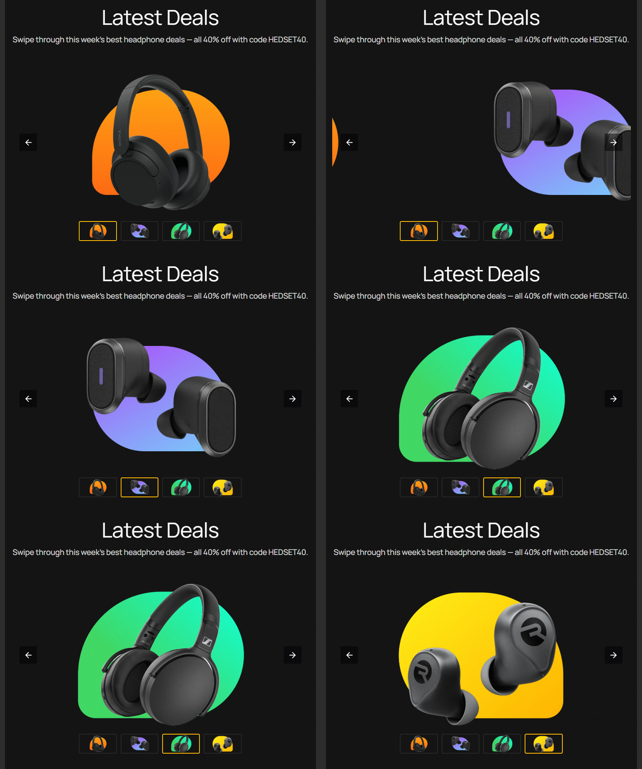
Recipients whose email client doesn't support AMP see a plain HTML version instead, in which the slides are simply stacked one below the other. Nothing breaks for them.
Before you start
AMP elements are a premium feature. If your current plan doesn't include them, you'll see an upgrade prompt when you try to add one to a project. See the Postcards pricing page for what each plan covers.
Important: AMP only renders in email clients that support AMP for Email — Gmail is the main one, alongside Yahoo Mail and Mail.ru. Outlook, Apple Mail, and most other clients ignore AMP entirely and display your HTML version. Even in a client that does support it, the carousel only appears when both of these are true:
- your sending domain is authenticated, with SPF, DKIM, and DMARC set up
- your sending address has been registered with Google for dynamic email
Always design your email so it still works without the carousel.
Adding a Carousel
The Carousel lives in the expanded element bubble.
- In the Layout panel on the left, hover above or below an existing element until a small blue plus (+) button appears. You can also hover between blocks in the centre of the editor to get the same plus button.
- Click the plus to open the elements bubble. It opens short, showing only the most-used elements.
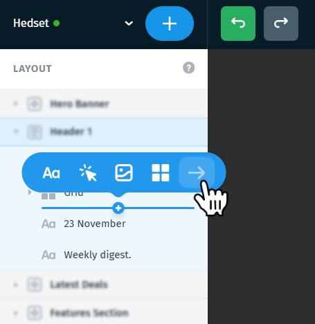
- Click the arrow (→) at the end of that row to expand the bubble and reveal every available element.
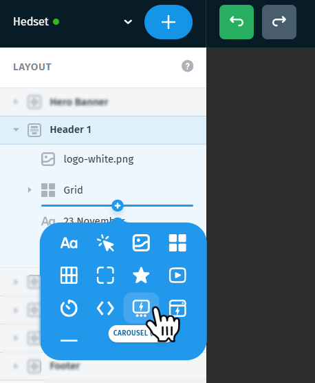
- Choose Carousel (AMP) — its icon carries the AMP lightning bolt. Hover any icon in the bubble to see its name.
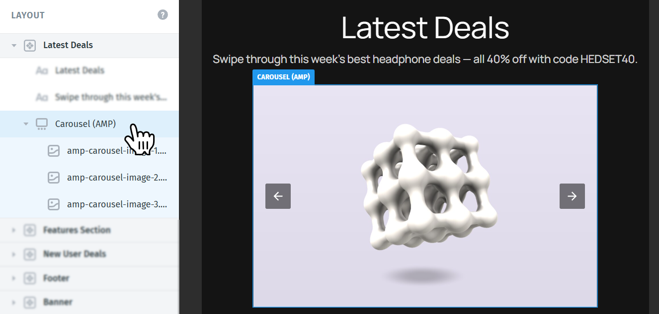
The element is added with a set of placeholder images already in place. In the Layout panel it appears as Carousel (AMP), with one child image for every slide.
Tip: You can also add a carousel from the centre of the editor by hovering between two blocks and clicking the blue plus that appears there.
Adding, replacing, and removing slides
Every slide is an Image element. You set its picture, its Alt text, and its Link the way you would for any other image, so individual slides can point at different pages.
Sizing works differently, though. Width, height, and the rest of the frame settings live on the parent Carousel (AMP) element, not on the slide. That's what keeps every slide the same size, and it's why the right panel for a selected slide is shorter than the one you get for a standalone image.
To add a slide:
- In the Layout panel, hover between two existing slides inside the carousel until the blue plus (+) appears.
- Click it to open the elements bubble.
- Choose Image.
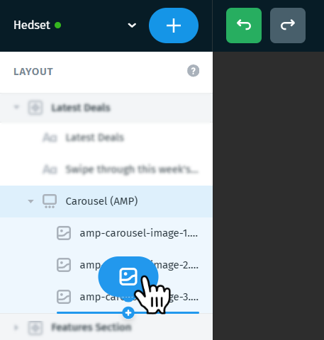
The new slide is added in that exact position.
To replace a slide's picture: select the slide, then use Upload or Direct URL in the Image section of the right panel. Fill in Alt text as well — that's what recipients see if images are blocked.
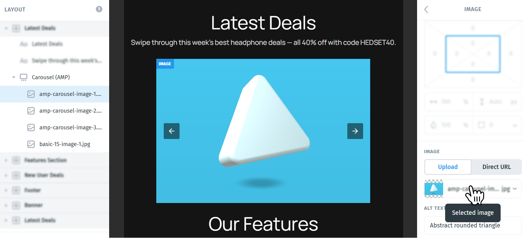
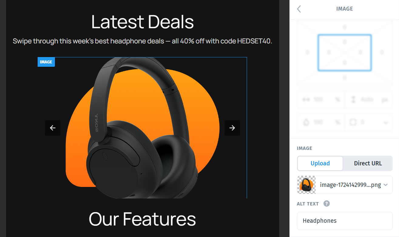
The image you upload replaces the placeholder in that slide.
To reorder or remove slides: drag or delete them in the Layout panel, the same way you manage any other element.
Note: The number of slides affects two settings. Autoplay needs at least two slides, and Loop needs at least three.
Carousel settings
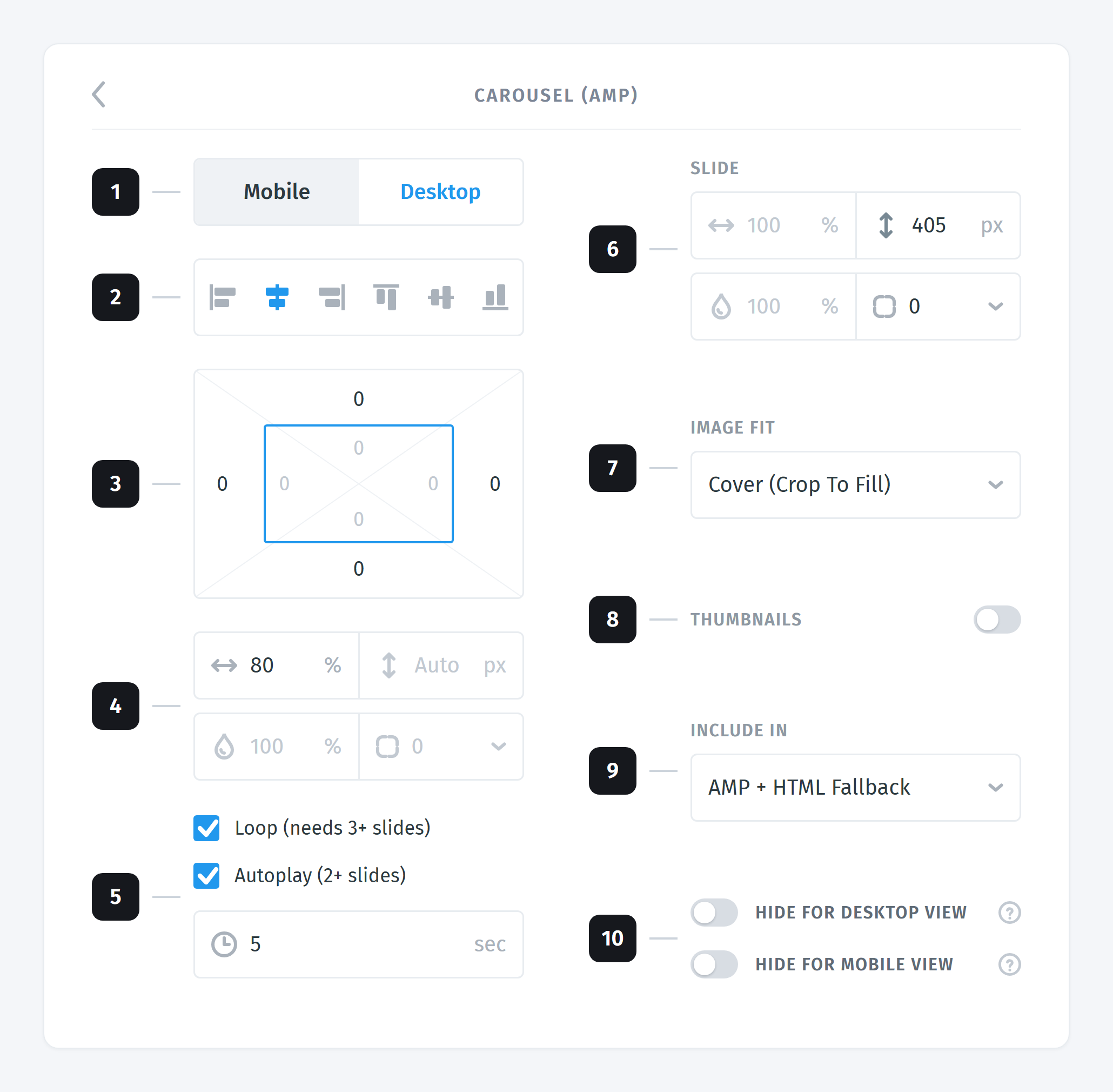
Select the Carousel (AMP) element itself, not one of its slides, to open its settings in the right panel. The numbers below match the callouts in the screenshot.
- View options (Desktop, Mobile)
- Alignment
- Margins
- Width
- Loop, autoplay, and delay
- Slide
- Image fit
- Thumbnails
- Include in
- Hiding options
Click any number on the image to jump straight to that setting.
1. View options (Desktop, Mobile)
Switch between Desktop and Mobile editing, or press the M keyboard shortcut. Any setting you change while in Mobile view overrides the Desktop value for that setting only, so you can tune the carousel separately for small screens without duplicating content.
2. Alignment
Six icons position the carousel inside its container. The first three are available and they set horizontal alignment (left, centre, right).
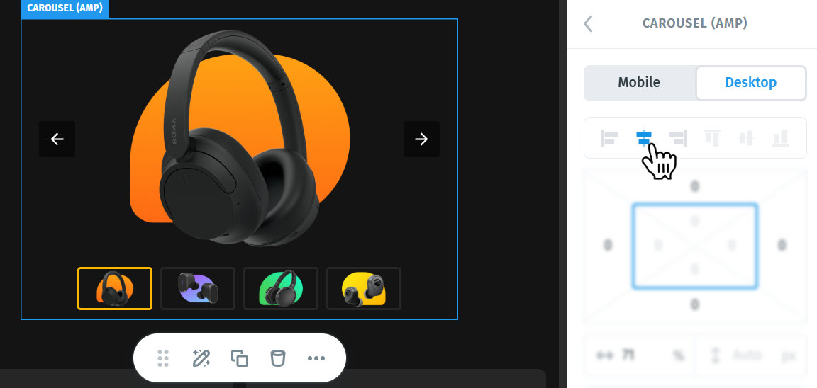
Note: If the carousel is set to 100% width, horizontal alignment has no visible effect, because there's no spare space to align it into. The same goes for vertical alignment when the container is no taller than the carousel.
3. Margins
Move the carousel using margins, which add space outside the element. Set the top, right, bottom, and left values in the margin box.
4. Width
Set the carousel's width as a percentage or in pixels. Click the % icon next to the value to switch to px.
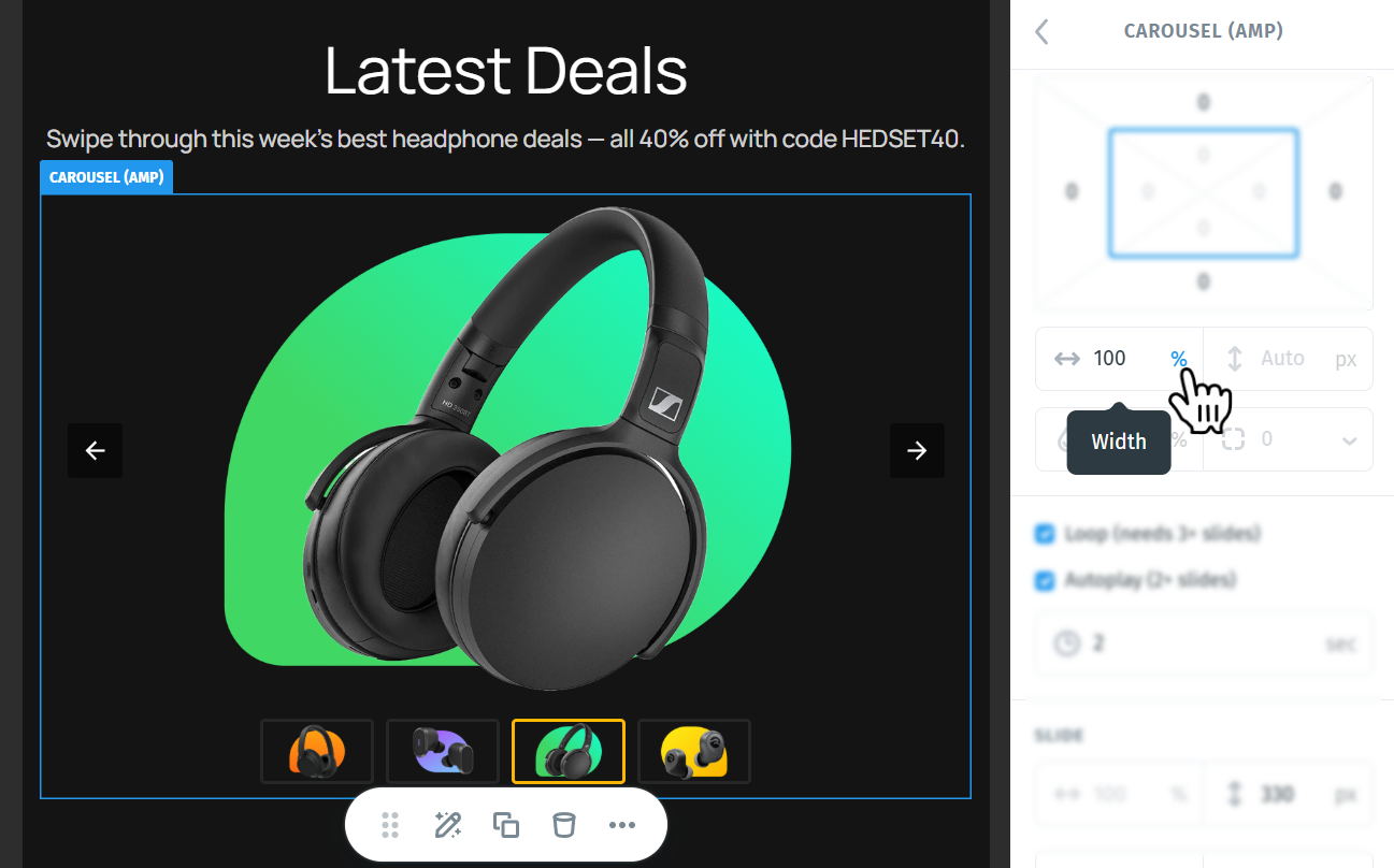
The height field beside it stays on Auto and can't be edited. The carousel takes its height from the Slide section instead, so that every slide comes out the same size. The opacity and corner radius fields on the row below are inactive for the element as a whole.
5. Loop, autoplay, and delay
These three settings control how the carousel moves. Both checkboxes are on by default.
Loop (needs 3+ slides) makes the carousel wrap around from the last slide back to the first.
When Loop is turned off, the next arrow disappears once you reach the last slide, and the previous arrow disappears on the first slide. That's intended — there's nowhere further to go.
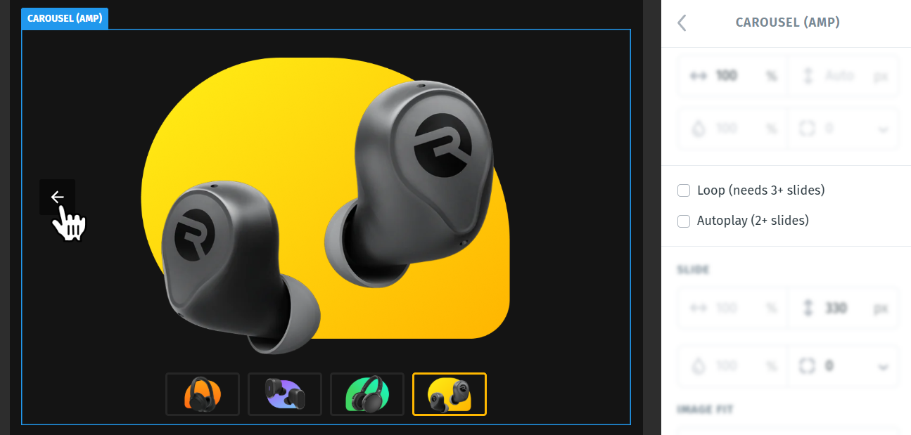
Autoplay (2+ slides) advances the slides on its own, without the recipient touching anything.
The delay field underneath, marked with a clock icon, sets how long each slide stays on screen, in seconds. Type a value or drag left and right to adjust it. It only matters when Autoplay is on.
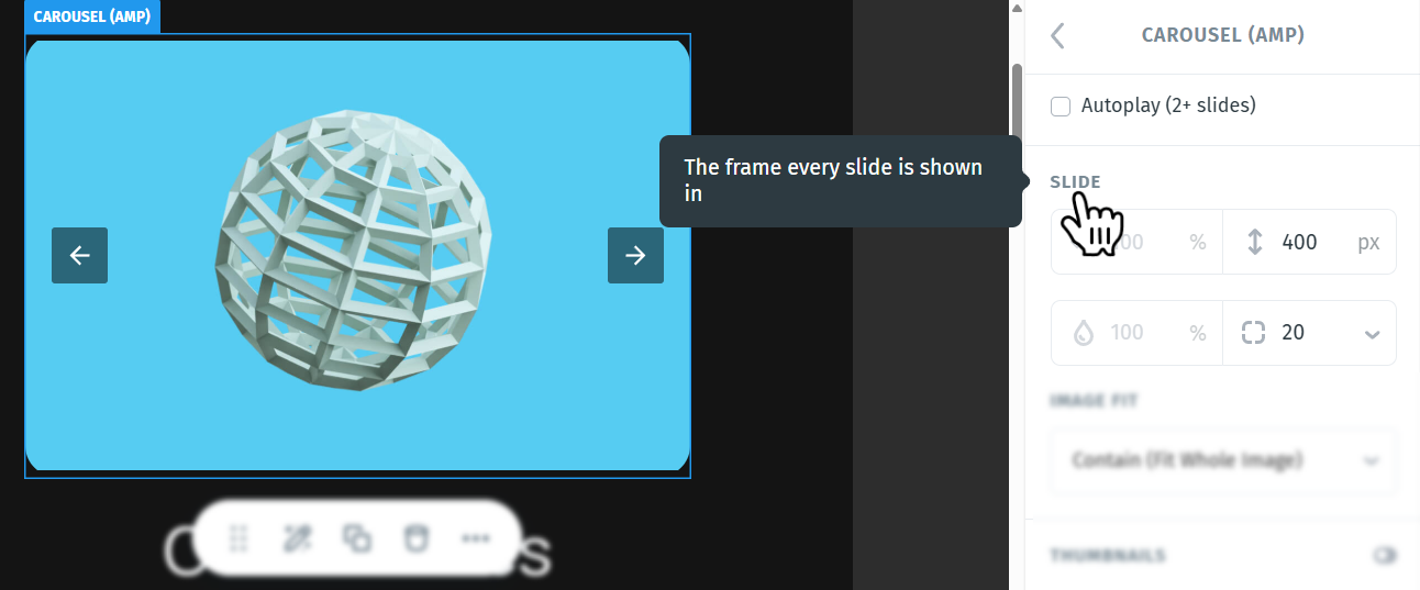
6. Slide
SLIDE is the frame every slide is shown in, and it's where the carousel gets both its size and its shape. Two settings here are yours to change:
- Height — set in pixels. This fixes the height of the whole carousel, so every slide stays the same size no matter what you put in it.
- Corner radius — rounds the corners of the slide frame. The higher the value, the rounder the corners. Click the small arrow next to the value to set each corner individually.
The other two fields in this section are fixed. Width is locked to 100% of the carousel, and opacity is inactive.
7. Image fit
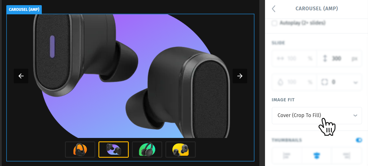
IMAGE FIT decides how each picture fills the slide frame. There are two choices:
- Cover (Crop To Fill) — the image scales up until it covers the whole slide, and anything that overflows is cropped. Every slide looks identical in size, at the cost of losing the edges of pictures that don't match the frame's proportions.
- Contain (Fit Whole Image) — the whole image is always visible, scaled down to fit inside the slide. Nothing is cropped, but pictures that don't match the frame leave empty space around themselves.
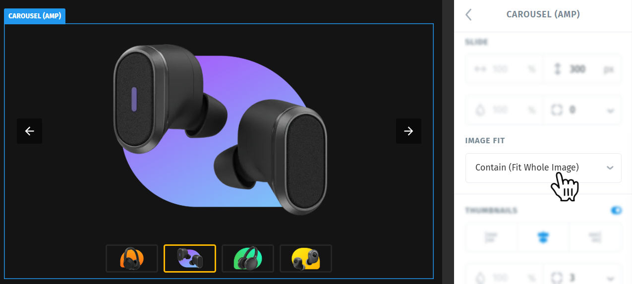
Use Cover when your images are all roughly the same shape and a clean edge-to-edge look matters. Use Contain when the full picture matters more than the framing, for example product shots or artwork.
8. Thumbnails
Turn THUMBNAILS on to show a strip of small, clickable previews under the slide area. Recipients can jump straight to any slide instead of stepping through with the arrows. The toggle is off until you switch it on, and switching it on reveals the rest of this section:
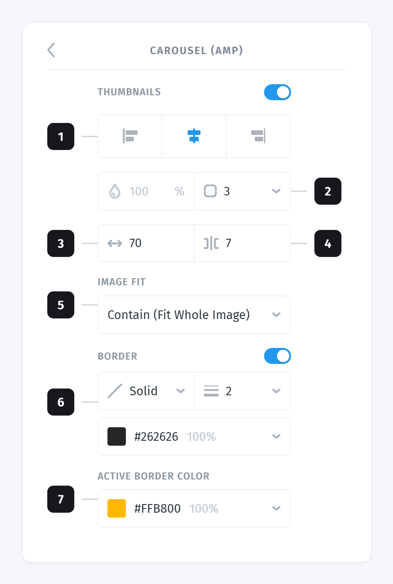
- Alignment — position the strip left, centre, or right under the slide.
- Corner radius — rounds the corners of every thumbnail.
- Width — how wide each thumbnail is, in pixels.
- Gap — the space between thumbnails.
- Image fit — the same Cover and Contain choice as above, applied to the thumbnails independently of the main slide.
- Border — its own toggle. Turn it on to set the style (solid, dotted, dashed), the thickness, and the colour of the outline around each thumbnail.
- Active border colour — the outline colour of the one thumbnail whose slide is currently on screen. This is how recipients see where they are in the sequence, so give it clear contrast against both your background and the ordinary border colour.
Note: Here, Borders belong to the thumbnails only. There's no border setting for the slide itself.
9. Include in
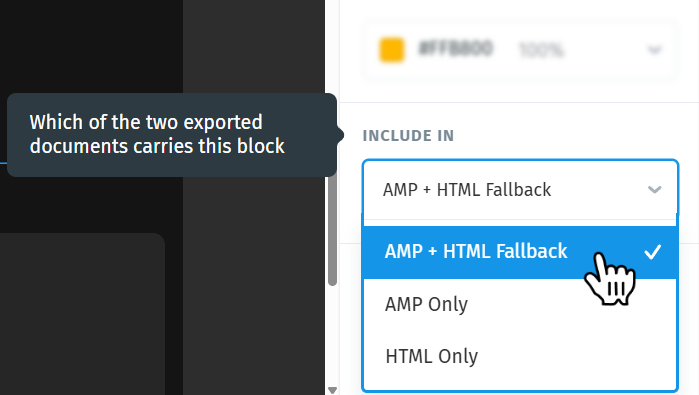
INCLUDE IN decides which of the two exported documents carries this block. See the next section for what those documents are.
- AMP + HTML Fallback (default) — the block goes into both documents. In the AMP version it's an interactive carousel; in the HTML version it falls back to static HTML.
- AMP Only — the block goes into the AMP document only. Recipients on non-AMP clients see nothing in that spot.
- HTML Only — the block goes into the HTML document only.
10. Hiding options
Two toggles at the bottom of the panel decide where the carousel appears:
- HIDE FOR DESKTOP VIEW — the carousel is left out of the desktop layout.
- HIDE FOR MOBILE VIEW — the carousel is left out of the mobile layout.
This is useful when a carousel earns its space on one screen size but not the other. Pair it with a simpler block set to the opposite toggle, and each layout gets the treatment that suits it.
Hidden elements are marked in the Layout panel with a crossed-out screen or phone icon, so you can tell at a glance what's been left out. Press M to switch views and check the result.
How the AMP and HTML versions work together
As soon as your project contains an AMP element, Postcards builds two versions of the same email if you download as ZIP:
- the AMP version, which supporting clients display, complete with your working carousel
- the HTML version, the fallback that every other client displays
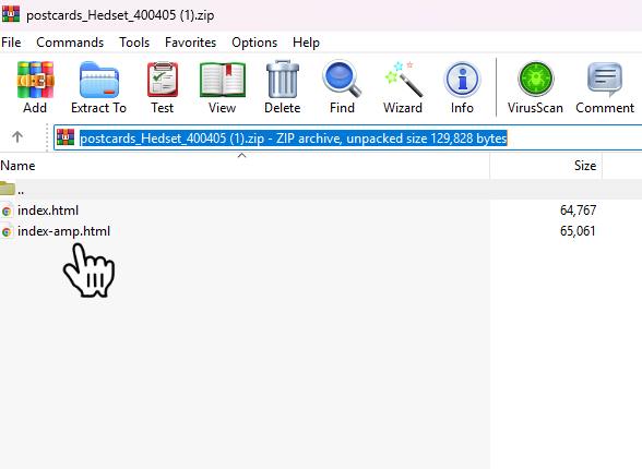
- index-amp.html — the AMP version
- index.html — the HTML fallback
Sending AMP needs a platform that supports it on purpose, which in practice means either a dedicated AMP field in its interface or an AMP parameter in its sending API. Check before you plan a campaign around a carousel: amp.dev keeps a list of email platforms with AMP support, and your platform's own documentation will tell you where to put the AMP version.
Postcards' own Send to Email Platform integrations always send the HTML version, so they aren't a route to AMP either.
What the carousel looks like in the fallback
In the HTML file, AMP blocks fall back to static HTML. For a carousel that means every slide is stacked in a single column, one image below the next, in the order they appear in the Layout panel.
Important: The automatic fallback isn't configurable. Postcards generates it for you, and there are no settings to change how it looks.
Exporting and sending
Download as ZIP — gives you the two HTML files described above, plus your images if you chose to include them locally.
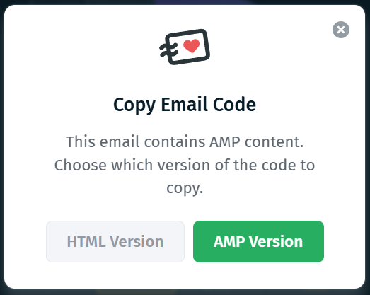
Copy Email Code — when your project contains AMP elements, Postcards asks which version you want before the code goes to your clipboard, with HTML Version and AMP Version buttons. Only one version reaches your clipboard, so if you need both you'll have to copy twice or download the ZIP instead.
Send to Email Platform (Integrations) — sends the plain HTML version only. Postcards warns you first: "This email contains AMP content. Integrations receive the HTML version only — AMP blocks fall back to static HTML. To get the AMP version, use Copy Email Code or Export." Click Continue to send the HTML version anyway, or Cancel and use one of the other two export routes.
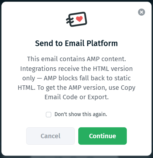
Note: That dialog has a Don't show this again checkbox. Once you tick it, integrations will keep sending the HTML version without warning you, so make sure everyone on your team knows before it gets dismissed.
For the full walkthrough of every export option, see Exporting Email Templates.
Getting AMP to actually render in Gmail
Every one of these has to be true, and the first is the one that stops most people:
- your sending platform can actually attach an AMP part, and you've given it the AMP version
- your sending domain is authenticated, with SPF, DKIM, and DMARC set up
- your sending address has been registered with Google for dynamic email
- the message is sent from that same registered address
Until you're registered, recipients see your HTML fallback.
Google's own documentation covers the whole process:
- AMP for Gmail — what dynamic email is and the rules for sending it
- Register with Google to send dynamic emails — the requirements and the registration form
- Test your AMP emails in Gmail — the developer setting that lets you receive AMP mail from your own address, which is the quickest way to see the real thing in a real inbox before you register
Previewing and sharing
Important: Direct Email Preview sends the regular version of your email, without AMP. What arrives in your inbox is the fallback, so the carousel appears as a stack of images. This is expected and doesn't mean anything is broken. Direct Email Preview can't be used to check the AMP version.
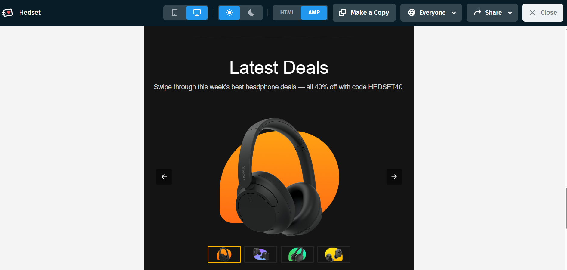
Shared preview links are the way to see both. They show the AMP version of the project, with a switch to flip over to the plain HTML version, and it works in the mobile preview too.
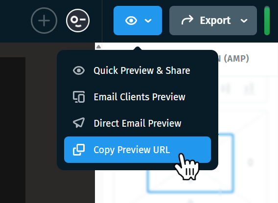
Preview URL
Good to know
- Design for the fallback first. Most inboxes will never see the carousel, and what they get instead is a column of your slides. Decide whether that reads well before you fine-tune the animation.
- Watch your email size. Gmail clips messages over roughly 102 KB, so keep an eye on the Health Bar and read Tips to Reduce Email Template Size.
- Keep slide images the same proportion where you can. Cover (Crop To Fill) will crop anything that doesn't match the slide frame.
- Don't judge AMP from a test send. Direct Email Preview delivers the fallback, so the carousel will always look stacked there. Check the AMP version in a shared preview link.
Next steps
- How the AMP Accordion Works in Postcards (article coming soon)
- How Image Works in Postcards
- Postcards Modules
- Exporting Email Templates
- Preview & Share Email in Postcards