
How the AMP Accordion Works in Postcards
The Accordion (AMP) element lets your recipients expand and collapse sections of content inside the email itself, without leaving their inbox. It is built on AMP for Email, a format that a small number of email clients support to make emails interactive.
An accordion is a stack of titled sections. Tapping a title opens that section and reveals what's inside it. It's the right element for anything long that not everyone needs to read at once: FAQs, shipping and returns, terms, a set of product details.

Before you start
Important: AMP elements are a premium feature. If your current plan doesn't include them, you'll see an upgrade prompt when you try to add one to a project. See the Postcards pricing page for what each plan covers.
Important: AMP only renders in email clients that support AMP for Email — Gmail is the main one, alongside Yahoo Mail and Mail.ru. Outlook, Apple Mail, and most other clients ignore AMP entirely and display your HTML version. Even in a client that does support it, the accordion only works when both of these are true:
- your sending domain is authenticated, with SPF, DKIM, and DMARC set up
- your sending address is registered with that email provider, which for Gmail means registering with Google for dynamic email
Always design your email so it still reads well without the accordion.
Adding an Accordion
The Accordion lives in the expanded element bubble.
- In the Layout panel on the left, hover above or below an existing element until a small blue plus (+) button appears. You can also hover between blocks in the centre of the editor to get the same plus button.
- Click the plus to open the elements bubble. It opens short, showing only the most-used elements.
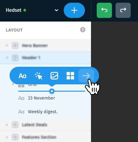
- Click the arrow (→) at the end of that row to expand the bubble and reveal every available element.
- Choose Accordion (AMP) — its icon carries the AMP lightning bolt. Hover any icon in the bubble to see its name.

The element arrives with two sections already in place, titled Section 1 and Section 2, each holding a line of placeholder text. In the Layout panel it appears as Accordion (AMP), with an Accordion Section (AMP) beneath it for every section.

Working with sections
An accordion is built from Accordion Section (AMP) elements. Each one is a title plus whatever content you put under it, and each is selected and edited on its own.
To add a section, use either of these:
- Duplicate an existing section. Right-click a section in the Layout panel and choose Duplicate. Postcards adds a copy with the same title and content, which makes it the quickest way to add a section that matches the rest.

- Use the blue plus. Hover between two sections in the Layout panel until the blue plus (+) appears, click it, and choose the element the new section should start with.
Note: With the blue plus, where you hover decides what happens. On the line between two sections, the element you pick starts a new section. Inside a section, it's added to that section's content instead. Watch the blue insertion line before you click.
To rename a section: select the section, then type into the TITLE field in the right panel. That title is the part recipients tap.

To reorder or remove sections: drag or delete them in the Layout panel, the same way you manage any other element.
Putting content in a section
A section can hold any element you'd use elsewhere in your email: text, images, buttons, grids, and more. Every new section starts with a single Text element reading "Edit this section content." Select it and type over it, then add anything else the section needs.
To add an element to a section, hover inside it in the Layout panel until the blue plus appears, click it, and pick what you want from the bubble.

Accordion settings
Select the Accordion (AMP) element itself, not one of its sections, to open its settings in the right panel.
- View options (Desktop, Mobile)
- Alignment
- Margins
- Width
- Spacing
- Behaviour
- Title
- Background colour
- Border
- Icon
- Content
- Include in
- Hiding options
Click any number on the image to jump straight to that setting

1. View options (Desktop, Mobile)
Switch between Desktop and Mobile editing, or press the M keyboard shortcut. Any setting you change while in Mobile view overrides the Desktop value for that setting only, so you can tune the accordion separately for small screens without duplicating content.
2. Alignment
Six icons position the Accordion inside its container. The first three are available and they set horizontal alignment (left, centre, right).

Note: If the accordion is set to 100% width, horizontal alignment has no visible effect, because there's no spare space to align it into.
3. Margins
Move the accordion using margins, which add space outside the element. Set the top, right, bottom, and left values in the margin box.
4. Width
Set the accordion's width as a percentage or in pixels. Click the % icon next to the value to switch to px.

The height field beside it stays on Auto and can't be edited, because an accordion's height changes as sections open and close. The opacity and corner radius fields on the row below are inactive for the element as a whole.
5. Spacing
The row below Width holds two spacing fields.
The field on the right sets the space between sections. Type a value or drag left and right to adjust it. At 0 the sections sit flush against each other as one solid block. A small value, around 8, separates them into individual cards.

The field on the left stays inactive. Sections always span the full width of the accordion, so there's nothing to space out horizontally.
6. Behaviour
Two checkboxes control how the accordion responds when someone taps a title. Both are on by default.
- Animate expand/collapse — sections slide open and closed instead of appearing instantly.
- Only one section open at a time — opening a section closes whichever one was open. Turn it off if you want recipients to be able to open several at once.
7. Title
The TITLE section styles every section title at once, so all your titles stay consistent. It carries the full text controls: font family, weight, size, line height, letter spacing, colour, and alignment

Tip: Section titles are the only thing a recipient sees before they interact, so make them specific. "Shipping and returns" earns a tap; "More information" doesn't.
Tip: Left-aligned titles keep every icon lined up along the right edge. With centred titles, each icon sits right after its title text instead, so the icons land at a different position on every row.
Important: Web fonts don't load in the AMP version. If your titles use a font like Manrope or Fira Sans, recipients who get the AMP version see them in your project's Fallback Font instead, which is Arial unless you've changed it. The same goes for the text inside your sections. You'll find Fallback Font in the project settings, which open in the right panel when nothing on the canvas is selected. If the exact look matters, pick a fallback that suits your design, or use a web-safe font such as Arial or Georgia.
8. Background colour
BACKGROUND COLOR fills the title bars. This is the colour of the closed accordion, so it's what most recipients see first.

9. Border
BORDER outlines the accordion. Turn it on to set the style (solid, dotted, dashed), the thickness, and the colour.

10. Icon
ICON controls the marker beside each title that shows a section can be opened. Turn it on, then supply your own image with Upload or Direct URL, and set its width and height under ICON SIZE.
When a section opens, its icon turns upside down, and it turns back when the section closes. That's why a downward-pointing arrow works best: it points down on closed sections and up on the open one.

Note: Keep the icon small and set its size deliberately. A large icon stretches the title bars and unbalances the whole element.
11. Content
CONTENT sets the background colour behind the content of an open section, separately from the title bars. Use it to separate what's open from what's still closed.

12. Include in
INCLUDE IN decides which of the two exported documents carries this block. See the next section for what those documents are.
- AMP + HTML fallback (default) — the block goes into both documents. In the AMP version it's an interactive accordion; in the HTML version every section is shown expanded.
- AMP Only — the block goes into the AMP document only. Recipients on non-AMP clients see nothing in that spot.
- HTML Only — the block goes into the HTML document only.

13. Hiding options
Two toggles at the bottom of the panel decide where the accordion appears:
- HIDE FOR DESKTOP VIEW — the accordion is left out of the desktop layout.
- HIDE FOR MOBILE VIEW — the accordion is left out of the mobile layout.
An accordion usually earns its space on mobile, where screen height is scarce, more than on desktop. These toggles let you show it in one layout and a plain block in the other.
Section settings
Select a single Accordion Section (AMP) to style that one section on its own. Two settings are specific to a section.

TITLE is a plain text field holding that section's title. Type over it to rename the section.
Expanded on load decides whether this section starts open when the email is opened. Tick it on the section you most want read.
Note: If Only one section open at a time is on at the accordion level, tick Expanded on load for one section only. Two sections both set to open on load contradict the setting.
Note: Expanded on load only affects the AMP version. In the HTML fallback every section is open anyway.
How the AMP and HTML versions work together
As soon as your project contains an AMP element, Postcards builds two versions of the same email if you download as ZIP:
- the AMP version, which supporting clients display, complete with your working accordion
- the HTML version, the fallback that every other client displays
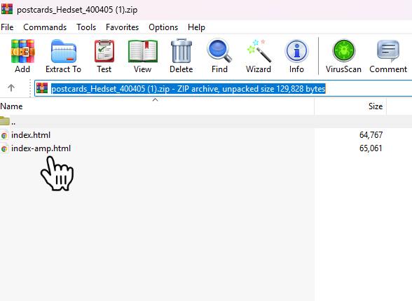
- index-amp.html — the AMP version
- index.html — the HTML fallback
Sending AMP needs a platform that supports it on purpose, which in practice means either a dedicated AMP field in its interface or an AMP parameter in its sending API. Check before you plan a campaign around an accordion: amp.dev keeps a list of email platforms with AMP support, and your platform's own documentation will tell you where to put the AMP version.
Postcards' own Send to Email Platform integrations always send the HTML version, so they aren't a route to AMP either.
What the accordion looks like in the fallback
In the HTML file, AMP blocks fall back to static HTML. For an accordion that means every section is shown expanded, each title followed by its content, in the order they appear in the Layout panel.
Important: The automatic fallback isn't configurable. Postcards generates it for you, and there are no settings to change how it looks. If you don't want every section open at once, build your own fallback instead, as described next.
Exporting and sending
Download as ZIP — gives you the two HTML files described above, plus your images if you chose to include them locally.
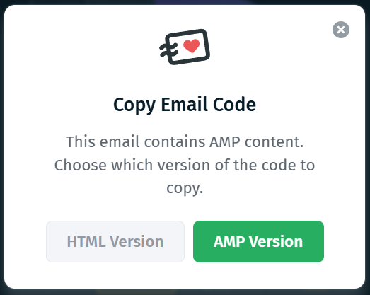
Copy Email Code — when your project contains AMP elements, Postcards asks which version you want before the code goes to your clipboard, with HTML Version and AMP Version buttons. Only one version reaches your clipboard, so if you need both you'll have to copy twice or download the ZIP instead.
Send to Email Platform (Integrations) — sends the plain HTML version only. Postcards warns you first: "This email contains AMP content. Integrations receive the HTML version only — AMP blocks fall back to static HTML. To get the AMP version, use Copy Email Code or Export." Click Continue to send the HTML version anyway, or Cancel and use one of the other two export routes.
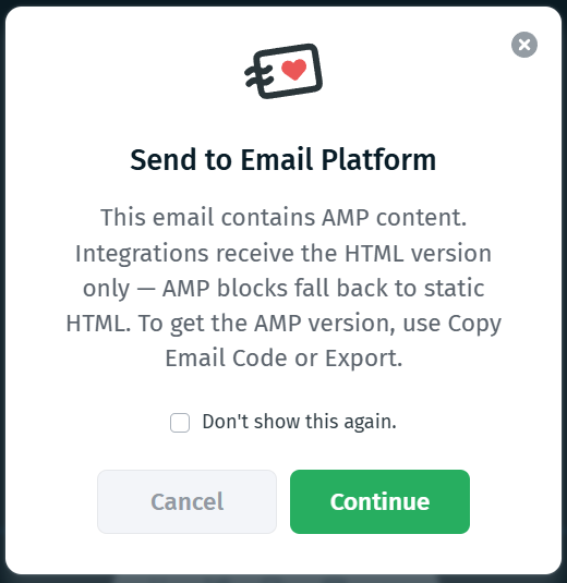
Note: That dialog has a Don't show this again checkbox. Once you tick it, integrations will keep sending the HTML version without warning you, so make sure everyone on your team knows before it gets dismissed.
For the full walkthrough of every export option, see Exporting Email Templates.
Getting AMP to actually render in Gmail
Every one of these has to be true, and the first is the one that stops most people:
- your sending platform can actually attach an AMP part, and you've given it the AMP version
- your sending domain is authenticated, with SPF, DKIM, and DMARC set up
- your sending address has been registered with Google for dynamic email
- the message is sent from that same registered address
Until you're registered, recipients see your HTML fallback.
Google's own documentation covers the whole process:
- AMP for Gmail — what dynamic email is and the rules for sending it
- Register with Google to send dynamic emails — the requirements and the registration form
- Test your AMP emails in Gmail — the developer setting that lets you receive AMP mail from your own address, which is the quickest way to see the real thing in a real inbox before you register
Previewing and sharing
Important: Direct Email Preview sends the regular version of your email, without AMP. What arrives in your inbox is the fallback, with every section already expanded and nothing to open or close. This is expected and doesn't mean anything is broken.
Shared preview links are the way to see both. They show the AMP version of the project, with a switch to flip over to the plain HTML version, and it works in the mobile preview too.
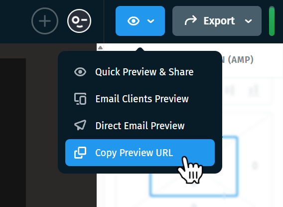
Preview URL:

For everything else preview links can do, see Preview & Share Email in Postcards.
Good to know
- Write the titles for the closed state. A collapsed accordion is a list of titles. If they don't tell the reader what's inside, nothing gets opened.
- Design for the fallback. Most inboxes will never see the accordion. They get every section expanded, so check that the full list still reads well before you fine-tune the animation.
- Watch your email size. Everything inside every section ships in the email whether or not it's ever opened. Gmail clips messages over roughly 102 KB, and it refuses an AMP version over 200 KB outright, showing the fallback instead. Read Tips to Reduce Email Template Size for ways to trim it.
- Expect a different font in Gmail. The AMP version can't load web fonts, so your titles and text appear in your project's Fallback Font there.
- Don't judge AMP from a test send. Direct Email Preview delivers the fallback. Check the AMP version in a shared preview link.