Sometimes, something on your website’s UI might not be completely clear or obvious to some users. It might be helpful to add some elements that give more information on some parts of the UI. This will improve the website’s overall user experience as users won’t be left to guess the meaning/message you were trying to communicate.
We will look at how to use Tooltips, Popovers, and Captions to provide additional information on your Startup that might be useful to your users.
Tooltips
Tooltips are small, interactive, textual hints used mostly on graphical elements. When using icons for actions, you can include a tooltip to give people clarification on the element’s function.
When you add a title attribute to any HTML element, its value will be shown in a tooltip when the mouse moves over the element.
<a href="#" class="f-42" title="This is a tooltip"><i class="far fa-edit"></i></a>
Below is the default tooltip.

You can stick with the default tooltip, but Bootstrap makes available a tooltip plugin that gives better-styled tooltips that you can customize.
Enable Bootstrap Tooltips
To enable the Bootstrap tooltip, you first have to initialize it. As you’ll see, all tooltips will have the data attribute data-toggle="tooltip", therefore, the following code will select all elements on a page with that attribute and enable the Bootstrap tooltip on them. Place this code in the js/script.js file.
$(function () {
  $('[data-toggle="tooltip"]').tooltip()
})
Place it inside the SF_scripts() function.
function SF_scripts(){
  ...

  $(function () {
    $('[data-toggle="tooltip"]').tooltip()
  })
} // SF_scripts end
Add a Tooltip to an Element
After enabling tooltips on the page, let’s add one to an element.
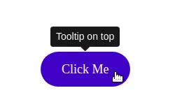
<button type="button" class="btn action-2" data-toggle="tooltip" title="Tooltip on top">
  Click Me
</button>
As you can see, it looks much better than the default tooltip.
Change the Position of the Tooltip
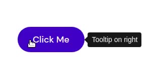
As we saw earlier, the default HTML tooltip is placed on the bottom right side of the cursor. When the cursor is positioned inside an element, the tooltip can end up covering some of the content. The Bootstrap tooltip is always positioned outside the element the cursor is pointing to. By default, it’s positioned above the element. You can change this with the data-placement attribute. Possible values are top, bottom, left and right.
Below, we place the tooltip to the right of the element:
<button type="button" class="btn action-2" data-toggle="tooltip" data-placement="right" title="Tooltip on right">
  Click Me
</button>
Use Custom HTML on the Tooltip
With the Bootstrap tooltip, you aren’t restricted to using only plain text for the content of the tooltip, you can use HTML as well. For this to work, you have to add the attribute data-html="true".
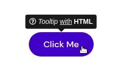
<button type="button" class="btn action-2" data-toggle="tooltip" data-html="true" title="<i class='far fa-question-circle'></i> <em>Tooltip</em> <u>with</u> <b>HTML</b>">
  Click Me
</button>
You can see the resulting tooltip below with an icon and some italicized, underlined, and bold text.
Enable Tooltips on Disabled Elements
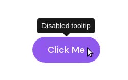
If you add a title to a disabled element, it won’t appear as a tooltip because disabled elements aren’t interactive, meaning users cannot focus, hover, or click them, therefore tooltips cannot be triggered on such elements. As a workaround, you should place the disabled element inside a <div> or <span> and trigger the tooltip on that div or span.
<span class="d-inline-block" tabindex="0" data-toggle="tooltip" title="Disabled tooltip">
  <button class="btn action-2" style="pointer-events: none;" type="button" disabled>Click Me</button>
</span>
In the above code, we add d-inline-block to the wrapper span which adds the CSS style display: inline-block to it. With this, the wrapper will cover the whole button. We add the tabindex="0" attribute to the wrapper to make it keyboard-focusable. Only links and form elements (input fields, buttons, checkboxes, etc) can receive keyboard focus (i.e. can be focusable in sequential keyboard navigation), so we use tabindex them to make the span keyboard focusable. We also add the CSS style pointer-events: none to the disabled button to prevent it from reacting to pointer events, like :hover and click. This will also make the cursor appear like an arrow instead of a hand when the mouse is over the element.
Popovers
You can also provide the user with additional information about an element using the Bootstrap Popover.
Enable Bootstrap Popovers
To use popovers, you first have to initialize them. The following code selects all elements with the data-toggle="popover" attribute and initializes the popover plugin on them. Place the code in the js/script.js file.
$(function () {
  $('[data-toggle="popover"]').popover()
})
Place it inside the SF_scripts() function.
function SF_scripts(){
  ...

  $(function () {
    $('[data-toggle="popover"]').popover()
  })
} // SF_scripts end
Add a Popover to an Element
After enabling popovers on the page, let’s add one to an element.
<button type="button" class="btn action-2" data-toggle="popover" title="Popover Title" data-content="This is a Popover. Lorem ipsum dolor sit amet consectetur.">
  Click Me
</button>
To add a popover to an element, you must add the data-toggle="popover" attribute to it. Popovers can have a header and content body. To add a header, use the title or data-title attributes. To add a body, use the data-content attribute. If the title and content are both zero-length, the popover will not be displayed.
Popovers are triggered when a user clicks on the element they’ve been initialized on. Once triggered, another click on the element will dismiss the popover. Later, we’ll see how we can modify this behavior.
Clicking on the button we added gives us the popover shown below.
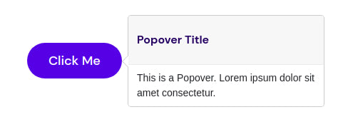
The popover’s header uses an <h3> element with the class popover-header. For the Startup template, we increased the line-height of h3 elements from the default set by Bootstrap. Let’s reduce it for this particular <h3> so that the header doesn’t have so much whitespace. Add the following to css/style.css:
.popover-header {
  line-height: 1.2 !important;
}
Now the popover looks much better:

Below, we create a popover with no header:
<button type="button" class="btn action-2" data-toggle="popover" data-content="This is a Popover. Lorem ipsum dolor sit amet consectetur.">
  Click Me
</button>

Change the Position of the Popover
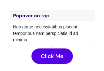
By default, popovers appear to the right of the element, but you can change their position by using the data-placement attribute. Below, we place the popover above the element.
<button type="button" class="btn action-2" data-toggle="popover" data-placement="top" title="Popover on top" data-content="Non atque necessitatibus placeat temporibus nam perspiciatis id ad minima.">
  Click Me
</button>
Dismiss Popover by Clicking on its Backdrop
As previously mentioned, by default, you close a popover by clicking the element you had clicked on to trigger it. This might be a bit counterintuitive as users have come to be used to dismissing similar components as popovers (like modals, dialog boxes, etc.) by clicking on the component’s backdrop (i.e. anywhere outside it). Let’s enable a similar behavior for the popover.
<a tabindex="0" class="btn action-2" role="button" data-toggle="popover" data-trigger="focus" title="Dismissible popover" data-content="This is a Popover. Lorem ipsum dolor sit amet consectetur.">Click Me</a>
We add the data-trigger="focus" attribute to enable the dismissal of popovers on the user’s next click of an element different from the element with the popover. For proper cross-browser and cross-platform behavior, we use the <a> tag instead of <button> and include a tabindex="0" attribute.
Use Custom HTML on the Popover
You aren’t restricted to using only plain text for the content of the popover, you can use HTML as well. For this to work, you have to add the attribute data-html="true".
<button type="button" class="btn action-2" data-toggle="popover" data-html="true" title="<i class='far fa-question-circle'></i> <em>Popover Title</em> <u>with</u> <b>HTML</b>" data-content="<i class='far fa-check-square'></i></i> <em>Popover content</em> <u>with</u> <b>HTML</b>">
  Click Me
</button>
You can see the resulting popover below with icons and italicized, underlined, and bold text.

Enable Popovers on Disabled Elements
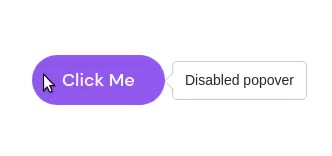
Disabled elements aren’t interactive, meaning users cannot focus, hover, or click them, therefore popovers cannot be triggered on such elements. As a workaround, you can trigger a popover on a <div> or <span> wrapper around the disabled element.
<span class="d-inline-block" data-toggle="popover" data-content="Disabled popover">
  <button class="btn action-2" style="pointer-events: none;" type="button" disabled>Click Me</button>
</span>
In the above code, we add d-inline-block to the wrapper span which adds the CSS style display: inline-block to it. With this, the wrapper will cover the whole button. We add the CSS style pointer-events: none to the disabled button to prevent it from reacting to pointer events, like :hover and click. This will also make the cursor appear like an arrow instead of a hand when the mouse is over the element.

For disabled elements, you might prefer to provide immediate visual feedback to users as they may not expect to click on a disabled element for more information. You can do this by adding the data-trigger="hover" attribute to the wrapper to make the popover appear when the user hovers over the disabled element.
<span class="d-inline-block" data-toggle="popover" data-trigger="hover" data-content="Disabled popover">
  <button class="btn action-2" style="pointer-events: none;" type="button" disabled>Click Me</button>
</span>
Captions
You can add brief explanations to various elements using Captions to give the user further information on what they are looking at.
Add Caption to a Table
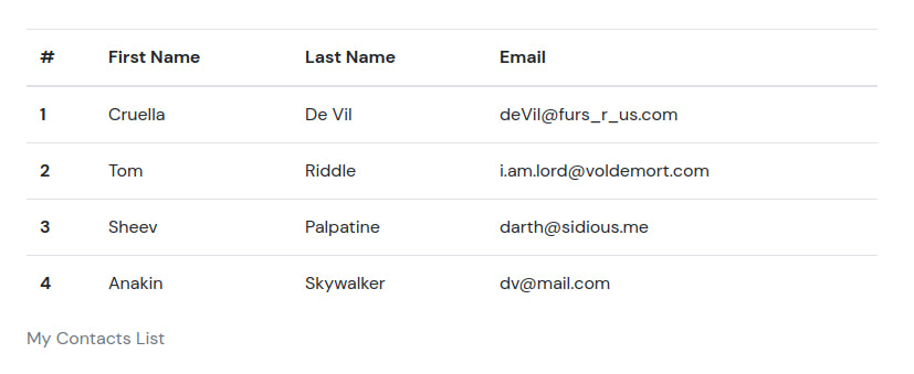
You might want to give more information describing a table’s data. You can do this by adding a caption at the bottom of the table. Adding a caption to a table also improves your website’s Accessibility. It helps users with screen readers to find the table, understand what it’s about, and decide if they want to read it.
To add a caption, place your text inside a <caption> tag.
<section class="pt-105 pb-45">
  <div class="container px-xl-0">
    <div class="row justify-content-center">
      <div class="col-xl-8 col-lg-10">
        <table class="table">
          <caption>My Contacts List</caption>
          <thead>
            <tr>
              <th scope="col">#</th>
              <th scope="col">First Name</th>
              <th scope="col">Last Name</th>
              <th scope="col">Email</th>
            </tr>
          </thead>
          <tbody>
            <tr>
              <th scope="row">1</th>
              <td>Cruella</td>
              <td>De Vil</td>
              <td>deVil@furs_r_us.com</td>
            </tr>
            <tr>
              <th scope="row">2</th>
              <td>Tom</td>
              <td>Riddle</td>
              <td>i.am.lord@voldemort.com</td>
            </tr>
            <tr>
              <th scope="row">3</th>
              <td>Sheev</td>
              <td>Palpatine</td>
              <td>darth@sidious.me</td>
            </tr>
            <tr>
              <th scope="row">4</th>
              <td>Anakin</td>
              <td>Skywalker</td>
              <td>dv@mail.com</td>
            </tr>
          </tbody>
        </table>
      </div>
    </div>
  </div>
</section>
For more on using and customizing tables on the Startup template, check out our guide.
Add Caption to an Image
To add a caption to an image, place the image inside a figure tag, and the caption inside a figcaption tag.
<figure class="figure">
  <img src="i/showcase_1_img_3.jpg" srcset="i/showcase_1_img_3@2x.jpg 2x" class="figure-img img-fluid radius10" alt="" />
  <figcaption class="figure-caption">The misty mountains.</figcaption>
</figure>

For more on using and customizing images on the Startup template, check out our guide.
Add Caption to a Carousel
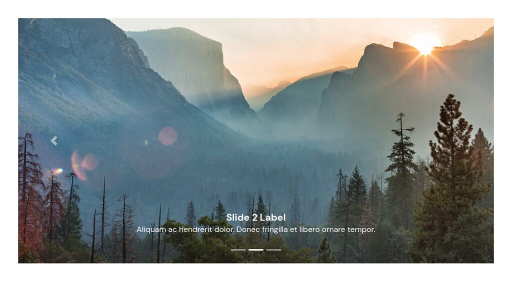
You can add captions to each of the slides in a carousel as shown below. The caption is placed inside .carousel-caption.
<section class="pt-105 pb-45">
  <div class="container px-xl-0">
    <div class="row justify-content-center">
      <div class="col-xl-10">
        <div id="carouselCaptions" class="carousel slide" data-ride="carousel">
          <ol class="carousel-indicators">
            <li data-target="#carouselCaptions" data-slide-to="0" class="active"></li>
            <li data-target="#carouselCaptions" data-slide-to="1"></li>
            <li data-target="#carouselCaptions" data-slide-to="2"></li>
          </ol>
          <div class="carousel-inner">
            <div class="carousel-item active">
              <img class="d-block" src="i/image.jpeg" alt="First slide">
              <div class="carousel-caption d-none d-md-block">
                <h5>Slide 1 Label</h5>
                <p>Lorem ipsum dolor sit amet, consectetur adipiscing elit.</p>
              </div>
            </div>
            <div class="carousel-item">
              <img class="d-block" src="i/image2.jpeg" alt="Second slide">
              <div class="carousel-caption d-none d-md-block">
                <h5>Slide 2 Label</h5>
                <p>Aliquam ac hendrerit dolor. Donec fringilla et libero ornare tempor.</p>
              </div>
            </div>
            <div class="carousel-item">
              <img class="d-block" src="i/image3.jpeg" alt="Third slide">
              <div class="carousel-caption d-none d-md-block">
                <h5>Slide 3 Label</h5>
                <p>Proin nibh eros, mattis eget risus vel, sollicitudin condimentum tellus.</p>
              </div>
            </div>
          </div>
          <a class="carousel-control-prev" href="#carouselCaptions" role="button" data-slide="prev">
            <span class="carousel-control-prev-icon" aria-hidden="true"></span>
            <span class="sr-only">Previous</span>
          </a>
          <a class="carousel-control-next" href="#carouselCaptions" role="button" data-slide="next">
            <span class="carousel-control-next-icon" aria-hidden="true"></span>
            <span class="sr-only">Next</span>
          </a>
        </div>
      </div>
    </div>
  </div>
</section>
For more on using and customizing carousels on the Startup template, check out our guide.
Add Caption to the Fancybox Lightbox
The Startup template supports the use of the Fancybox lightbox to create customizable modals. You can add a caption to the modal by using the data-caption attribute.
<a href="i/large_image.jpeg" data-fancybox data-caption="This image has a caption">
  <img src="i/small_image.jpeg" />
</a>

For more on using and customizing the Fancybox lightbox on the Startup template, check out our guide.
