
A modal can be used to capture the user’s attention and focus it on a particular piece of content. They are commonly used to display notifications, prompts to the user, images, videos, embedded content like maps, etc.
The startup template builder makes it easy for you to include modals on your website. It supports the use of two modals out-of-the-box: the Fancybox lightbox and the Bootstrap Modal. We’ll show you how to use both.
Fancybox Lightbox
FancyBox is a JavaScript library that can be used to present various types of media in a lightbox (a window shown on the foreground while the rest of the webpage is dimmed out). It can display images, video, iframes and any HTML content. It is responsive, touch-enabled (swipe to navigate, spread/pinch to zoom in/out supported on touch devices) and customizable.
Displaying Images
Single Image
Modals are usually activated as a result of a user click (but you can also activate them with JavaScript as a result of some other event). To use fancybox and have it get activated by clicking on a certain element, you add the data-fancybox attribute to the element. This automatically binds a click event to the element that will start fancybox when invoked. To specify the source of the content that will be shown on the lightbox, you can use either the href or data-src attribute.
You can use fancybox on thumbnail images that display a larger image in a lightbox when clicked. The following will display a 240x160 image on the page that will open up a 1500x1000 image when clicked.
<a href="https://source.unsplash.com/xAgvgQpYsf4/1500x1000" data-fancybox>
  <img src="https://source.unsplash.com/xAgvgQpYsf4/240x160" />
</a>
Below you can see the fancybox lightbox. When you hover on the image, the two buttons (Zoom and Close) at the top-right appear. You can close the lightbox by clicking on the close button or by clicking anywhere on the page outside the image.
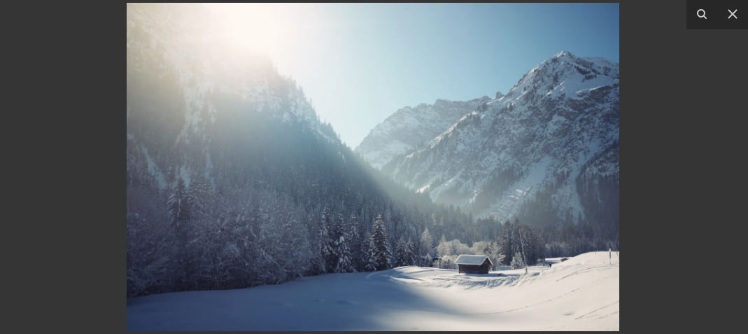
Image with Caption
You can add a caption below the image appearing in the lightbox by using the data-caption attribute.
<a href="https://source.unsplash.com/0JYgd2QuMfw/1500x1000" data-fancybox data-caption="This image has a caption">
  <img src="https://source.unsplash.com/0JYgd2QuMfw/240x160" />
</a>
Images Using “srcset”
You can use the srcset attribute to specify different size images to be used on different size displays. This will improve load times on mobile and save your users some bandwidth.
<a href="medium.jpg" data-fancybox data-srcset="large.jpg 1600w, medium.jpg 1200w, small.jpg 640w">
  <img src="thumbnail.jpg" />
</a>
Image Gallery
You can group several images together to create a gallery. With this, when you open one image in the lightbox, you will be able to scroll through the other images by using the left and right controls that will appear on the lightbox.
To group images in a gallery, use the same data-fancybox value on them.
<a href="https://source.unsplash.com/juHayWuaaoQ/1500x1000" data-fancybox="gallery-images">
  <img src="https://source.unsplash.com/juHayWuaaoQ/240x160" />
</a>

<a href="https://source.unsplash.com/eWFdaPRFjwE/1500x1000" data-fancybox="gallery-images">
  <img src="https://source.unsplash.com/eWFdaPRFjwE/240x160" />
</a>

<a href="https://source.unsplash.com/c1JxO-uAZd0/1500x1000" data-fancybox="gallery-images">
  <img src="https://source.unsplash.com/c1JxO-uAZd0/240x160" />
</a>

<a href="https://source.unsplash.com/i2KibvLYjqk/1500x1000" data-fancybox="gallery-images">
  <img src="https://source.unsplash.com/i2KibvLYjqk/240x160" />
</a>
Below you can see the gallery lightbox. You can move through the images using the controls on the left and right sides of the image. On the top-left corner, is a number showing you the position of the current image in the gallery. On the top-right corner, you’ll find the Zoom, Start slideshow, Thumbnails and Close buttons, respectively.
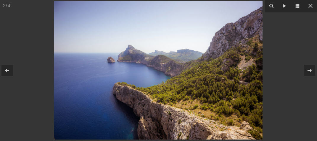
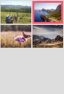
Start slideshow will automatically scroll through the images, while Thumbnails will open a view on the right side of the modal displaying the thumbnails in the gallery, with the active image highlighted.
Displaying Videos
To display and play YouTube and Vimeo videos in the fancybox lightbox, you only need to provide the video’s page URL. The videos will be responsive and will always fit within the window while maintaining the correct aspect ratio.
The following adds a link to the page with the text YouTube Video that opens up a lightbox containing a YouTube video when clicked.
<a data-fancybox href="https://www.youtube.com/watch?v=Guksa1kxMDI">
  YouTube Video
</a>
The following adds a link to the page with the text Vimeo Video that opens up a lightbox containing a Vimeo video when clicked.
<a data-fancybox href="https://vimeo.com/81676731">
  Vimeo Video
</a>
Note:
If you use fancybox with a Vimeo video and test the code on your computer, the lightbox will appear but the video won’t load. You’ll get an error message:
Firefox:
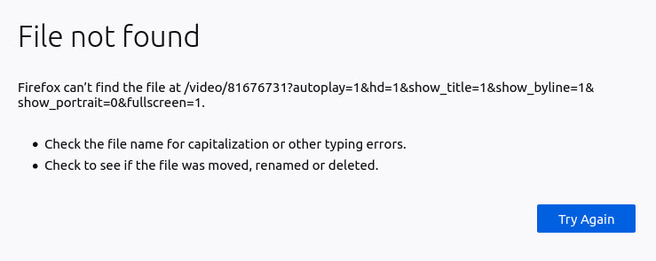
Chrome:

For it to work, the webpage needs to be running on a publicly accessible server. If you upload your website to your hosting platform and try out the lightbox with the Vimeo video, it will work.
If you want to test the code on your computer, you’ll have to make your local server accessible online. You can do this by opening the code in Visual Studio Code and using the Live Server extension to launch a local live server. Check the extension’s page for instructions on how to launch a local development server.
You can also provide a direct link to an MP4 video.
<!-- MP4 Video stored on your server -->
<a data-fancybox href="videos/video.mp4" class="btn lg action-1">
  Play Video
</a>

<!-- MP4 Video stored on an external server -->
<a data-fancybox href="https://example.com/videos/video.mp4" class="btn lg action-2">
  Play Video
</a>
You can use data-width and data-height attributes to customize the video’s dimensions and data-ratio to set its aspect ratio.
<a data-fancybox data-width="640" data-height="360" href="video.mp4">
  Direct link to MP4 video
</a>
Displaying Embedded Content
You can use fancybox to load content in an iframe.
The following will display a Google map in the lightbox:
<a data-fancybox data-type="iframe" data-src="https://www.google.com/maps/embed?pb=!1m18!1m12!1m3!1d3168.6395364528967!2d-122.08626633780452!3d37.421994070413874!2m3!1f0!2f0!3f0!3m2!1i1024!2i768!4f13.1!3m3!1m2!1s0x808fba02425dad8f%3A0x6c296c66619367e0!2sGoogleplex!5e0!3m2!1sen!2ske!4v1585314748051!5m2!1sen!2ske" href="javascript:;">
    Google Map
</a>
And the following will display a PDF document in the lightbox:
<a data-fancybox data-type="iframe" data-src="https://eloquentjavascript.net/Eloquent_JavaScript.pdf" href="javascript:;">
    PDF file
</a>
Displaying HTML Content
You can use fancybox to load any HTML content. This means that you are free to create and style your own custom modals.
You can have the lightbox display some HTML content that is on the page, or you can have it load the HTML content from another page via AJAX.
To display HTML that is on the page, create the HTML element and style it as necessary. Add display: none style to the element so that it doesn’t show up on the page. We only want it to show up in the lightbox when it’s activated. Add a unique id to the element so that fancybox knows which element to display. Then, when adding fancybox to an element, point it to this id with the data-src attribute.
<!-- HTML content to be displayed in lightbox -->
<div style="display: none;" id="hidden">
    <h2>Modal Title</h2>
    <p>Here is some content for the modal</p>
</div>

<!-- Link that will display lightbox when clicked -->
<a data-fancybox data-src="#hidden" href="javascript:;">
    Trigger
</a>
Below, you can see how the simple modal looks. It comes with a close button on its upper-right corner.
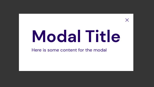
You can also have the HTML content in a different file and load it via AJAX. To load content via AJAX, you need to add a data-type="ajax" attribute to your link:
<a data-fancybox data-type="ajax" data-src="https://example.com/path/to/file.html" href="javascript:;">
    Load modal content with AJAX
</a>
We’ve looked at different ways that you can use the fancybox lightbox to display different content. The default lightbox is sufficient for different use cases, but if you prefer to customize it, there are some options you can change. Check the documentation for a list of options that you can modify.
Bootstrap Modal
The other modal we will look at is the Bootstrap Modal.
Creating a Modal
The following code creates a modal.
<!-- Button trigger modal -->
<button type="button" class="btn lg action-1" data-toggle="modal" data-target="#exampleModal">
Launch demo modal
</button>
<!-- Modal -->
<div class="modal fade" id="exampleModal" tabindex="-1" role="dialog" aria-labelledby="exampleModalLabel" aria-hidden="true">
<div class="modal-dialog" role="document">
<div class="modal-content">
<div class="modal-header">
<h5 class="modal-title" id="exampleModalLabel">Modal Title</h5>
<button type="button" class="close" data-dismiss="modal" aria-label="Close">
<span aria-hidden="true">×</span>
</button>
</div>
<div class="modal-body">
Some text content for the modal
</div>
<div class="modal-footer">
<button type="button" class="btn modal-dismiss" data-dismiss="modal">Cancel</button>
<button type="button" class="btn action-2">Save</button>
</div>
</div>
</div>
</div>
We first include a button that will activate the modal when clicked. We add a data-target to the button with a value of the id of the modal element we want to be triggered by the button.
We then add the modal class to the element that will be the modal. The modal has a header, body, and footer (optional). We add a button with the text x to the modal’s header. This will be the modal’s Close button. We add the data-dismiss="modal" attribute to the button to let bootstrap know that it should close the modal when the button is clicked. We also add this attribute to the Cancel button in the modal’s footer, allowing us to close the modal with that button as well. By default, the modal also closes when you click on the modal’s backdrop (anywhere outside the modal).
The Save button does nothing in our example, but in a real app, you would probably send data over to be saved in the backend and then dismiss the modal. You can dismiss the modal programmatically with the following code:
$('#exampleModal').modal('hide')
Below, you can see the resulting modal. When it is triggered, it slides down and fades in from the top of the page.
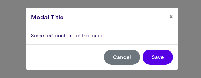
Note: You might notice the modal-dismiss class that is on the modal Close button. This isn’t one of our predefined classes or a Bootstrap class, it is a custom CSS class added to give the button its text color and background color. Below is the CSS added to the css/style.css file:
.modal-dismiss {
  color: #fff;
  background-color: #6c757d;
  border-color: #6c757d;
}

.modal-dismiss:hover {
  color: #fff;
  background-color: #5a6268;
  border-color: #545b62;
}
Modal with a Static Backdrop
Sometimes, you might not want the modal to close when the user clicks on its backdrop (anywhere outside the modal). The user might click the backdrop by mistake and it will be annoying for it to close when they weren’t finished with it, especially if they were in the middle of doing a task, like filling out a form on the modal.
You can prevent the modal from closing when clicking outside it by setting the backdrop to static with data-backdrop="static".
<!-- Button trigger modal -->
<button type="button" class="btn lg action-1" data-toggle="modal" data-target="#staticBackdrop">
Launch static backdrop modal
</button>
<!-- Modal -->
<div class="modal fade" id="staticBackdrop" data-backdrop="static" tabindex="-1" role="dialog" aria-labelledby="staticBackdropLabel" aria-hidden="true">
<div class="modal-dialog" role="document">
<div class="modal-content">
<div class="modal-header">
<h5 class="modal-title" id="staticBackdropLabel">Modal Title</h5>
<button type="button" class="close" data-dismiss="modal" aria-label="Close">
<span aria-hidden="true">×</span>
</button>
</div>
<div class="modal-body">
Some text content for the modal
</div>
<div class="modal-footer">
<button type="button" class="btn modal-dismiss" data-dismiss="modal">Cancel</button>
<button type="button" class="btn action-2">Save</button>
</div>
</div>
</div>
</div>
Now the modal will only close when elements with the data-dismiss attribute are clicked.
Vertically Center the Modal
By default, the modal is horizontally centered, but not vertically centered. It appears at the top of the window. To vertically center the modal, add the modal-dialog-centered class to .modal-dialog.
<!-- Button trigger modal -->
<button type="button" class="btn lg action-1" data-toggle="modal" data-target="#exampleModalCenter">
Launch vertically centered modal
</button>
<!-- Modal -->
<div class="modal fade" id="exampleModalCenter" tabindex="-1" role="dialog" aria-labelledby="exampleModalCenterTitle" aria-hidden="true">
<div class="modal-dialog modal-dialog-centered" role="document">
<div class="modal-content">
<div class="modal-header">
<h5 class="modal-title" id="exampleModalCenterTitle">Modal Title</h5>
<button type="button" class="close" data-dismiss="modal" aria-label="Close">
<span aria-hidden="true">×</span>
</button>
</div>
<div class="modal-body">
Some text content for the modal
</div>
<div class="modal-footer">
<button type="button" class="btn modal-dismiss" data-dismiss="modal">Cancel</button>
<button type="button" class="btn action-2">Save</button>
</div>
</div>
</div>
</div>
Change the Modal Size
You can change the size of the modal by placing a modifier class on .modal-dialog. There are 3 available classes: modal-sm (max width 300px), modal-lg (max width 800px) and modal-xl (max width 1140px). If you don’t include a modifier class, you will get the default “medium” sized modal (max width 500px).
The following creates a large modal:
<!-- Button trigger modal -->
<button type="button" class="btn lg action-1" data-toggle="modal" data-target="#exampleLargeModal">
Launch large modal
</button>
<!-- Modal -->
<div class="modal fade" id="exampleLargeModal" tabindex="-1" role="dialog" aria-labelledby="exampleLargeModalLabel" aria-hidden="true">
<div class="modal-dialog modal-lg" role="document">
<div class="modal-content">
<div class="modal-header">
<h5 class="modal-title" id="exampleLargeModalLabel">Modal Title</h5>
<button type="button" class="close" data-dismiss="modal" aria-label="Close">
<span aria-hidden="true">×</span>
</button>
</div>
<div class="modal-body">
Some text content for the modal
</div>
<div class="modal-footer">
<button type="button" class="btn modal-dismiss" data-dismiss="modal">Cancel</button>
<button type="button" class="btn action-2">Save</button>
</div>
</div>
</div>
</div>
You can see how it looks below:

