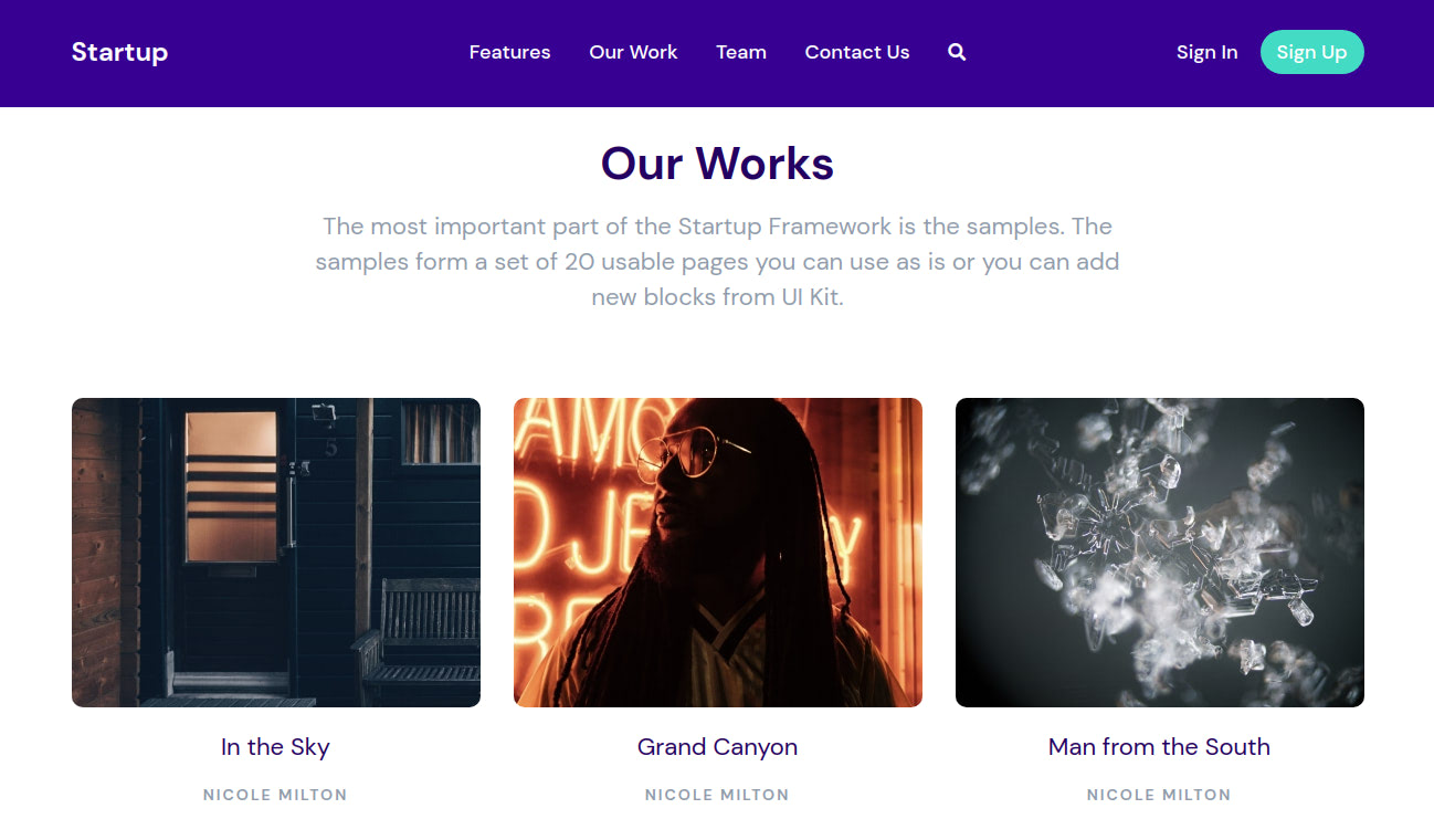
You might want to add a Sticky Navbar (a navigation bar that stays fixed at the top of the page even as the user scrolls) to your Startup website. This guide will show you how to achieve this and we’ll also take you through how to solve some issues that you might face.
Make the Navbar Sticky
To make the Navbar sticky, simply add the fixed-top Bootstrap class to your <nav> tag.
<nav class="header_menu_1 pt-30 pb-30 mt-30 fixed-top">
  ...
</nav>
With that, your Navbar will now stay fixed at the top of the page, even if you scroll through the page. Note that this will only be on large screens, like desktops. On a smaller screen (on mobile devices), the main Navbar is hidden, and instead, a different navigation menu is shown. Its markup is marked with the <!-- Navigation Mobile type X --> comment.
The fixed-top class we used on the Navbar adds the following styles to the element:
.fixed-top {
  position: fixed;
  top: 0;
  right: 0;
  left: 0;
  z-index: 1030;
}
Add Anchors to the Page Sections for Easy Navigation
Now that you’ve made the Navbar to always be visible, you might want to add some anchor links to it that makes it easier to navigate to different sections of the page.
To do this, first, add fragment identifiers (also called anchor identifiers) to the different sections of the page that you want to navigate to. A fragment identifier is an element with a unique identifying name assigned to an id attribute.
<section id="features" class="pt-105 pb-45 bg-light text-center feature_2">
  ...
</section>

<section id="our-work" class="pt-105 pb-90 bg-light text-center showcase_2">
  ...
</section>

<section id="team" class="pt-100 pb-100 bg-light text-center team_1">
  ...
</section>

<section id="contact-us" class="pt-80 pb-100 bg-light text-center contact_2">
  ...
</section>
After marking a section with a fragment identifier, you can navigate to it with a URL that ends with #, followed by the fragment identifier, e.g. http://example.com#section_1. Edit your Navbar links to point to the fragment identifiers you just added:
<div class="col-lg-6 text-center">
  <a href="#features" class="link color-heading mx-15">Features</a>
  <a href="#our-work" class="link color-heading mx-15">Our Work</a>
  <a href="#team" class="link color-heading mx-15">Team</a>
  <a href="#contact-us" class="link color-heading mx-15">Contact Us</a>
  <a href="#" class="link color-heading f-16 mx-15">
    <i class="fas fa-search"></i>
  </a>
</div>
Now, you can easily jump to any section of the page using the Navbar links.
Troubleshooting
When you make your Navbar sticky using the above instructions, you might find that there is still some work that needs to be done to make the Navbar fit/look better with the rest of the page. We won’t cover every scenario you might face, and you are free to style your Navbar as you wish, we just wanted to provide this guide to whoever might need it. Even if your default Navbar and page look different from the example we’ll give, you might find some pointers that will be useful.
Below, is our example webpage which we’ll be adding a sticky Navbar to.
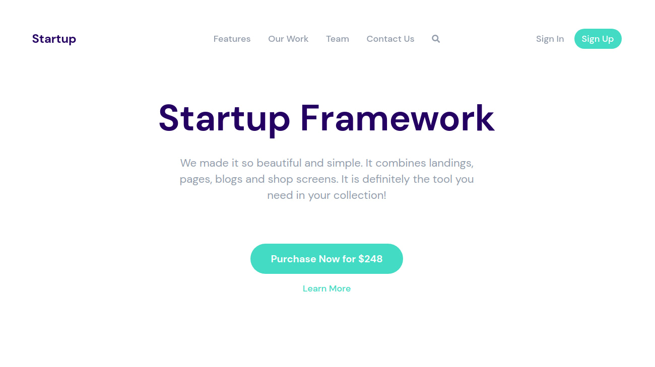
After making the Navbar sticky, you can see it doesn’t look so great once you start scrolling down the page:

Let’s try adding a different background color to the Navbar to make it more distinguishable from the rest of the page. We do this by adding the bg-dark class to it.
<nav class="header_menu_1 pt-30 pb-30 mt-30 fixed-top bg-dark">
  ...
</nav>
This adds a dark background to the element. The color it uses was set by the Startup generator. The Startup generator has a color control that allows you to set dark and light colors for your template. To find out more about this, refer to this guide.

Now the Navbar is more distinguishable from the rest of the page, but there is that blank whitespace above it that we should remove. The blank space is due to the margin added to the <nav> element by the mt-30 class (adds margin-top: 30px; to the element). After removing this class from <nav>, our Navbar now looks better.

With a dark background color for the Navbar, there isn’t that much contrast between the background and the color of the links on the Navbar. Let’s give them a lighter color to increase the contrast and make them more distinguishable. We remove the color-heading class from the Navbar and Sign In links and instead use color-white on them. We also add the color-white class to the Startup text in the brand logo area of the Navbar.
<nav class="header_menu_1 pt-30 pb-30 fixed-top bg-dark">
  <div class="container px-xl-0">
    <div class="row justify-content-center align-items-center f-18 medium">
      <div class="col-lg-3 logo">
        <span class="color-white">Startup</span>
      </div>
      <div class="col-lg-6 text-center">
        <a href="#features" class="link color-white mx-15">Features</a>
        <a href="#our-work" class="link color-white mx-15">Our Work</a>
        <a href="#team" class="link color-white mx-15">Team</a>
        <a href="#contact-us" class="link color-white mx-15">Contact Us</a>
        <a href="#" class="link color-white f-16 mx-15">
          <i class="fas fa-search"></i>
        </a>
      </div>
      <div class="col-lg-3 col-md-4 col-sm-6 d-flex justify-content-end align-items-center">
        <a href="#" class="link mr-20 color-white">Sign In</a>
        <a href="#" class="btn sm action-1">Sign Up</a>
      </div>
    </div>
  </div>
</nav>
Now the Navbar looks much better at the top of the page and when we scroll through the page.
