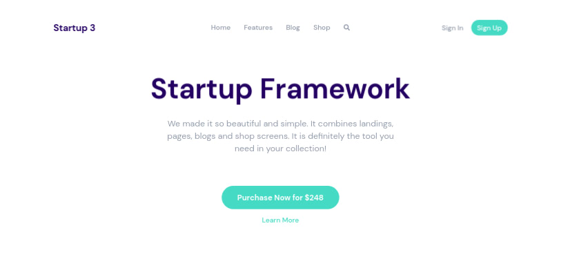
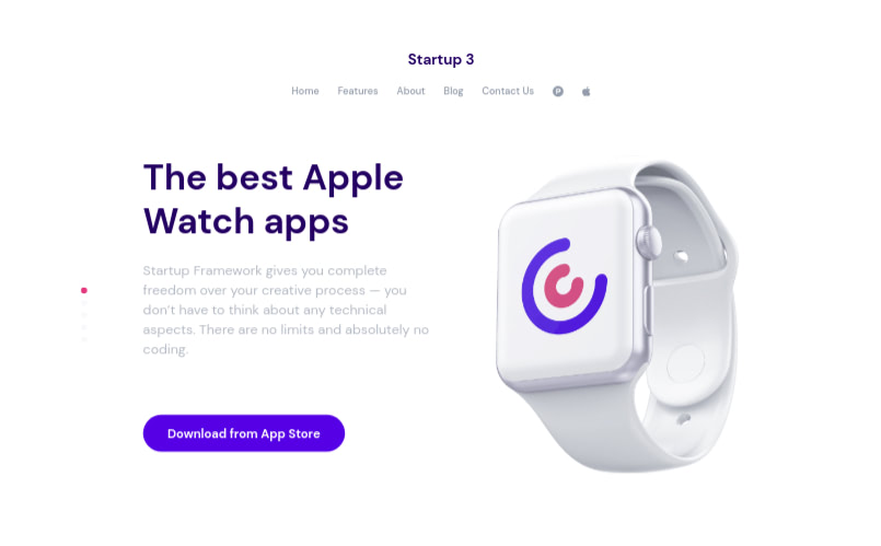
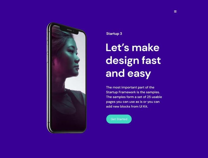
On the Headers and Navigations of a Startup template, you’ll see a logo with the placeholder text Startup X.
This might be commonly situated at the top-left of the Headers or Navigations section:
Or in the middle:
Or within the header’s content:
You’ll also find the logo on some of the available Footers:

We’ll show you how to change the logo so that you can customize it according to your brand.
Using a Text Logo
The logo that comes with the Startup template is just text that has been styled.
If you prefer to also use text for your logo, then change the text in the index.html file.
<div class="col-lg-3 logo" data-aos-duration="600" data-aos="fade-down" data-aos-delay="1200">designmodo</div>
The font used for the logo was set by the Startup App according to what was selected on the Fonts control.
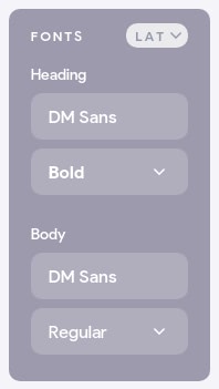
The Fonts control lets you select a font for your Headings (this will also be used for the logos) and for the Body (the rest of the content).
If you take a look at the css/framework.css (or scss/framework.scss) file, you will see style rules for the logo class.
css/framework.css
.logo {
  font-family: DM Sans;
  font-size: 24px;
  color: #1E0E62;
  font-weight: 700;
}
.logo.color-white {
  color: #ffffff;
}
scss/framework.scss
.logo {
  font-family: $font_heading;
  font-size: 24px;
  color: $color_main;
  font-weight: $bold;
  &.color-white {
    color: $color_white;
  }
}
The color is also set by the Startup app according to what is selected on the Colors control
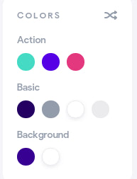
Our logo uses the #1E0E62 color, which is the Main Color selected by the first circle in the Basic row of the Color control. Logos appearing on a dark background will use the #ffffff color (White). This is set by the third circle in the Basic row of the Color control (for more on customizing colors, check out this document.
You can change the font and color of your logo if you prefer. Check out the Fonts help document for a guide on how to import and use various fonts in your template.
css/framework.css
.logo {
  font-family: Berkshire Swash;
  font-size: 24px;
  color: #1E0E62;
  font-weight: 400;
}
scss/framework.scss
.logo {
  font-family: $font_logo;
  font-size: 24px;
  color: $color_main;
  font-weight: $normal;
  &.color-white {
    color: $color_white;
  }
}
If you are using SCSS, you might want to add another variable for the new font, especially if you are using different fonts for headings and the logo. The default style used $font_heading for the font-family. If you take a look at the scss/variables.scss file you will see the value for this variable:
$font_heading: DM Sans;
If you want to use the same font for your heading and logo, then go ahead and change its value, otherwise, create a new variable, which you’ll then use as the font-family:
$font_logo: Berkshire Swash;
Now your page should have the new font.

Using an Image Logo
If you’d rather use an image for the logo, then replace the default logo text with the image:
<div class="col-lg-3 logo" data-aos-duration="600" data-aos="fade-down" data-aos-delay="1200">
  <img src="i/logo.png" class="w-50 img-fluid" alt="">
</div>
We add a size class to the image to size it. For your logo, try different widths to find a size that looks good on your template. You can set a specific value for the height as well, but we use auto to ensure that the image maintains its aspect ratio. If, for instance, an image was 720px x 360px and you set the width and height to 50px, the image will end up looking squished. But if you only set one dimension for it (width or height) and set the other dimension to auto, then the size of the auto dimension will be calculated in proportion to the set one, with respect to the aspect ratio.
You could use an icon for the logo:
![]()
Or custom-styled text:

As mentioned previously, some Footers also have the logo, so be sure to change that as well if your footer has one.
Customizing the Logo Displayed on Mobile Devices
After changing the logo found on the navigation bar at the top of the page, you aren’t done yet. When viewed on a computer screen, the page will display your new logo, but when viewed on a smaller screen (phone or tablet), it will still have the old logo. You have to change this as well.
You can see how your webpage will look on a mobile device by using your browser’s Developer Tools. You can open the developer tools with Ctrl+Shift+I (Ctrl+Option+I on macOS) on both Firefox and Chrome.
Then, if you are using Chrome, click on the Toggle device toolbar icon shown below (in blue). It’s found on top of the Developer Tools drawer on the left corner. You can also use the keyboard shortcut Ctrl+Shift+M (Ctrl+Option+M on macOS) to toggle the control.
![]()
On Firefox, click the Responsive Design Mode icon shown below (in blue). It’s found on top of the Developer Tools drawer on the right corner. You can also use the keyboard shortcut Ctrl+Shift+M (Ctrl+Option+M on macOS) to toggle the design mode.
![]()
You will then be able to see the page as it will look on a mobile device.
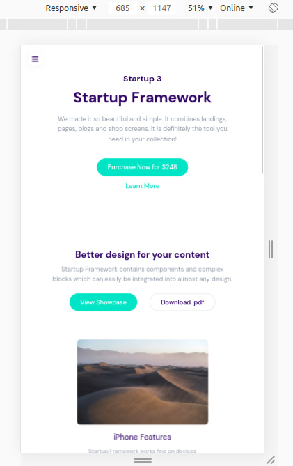
Chrome:
Firefox:
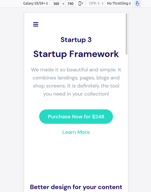
At the top of the Device Toolbar, there are controls that you can use to select the size of the screen, zoom level, simulated network type and portrait/landscape mode.
You can select the dimensions of a specific device by selecting it from the first dropdown menu. If you select Responsive, you will be able to change the size of the device by dragging its edges inwards or outwards.
As you can see, on mobile, the navigation bar that we changed the logo on is not visible, instead, we see a header with a logo (the old logo).
The page also has a side menu that you can open. The menu itself has a logo displayed:
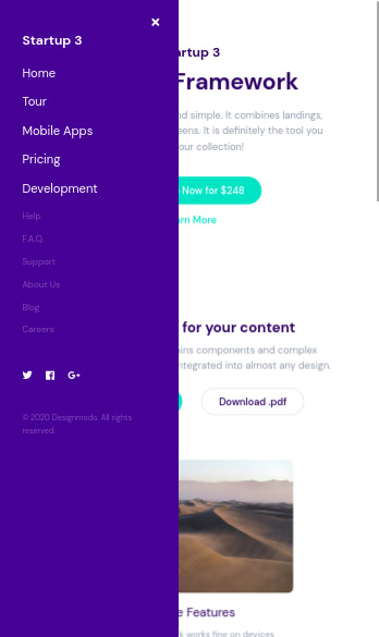
To change these logos, change the following two lines in the index.html file:
<!-- Navigation Mobile type X -->
<div class="logo color-white mb-30">Startup 3</div>

<!-- Header Menu X -->
<div class="mb-3 logo d-block d-xl-none text-center logo_mobile">Startup 3</div>
Now your new logo will also be displayed on mobile devices.
