
How to Build a Collage Layout in Postcards
In this guide, I’ll walk you through how to create an image collage in Postcards using the Grid element and regular Image elements. You’ll be able to build the layout yourself, arrange the images the way you want, and fine-tune the spacing and sizing until everything lines up properly.
A collage is a simple way to make an email section feel more polished, visual, and engaging. With a simple structure and a few manual adjustments, you can create this kind of design directly in the editor and give your layout a more dynamic, eye-catching look.
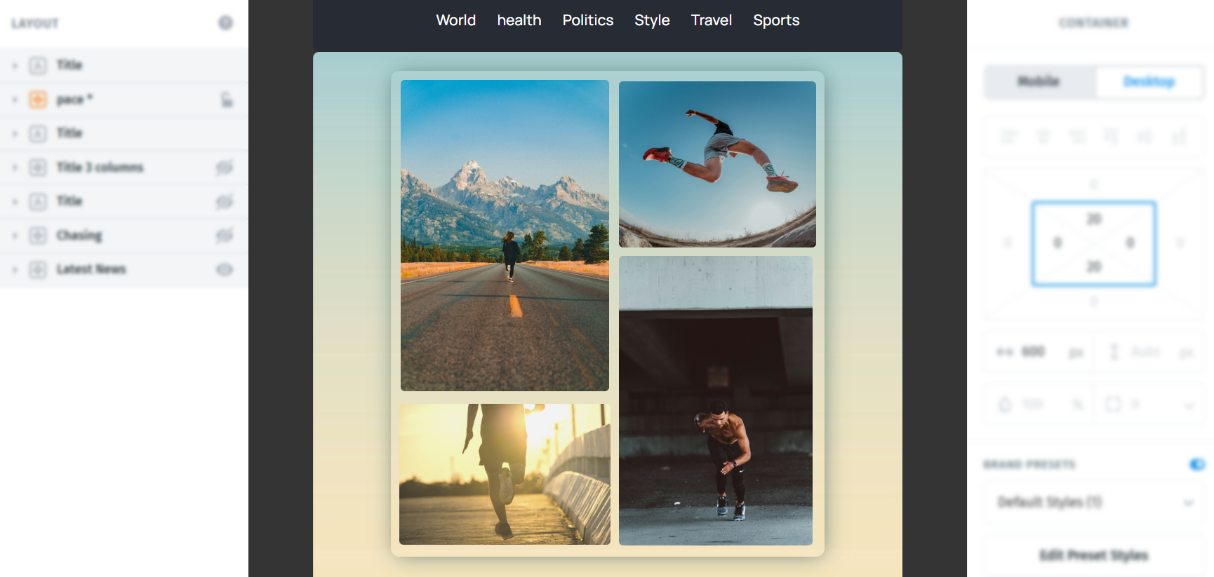
Before you start
A Grid is a layout container that helps you organize content into rows and columns. By default, it starts with two items, and you can drag your own elements into each one. You can find more information on Grids Here.
Keep in mind that collage-style layouts like this can be more difficult to maintain on mobile, since the structure may shift or stack differently on smaller screens. Because of that, make sure to review and adjust the layout in mobile view for better compatibility. If needed, you can turn off Collapse on mobile on the collage Grid to help preserve the collage layout, and then fine-tune the spacing and sizing for smaller screens in mobile view.
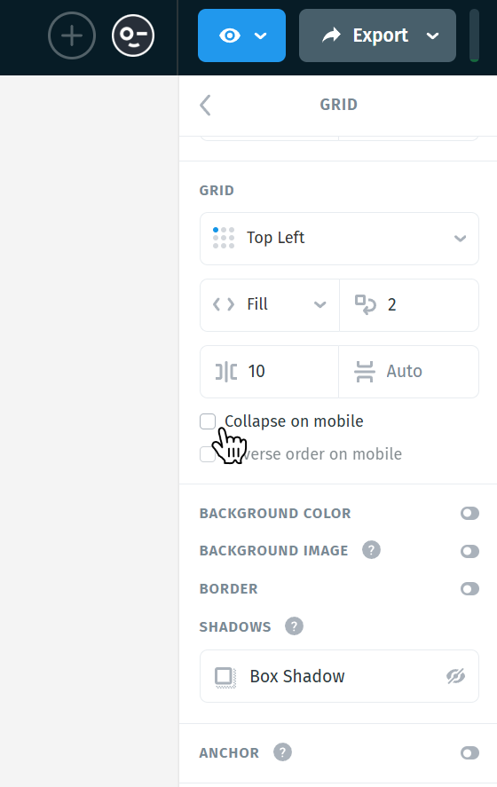
Another option is to hide the collage module or Grid on mobile entirely if you prefer a cleaner and more reliable mobile experience. You can also create two separate modules, one hidden on desktop and one hidden on mobile, and customize each one as needed.
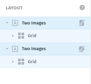
To do this, simply select each module, go to the settings panel on the right, and enable the option to hide on mobile or hide on desktop depending on how you want that version to appear.

Before you start, it’s a good idea to have all your images ready and uploaded to your Image Library, so you can quickly place them into your layout. You can also upload images directly from your computer as you go, but having them prepared ahead of time makes the process much smoother.
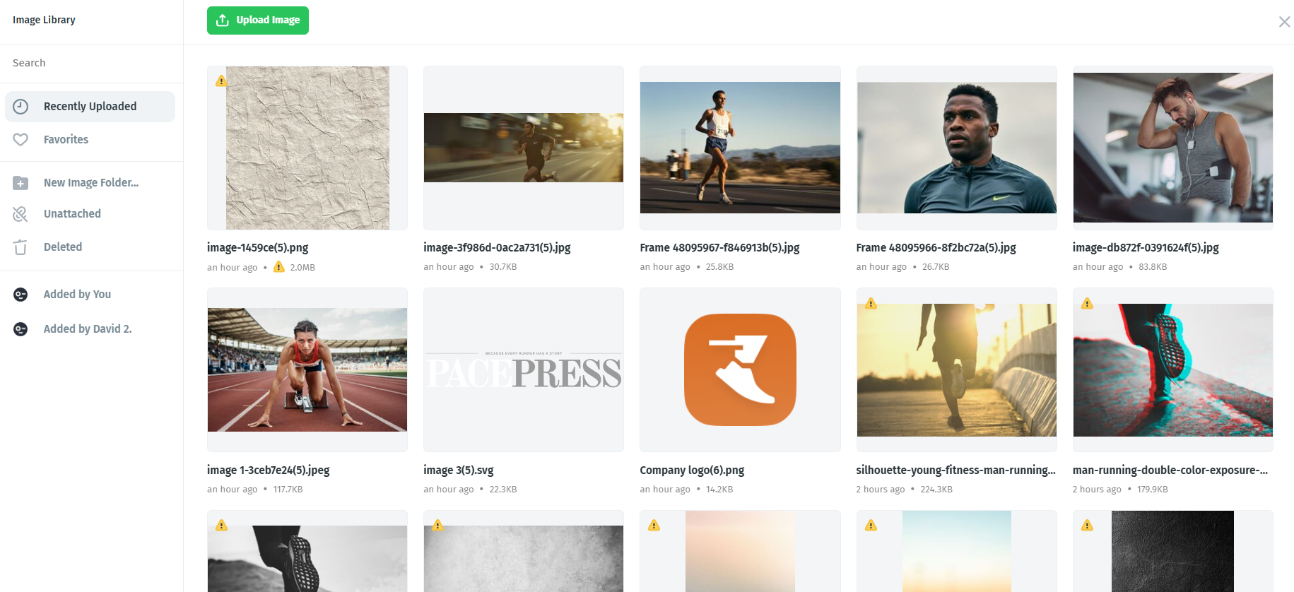
When choosing your images, keep proportions in mind. Try to mix more vertical images with more proportional or horizontal ones, and adjust their sizes as needed. This helps the collage feel more balanced and visually intentional.
A simple collage like the one shown above can be created using a Grid with two Items, placing two Image elements inside each Item. Each Item acts as a column, allowing you to stack images vertically within it.
For more complex layouts (for example, three columns), you can use a Grid with three Items inside and distribute your images accordingly, adding one, two, or more images inside each Item depending on the layout you want to achieve. Here is an example:
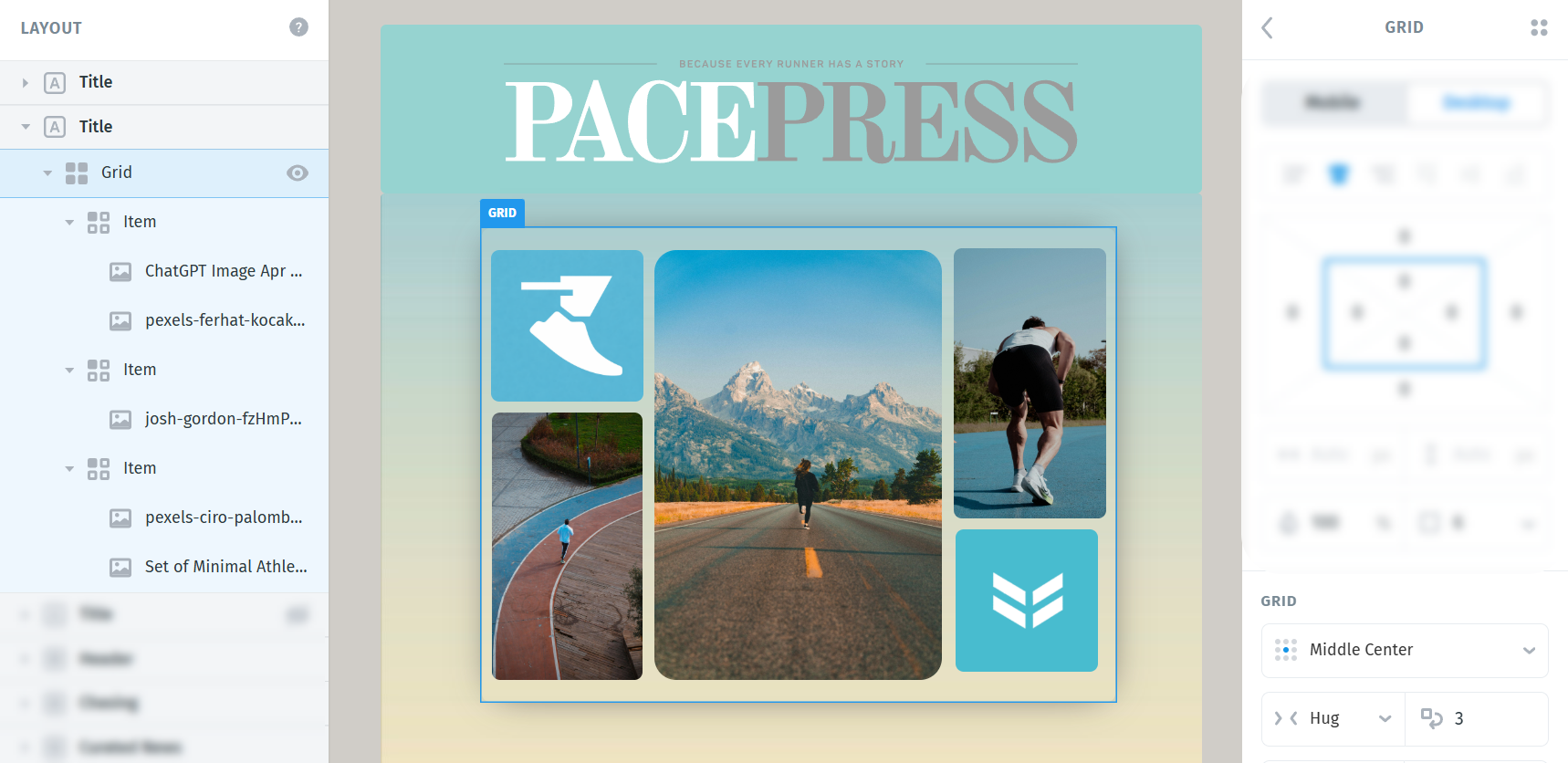
Step 1: Add a Grid to your layout
For this tutorial, we’ll focus on building a simple two-column collage with four images.
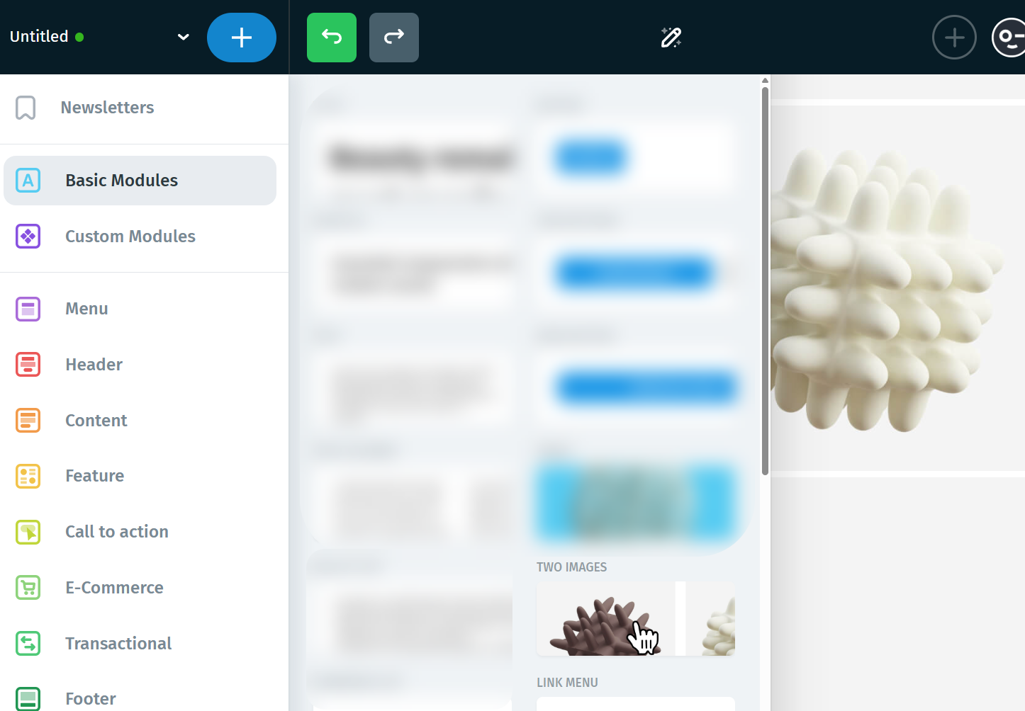
Start by adding a Grid to your template. There are two easy ways to do this in Postcards. The first option is to click the large blue plus (+) button in the top-left corner of the editor, open Basic Modules, and drag the Two Images item onto your canvas.
The second option is to use the Layout panel. Hover your mouse above or below any existing element, click the small plus (+) button that appears, and then choose Grid.
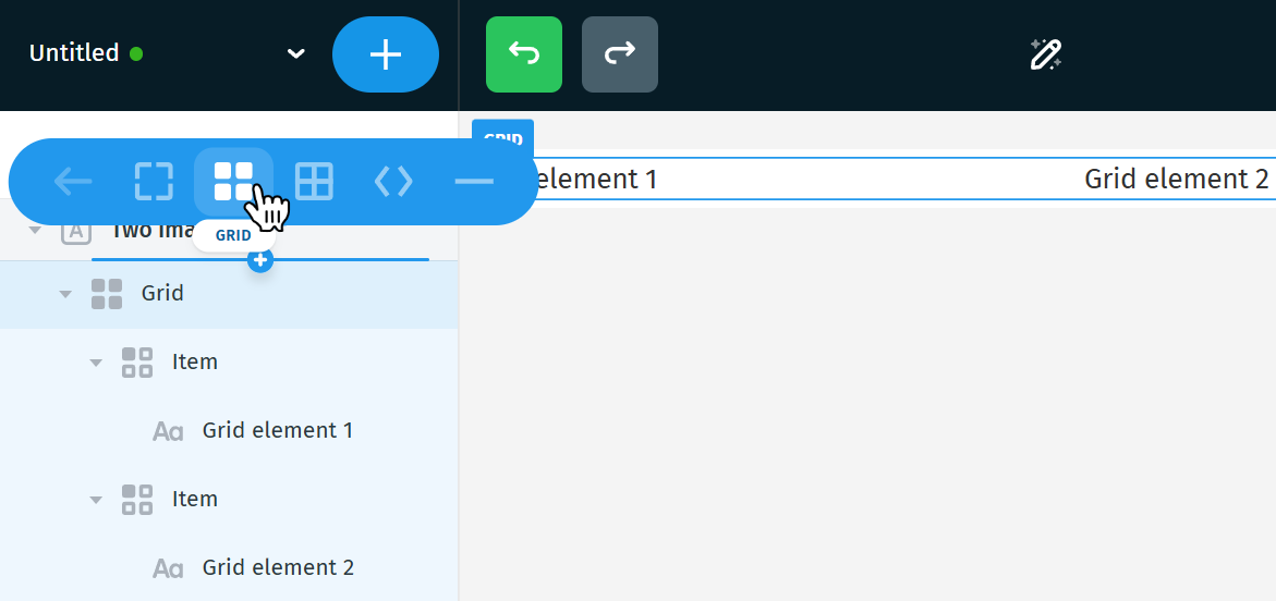
Either method will give you the basic structure you need to begin building the collage. Each pre-made Grid comes with default placeholders inside the Items.
Step 2: Replace the placeholders with images
Once your Grid is in place, the next step is to replace the default placeholders with your own images.
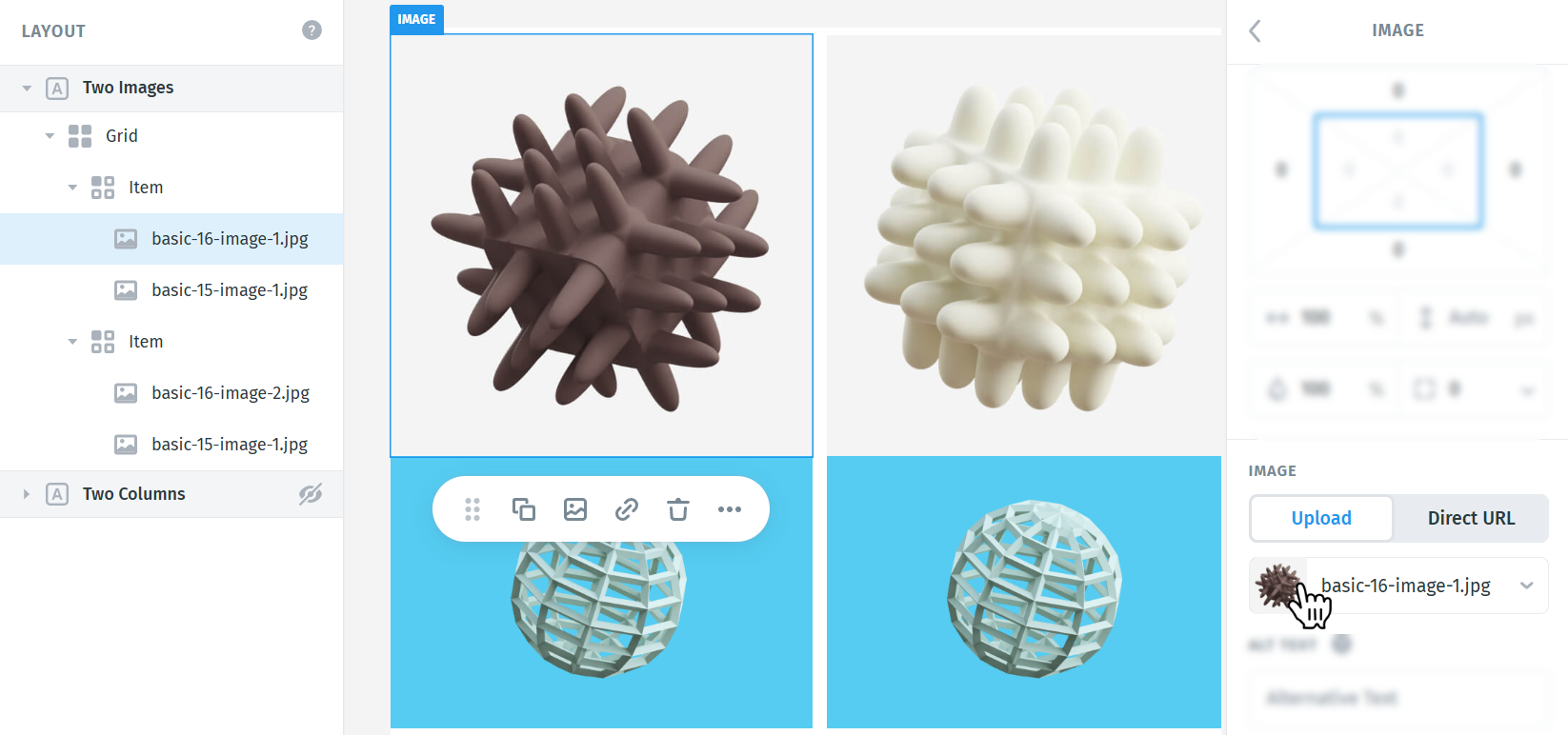
Inside each Item, remove the placeholder content if you do not need it. Then drag Image elements into the Grid Items, or insert them directly from the Layout panel using the small plus (+) button. Make sure to insert the image elements inside each item.
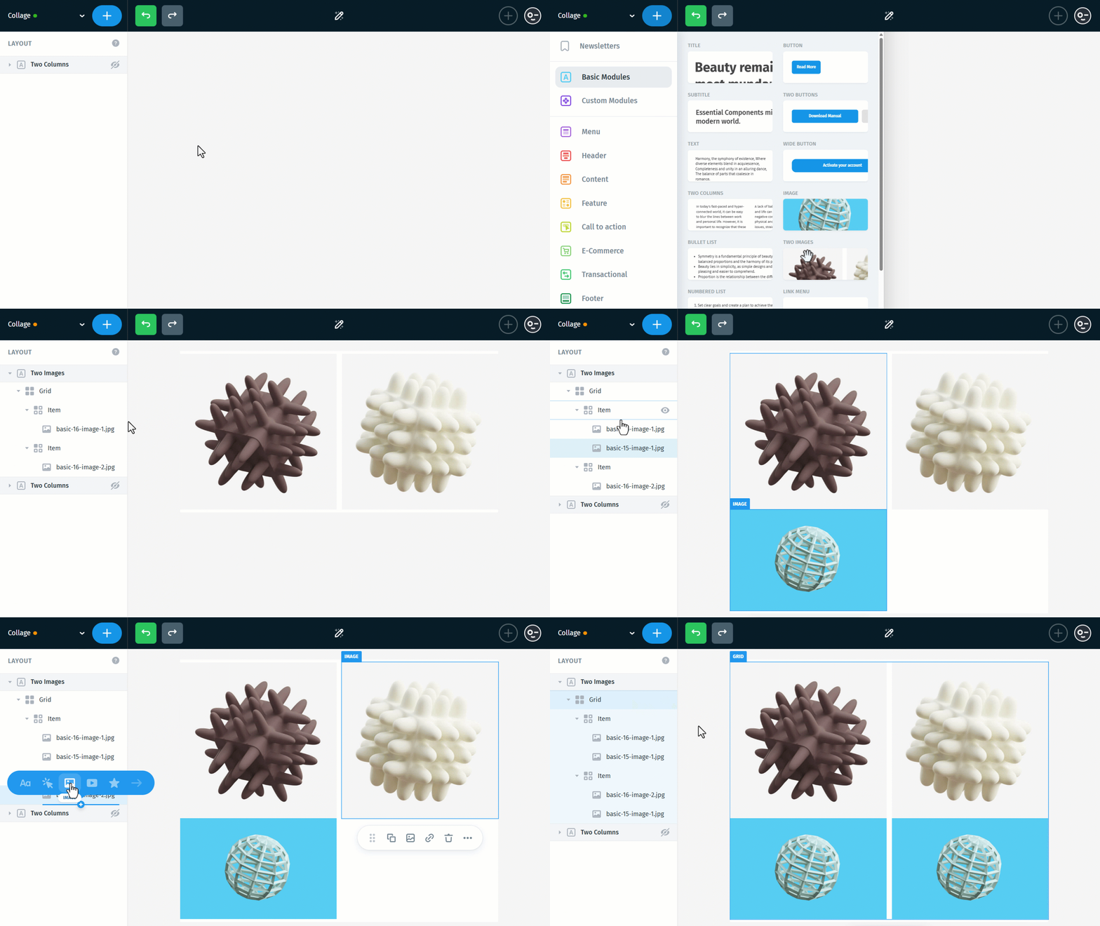
For this example, add two Image elements inside the first Item and two Image elements inside the second Item.
This will give you the basic four-image structure needed for a simple two-column collage.
Step 3: Upload your own images
Now it’s time to replace the placeholder images with your own. You can upload images from your computer, choose them from your Image Library, or paste the URL of an image if needed.
Start by replacing all four placeholder images with the ones you want to use in your collage. Click each Image element, then go to the settings panel on the right to upload or select your image.
At this stage, the goal is not to make everything perfect yet. Just focus on placing all four images into the Grid so the collage structure is ready for the next adjustments. This is how my collage looks after simply inserting the images:
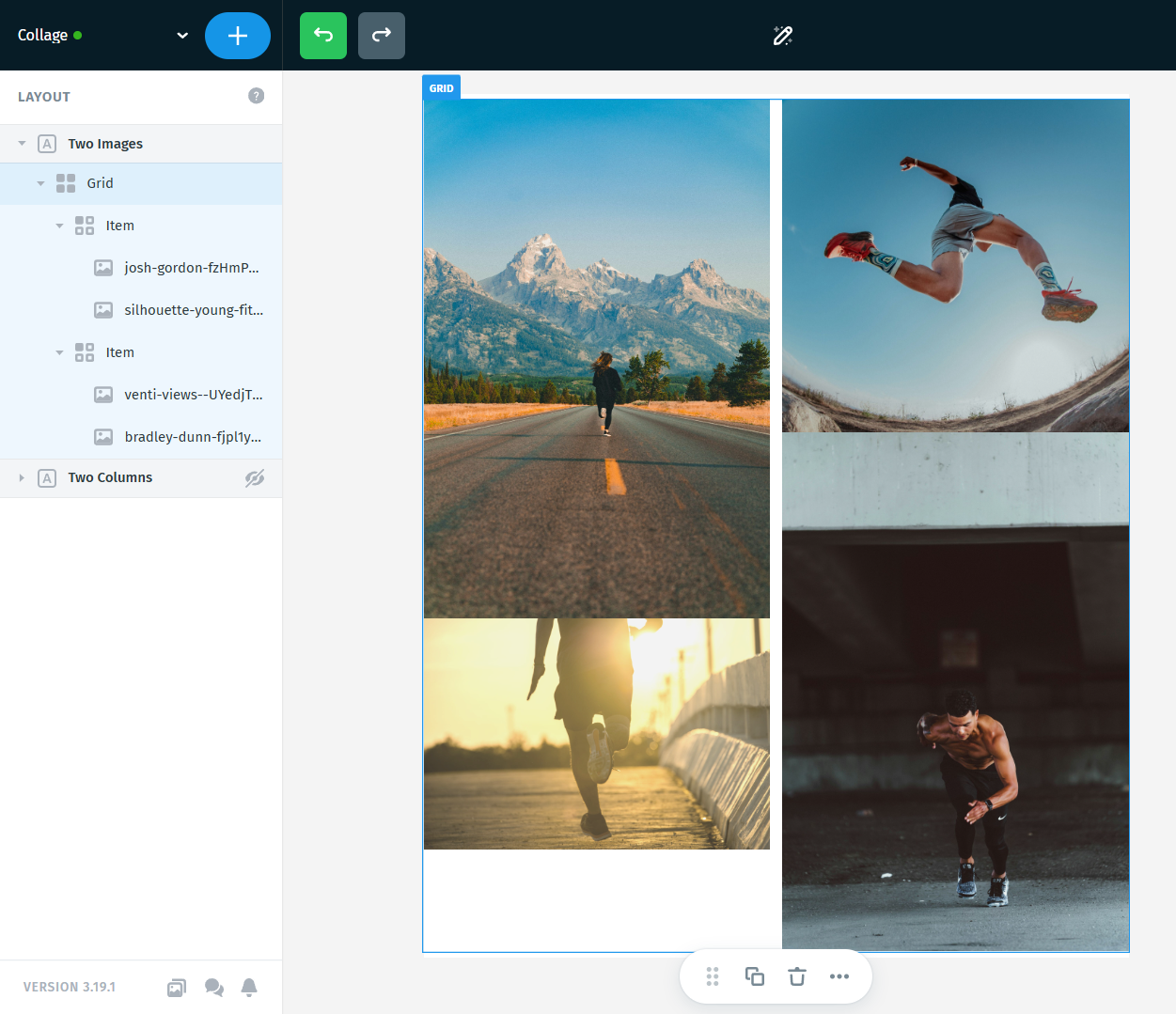
Step 4: Adjust the image sizes and spacing
Once all four images are in place, you can start shaping the collage by adjusting the size and spacing of each one.
Try to think about how the images will work together visually. A collage usually looks better when you mix image proportions a little, for example pairing a taller image with another one that is shorter or more proportional. This helps the layout feel more balanced and gives you more flexibility when adjusting the final composition.
Let’s start by adjusting each image’s size and proportions so the collage begins to take shape. Select each Image element, then use the settings panel on the right to resize it until it roughly matches the look you want. You can decrease the width using the horizontal arrow icon on the left, or increase the height using the vertical arrow icon on the right.
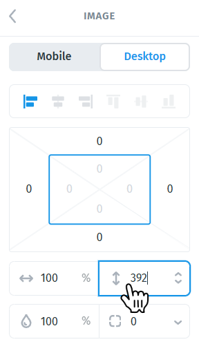
Using px instead of percentages can be more helpful when you want more precise, pixel-perfect control over the collage layout. You can switch from percentages to px by clicking the percentage value in the sizing control.
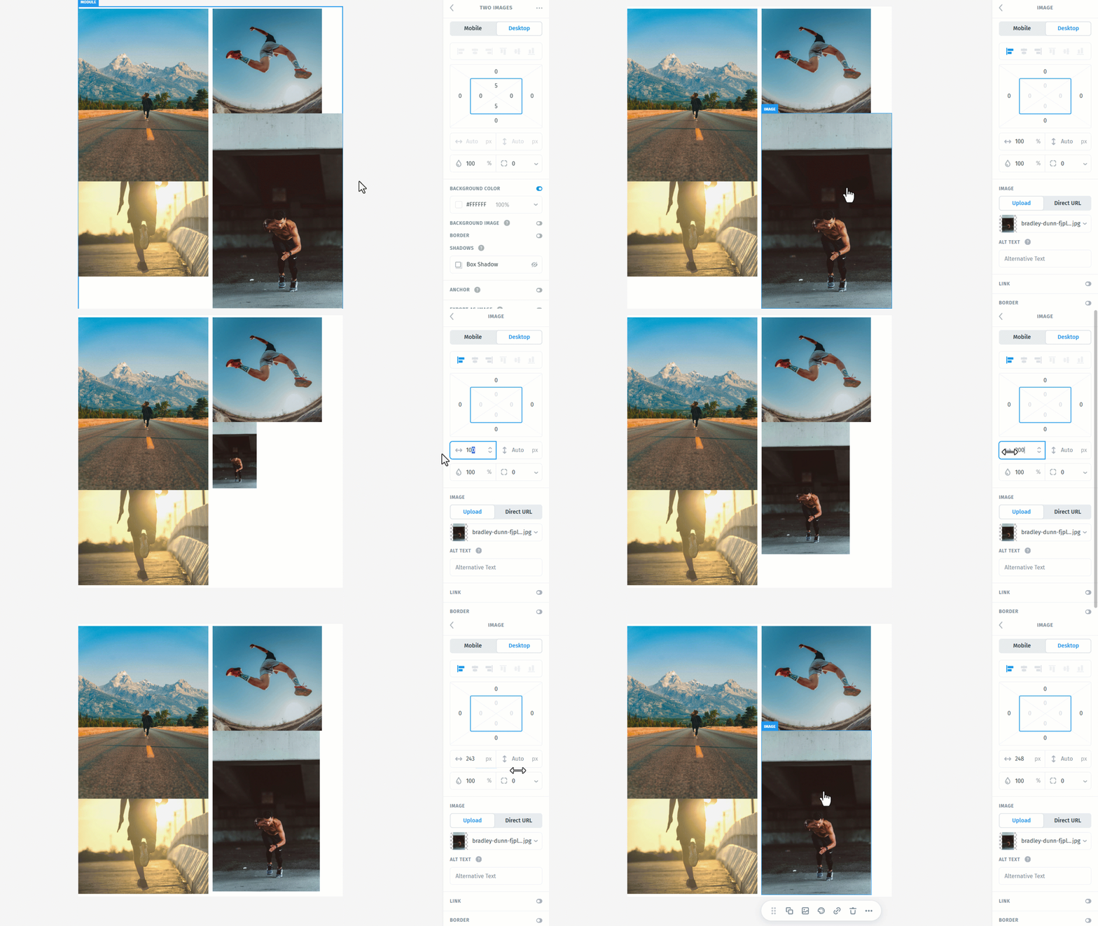
Make small adjustments as needed until the overall composition feels balanced.
At this point, you can also add rounded corners to the images if you want to give the collage a more defined look. Click each Image element, then go to the settings panel on the right and scroll to the Rounded corners control, located just below the Height setting. From there, enter the border value you want to apply.
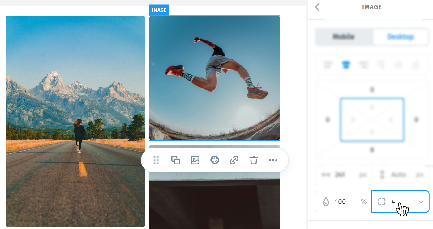
Step 5: Refine the Grid Layout and Spacing
At this stage, you may also want to adjust the Grid itself depending on how wide you want the collage to appear inside the module.
- If you want the Grid to stay closer to the natural size of the content, set it to Hug. This is useful when you want the collage to feel more compact and not stretch too far across the available space.
- If you want the Grid to expand and take up more of the container width, set it to Fill. This usually works better when you want the collage to feel wider and make fuller use of the section.
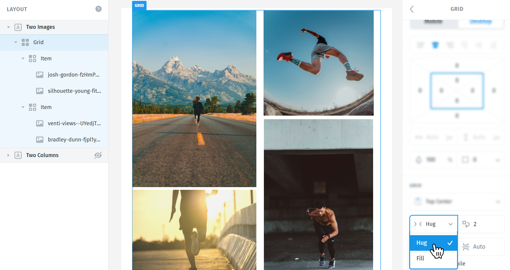
To try both options, select the Grid and use the sizing settings in the panel on the right. Switching between Hug and Fill can noticeably change the overall balance of the collage, so it’s worth testing both to see which one fits your layout better.
Right next to these settings, you’ll also find Wrap count, which controls how many Items appear in each row before wrapping to the next line. For this tutorial, since we’re creating a simple two-column collage, we’ll set the Wrap count to 2.
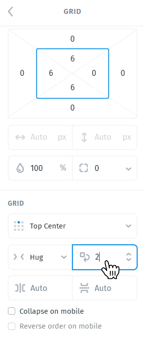
Adjust Padding Around the Collage
You can add left or right padding to the parent module or to the Grid itself if you want better spacing around the collage. This can help the layout feel more balanced and prevent the images from sitting too close to the edges of the section. For example, here I added 40px of padding on the left and right, and 12px of padding on the top and bottom to the module:
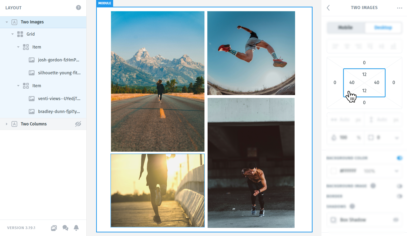
Padding can also be added directly to the Grid, which is especially useful if you want a bit of inner space before applying a border around the entire Grid.
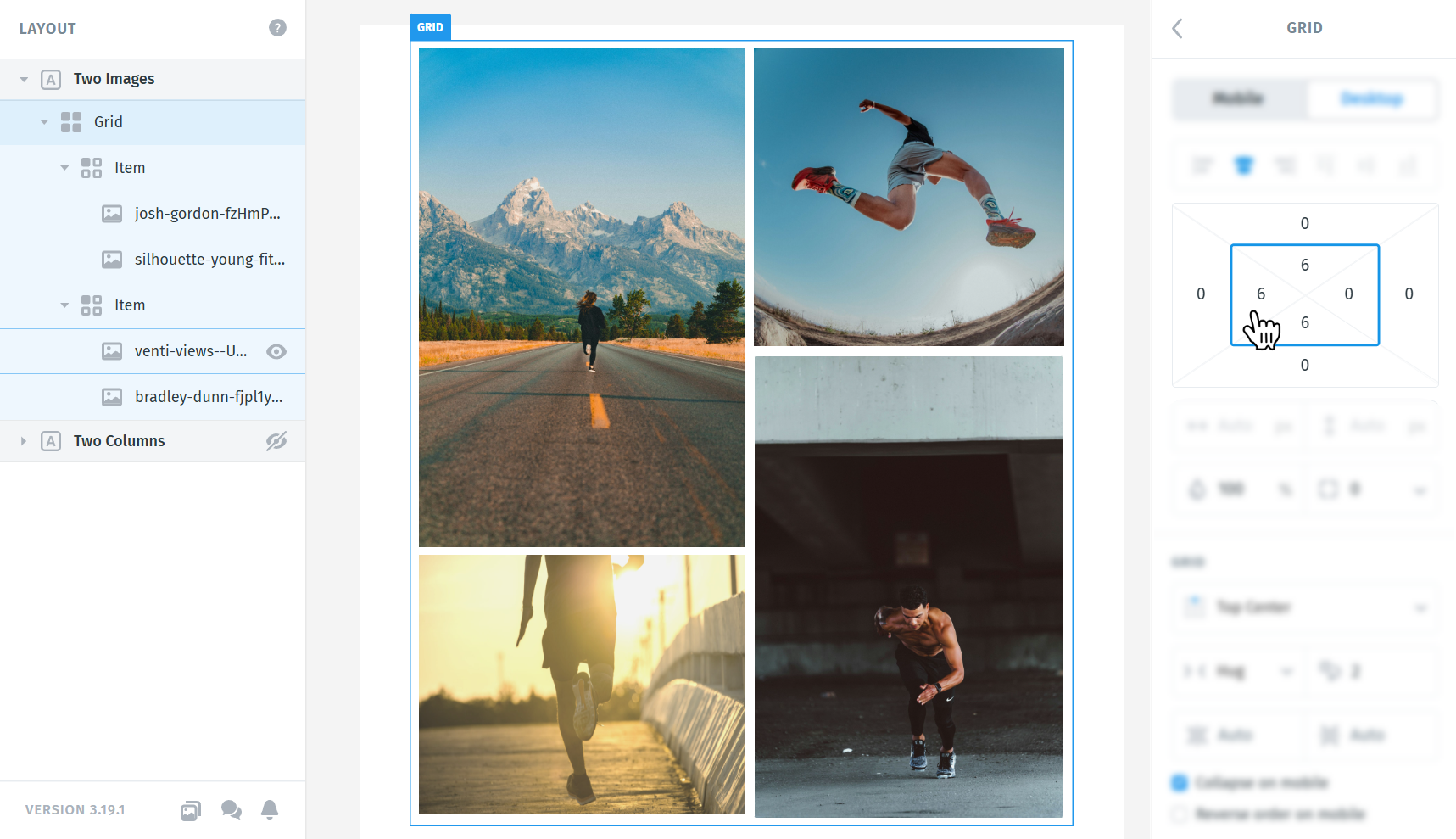
We can now add some margin between the images so they don’t sit directly against each other. Select the image you want to adjust and apply a margin as needed.
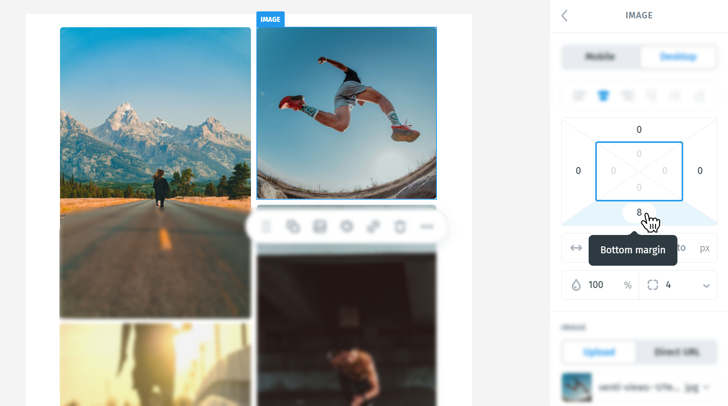
For example, here I added a bottom margin of 8px to create a bit of space between it and the image directly below.
Step 6: Add a background image or background color
You can also add a background image or a solid background color to help the collage stand out more.
You can apply the background either to the Grid itself or to the entire module. In this example, I’ll apply it to the module so it frames the whole collage section.
To do this, select the module, then go to the settings panel on the right.
- If you want to use a solid color, enable Background color and choose the color you want.
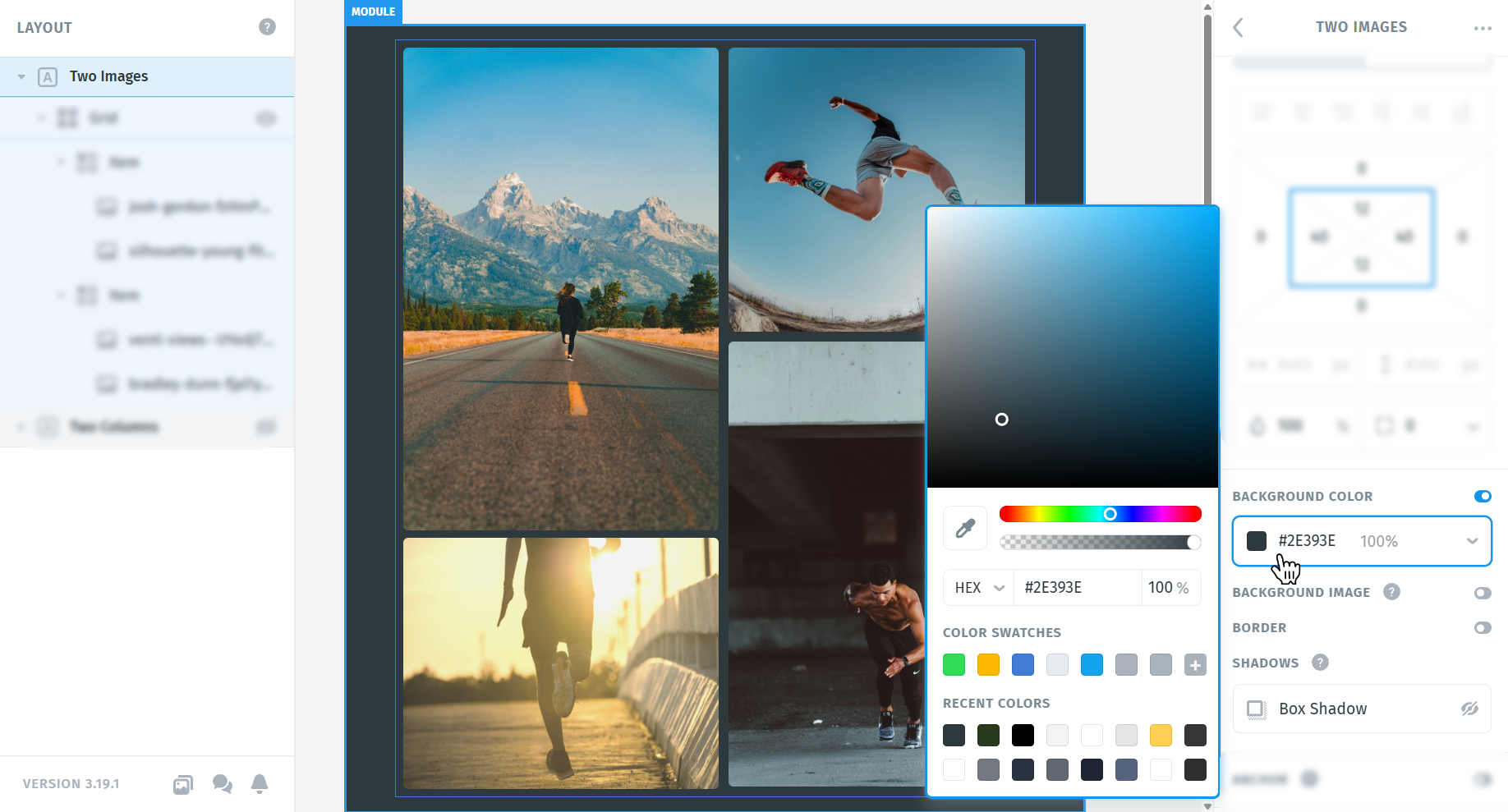
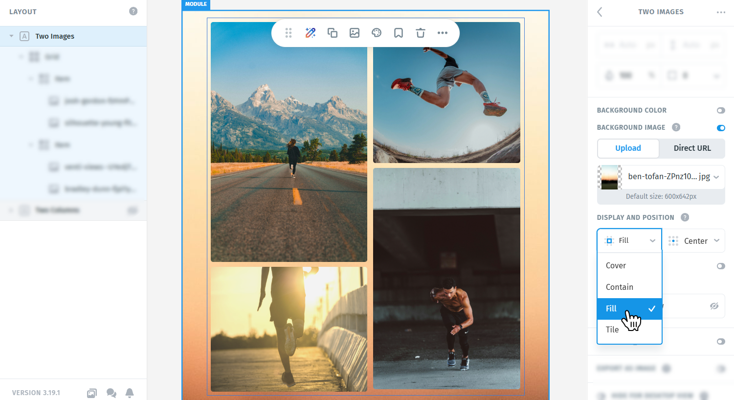
- If you want to use an image, enable Background image and upload your file. Once the image is added, you can adjust its display and position using the available settings until it looks right behind the collage.
Step 7: Add a border or shadow to the Grid
Postcards also lets you apply a border and shadow to the entire Grid, which can help the collage feel more polished and visually separated from the rest of the layout.
To do this, select the Grid element, then go to the settings panel on the right and scroll down to the Border setting. Turn the border on, then choose the border style, thickness, and color you want to use. You can also apply rounded corners to the Grid itself if you want the border to have a softer, more rounded appearance.
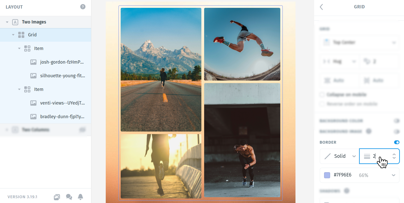
For my example, I won’t use a border and will rely only on a subtle shadow effect instead.
Right below that, you’ll also find the Shadow setting. Enable it by clicking the eye icon. Once it is active, you can adjust the color, position, blur, and spread of the shadow until it looks the way you want.
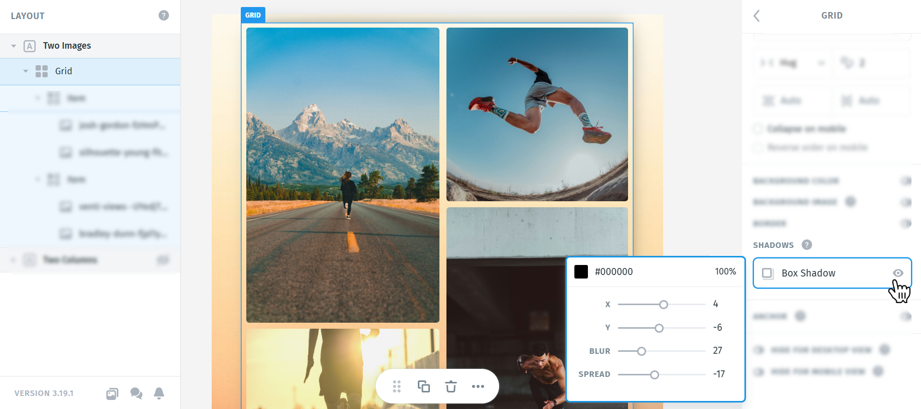
With that, your collage section is ready. As a final step, make sure to review it in Preview & Share, check how it looks on both desktop and mobile, and send yourself a test email before using it in a live campaign. Since collage-style layouts rely on several images and spacing adjustments working together, testing is especially important to make sure everything renders the way you expect.
As you continue working with collages, try experimenting with different image proportions, spacing, backgrounds, shadows, and Grid settings to create new and more interesting layouts of your own.
You can also explore other collage styles, from simpler arrangements with just a few images to more complex compositions with multiple columns and varied image sizes. Small changes can completely transform the look of the final design, so don’t be afraid to test different combinations until you find a layout that feels balanced, creative, and visually engaging.
What we learned
- How to create a collage layout in Postcards using 2 columns and 4 images
- How to add a Grid to your layout
- How to replace the placeholders with your own images
- How to adjust image size, proportions, spacing, and margins
- How to refine the collage using Grid settings
- How to improve the final design with padding, shadows, and background styling