How Grid Works in Postcards
A Grid is a layout container used to structure content in rows and columns. It helps organize elements in a clean and consistent way, especially useful for things like card layouts, feature sections, or lists of items.
When navigating through the Layers structure, hovering above or below a specific element will reveal a small plus (+) button. Clicking it will prompt a bubble of available elements that can be inserted - from here you’ll be able to choose Grid.
By default, the Grid comes with two items, each containing just a single text placeholder.
To start using it:
Simply drag and drop your own elements (images, text, etc.) from the Layer panel on the left side into each grid item. Also, feel free to delete text placeholders.
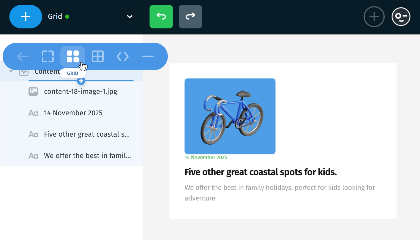
You should get a result similar to this:
The image appears on the right and all the text content is on the left.
Note:
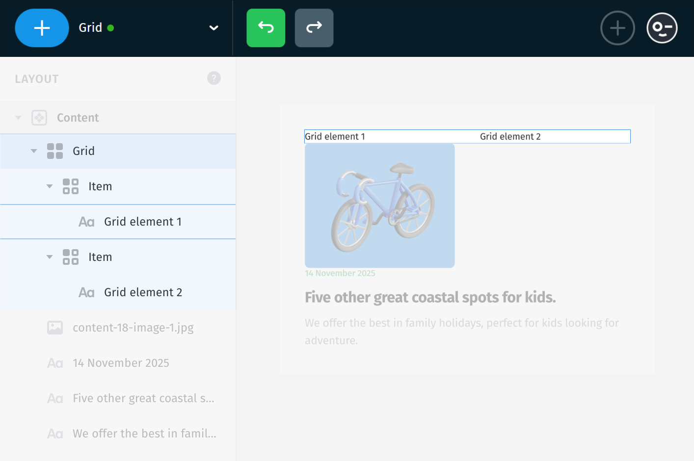
In a Grid layout, the first item always appears on the left. This means the position of your content depends on the order of the items inside the Grid - first = left, second = right (on Desktop).

For example, if you move the text content into the first Grid item, then the text will appear on the left side.
The order of items inside the Grid defines how they appear:
- First item = left (on Desktop)
- Second item = right
- If you add a 3rd, 4th, or more items, they’ll continue below, wrapping into the next row depending on the grid settings.

To create a new Grid Item, you have two options:
- Click the (+) button between the “Grid” and “Item” layers (or between collapsed items). Just pick the element you want, and a new item will be added automatically.
- Or simply duplicate an existing item: Right-click on it and choose Duplicate, or use the shortcut Cmd+D (Mac) / Ctrl+D (Windows).
Each structural element contributes to the overall size of the email template. Avoid excessive nesting; this applies to both grids and groups, as it can negatively impact performance and maintainability.

Important: On mobile, the layout typically becomes vertical - items will stack one below the other, with the first item always on top.
Padding, margins, borders and opacity
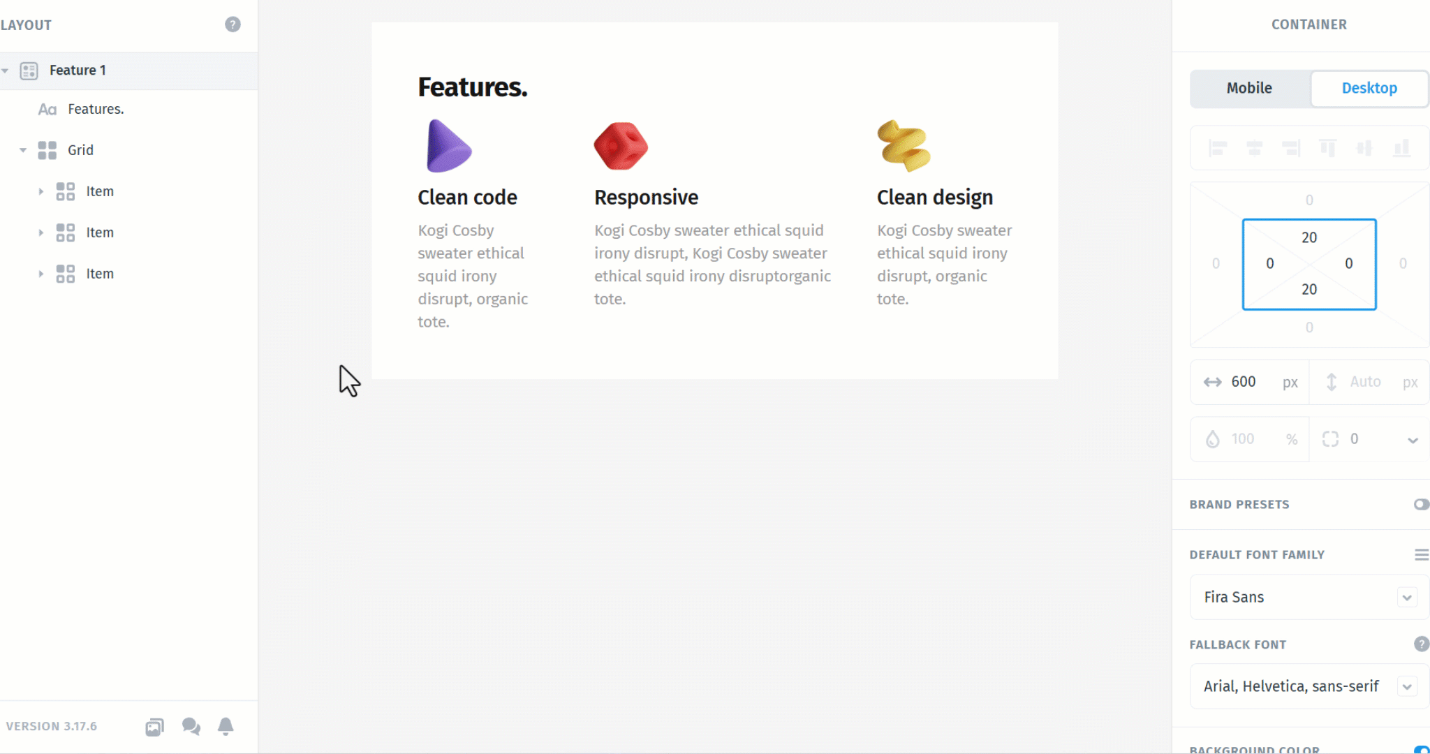
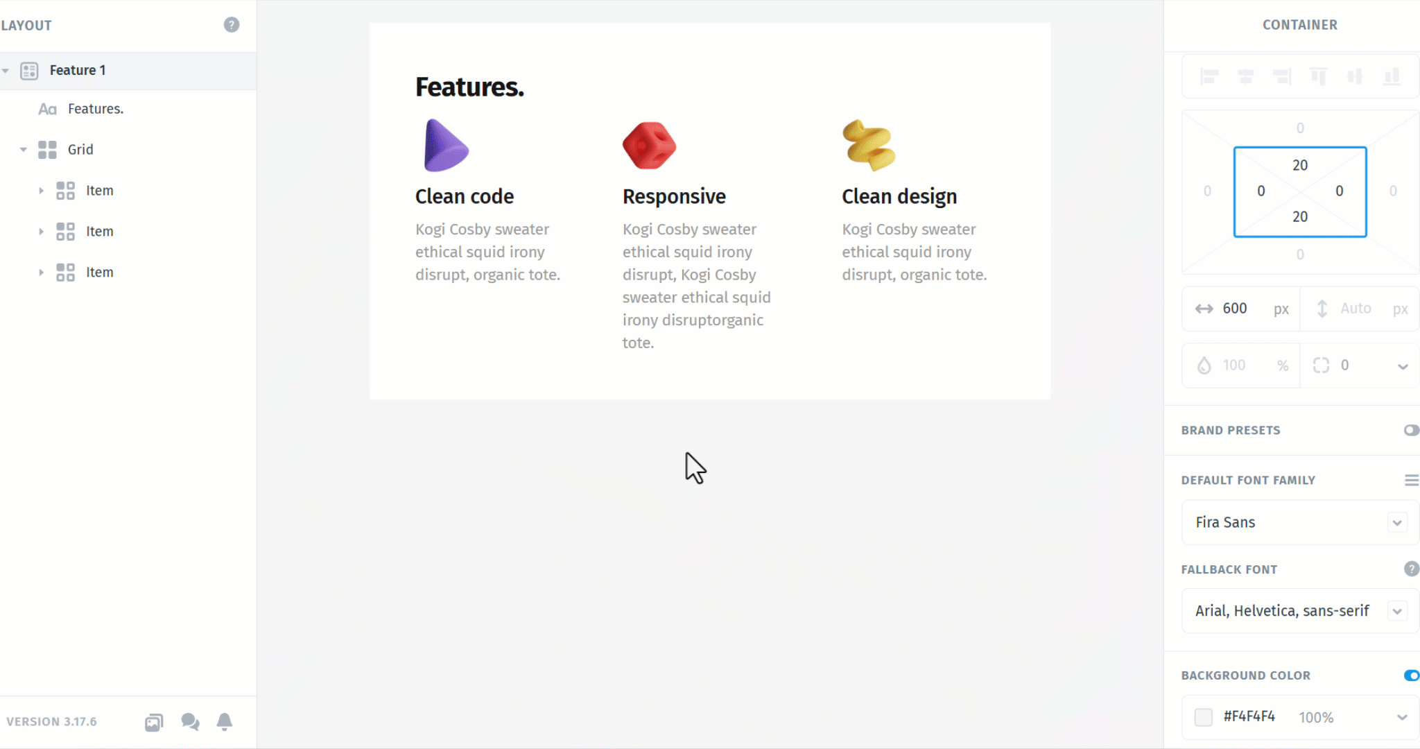
You can adjust the padding and margin of the entire Grid just like any other element in Postcards. Select the Grid itself (not an individual item), then use the right panel to control spacing around and inside the grid.
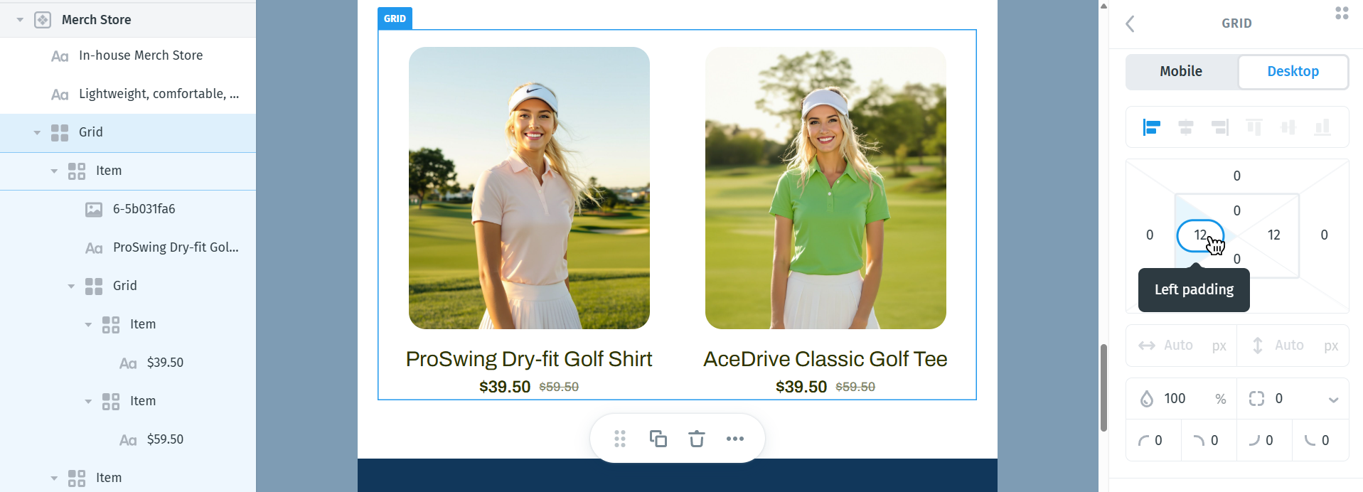
This is useful when you need more breathing room between the grid and surrounding content or want to fine-tune internal spacing.
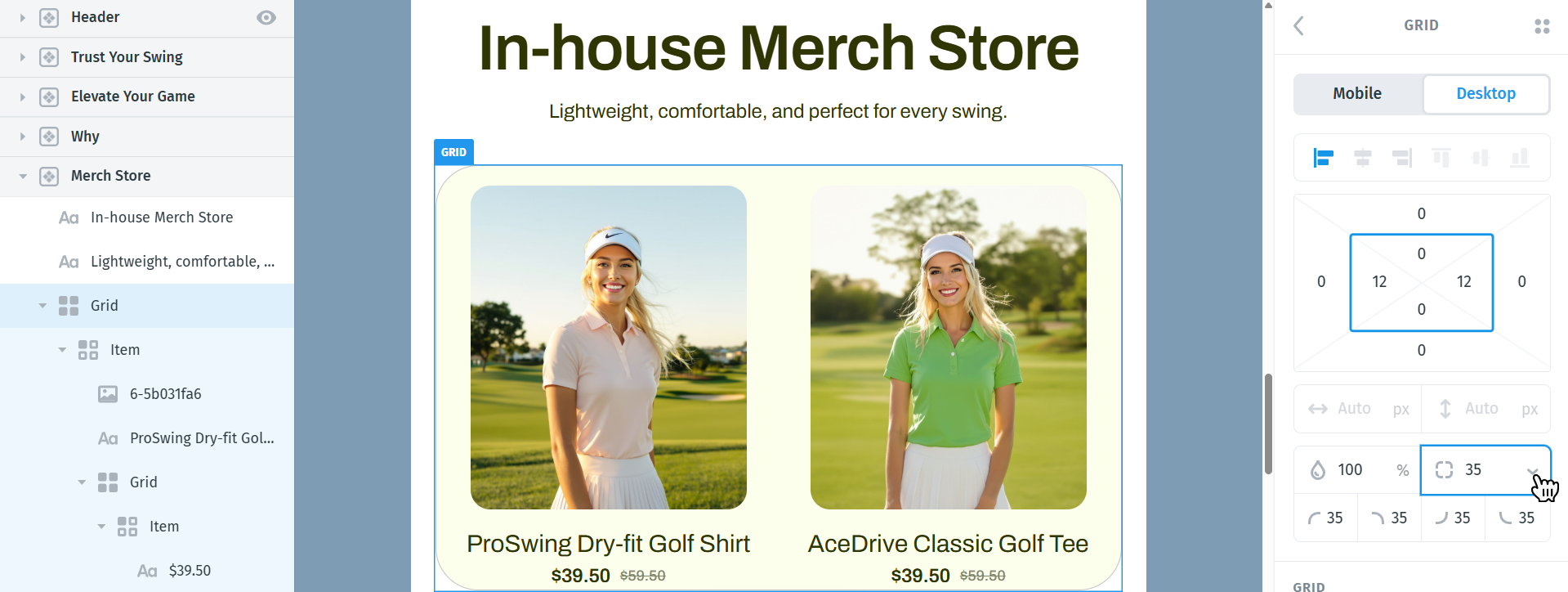
You can also add borders to the Grid’s background to visually separate it from other sections. Border size can be set to a specific value by entering a number, or by clicking the border value field, holding the click, and dragging your mouse left or right to decrease or increase the value.
Each side of the border can be customized individually by clicking the downward arrow next to the border settings.
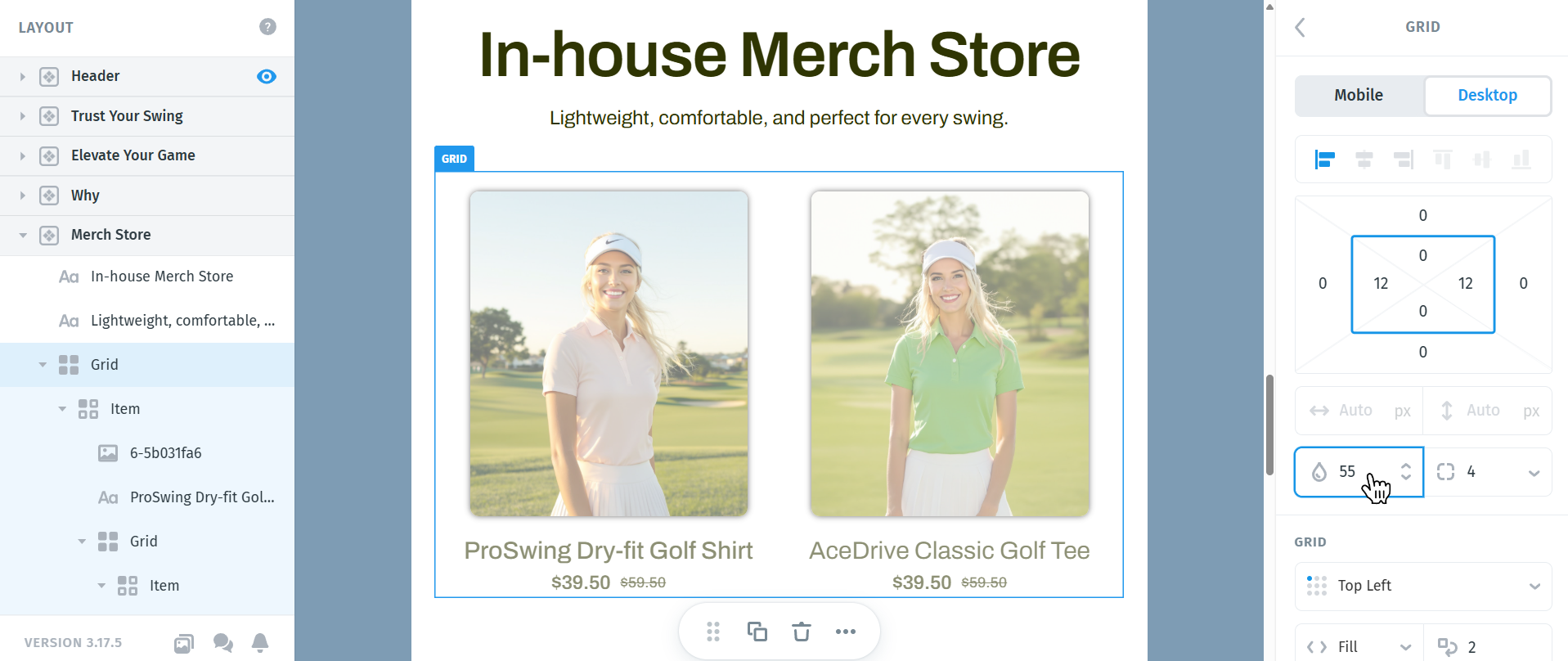
The Opacity setting controls the transparency of the entire Grid and applies to all elements within it, including the background, padding, margins, and borders.
You can adjust the opacity by entering a value directly or by clicking the value field and dragging left or right to decrease or increase the percentage.
- 100% makes the grid fully visible
- 0% makes the grid completely invisible
- Values in between apply partial transparency to the entire grid
This is useful for creating subtle section backgrounds, layered layouts, or visually softening a group of elements without modifying each item individually
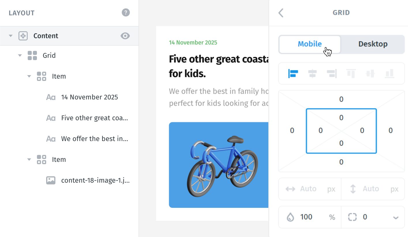
Refer to the image below to identify the supported grid options, and just under you’ll find how to use and apply them:
- Alignments
- Sizing options
- Wrap count
- Spacing
- Collapse on mobile
- Reverse order on mobile

1. Alignments
Grid items are usually aligned to the top-left corner unless you tell them otherwise. That’s because top-left is the starting point in most layout systems.
You can change the alignment by clicking on the alignment name.

2. Sizing options (Hug vs Fill)
Grid and Grid Item sizing depends on whether the Grid has a Wrap Count set or not. This is an important distinction, as it directly affects how Hug and Fill behave.
Hug means the grid (or the item inside it) will shrink to fit its content. If the content is small, the element will take up only the minimum space it needs.
Fill means the grid (or the item inside it) will expand to fill the available space inside its container.
Important: Hug and Fill do not always control width, their behavior changes depending on the Grid’s Wrap Count setting.

3. Wrap count
Wrap Count controls how many items fit per row before wrapping to the next line. This setting effectively defines a fixed number of columns.
- If Wrap Count = 2, the grid shows 2 items per row (each item takes 50% width).
- If Wrap Count = 3, the grid shows 3 items per row (each item takes ~33% width).
- Additional items automatically wrap to the next row.

How Wrap Count affects Grid Item width
When a Grid has a Wrap Count specified (for example, 2 or 3):
-
All Grid Items automatically split the available width evenly
Each item’s width is determined by the number of columns
- 2 columns → 50% / 50%
- 3 columns → 33% / 33% / 33%
In this mode:
- Hug and Fill settings on individual Grid Items do not affect their width
- Width is locked by the Grid’s column count
Even though the UI may still show Hug or Fill on Grid Items, those settings won’t change the layout while Wrap Count is set.
If Wrap Count is not specified (Auto):
- Grid Item width is controlled by Hug and Fill and you can also set a manual width using px or % values.
This allows more flexible layouts:
- Fill items take up available space
- Hug items stay as small as their content
Summary
- Wrap Count set → Grid Items always have equal width (Fill / Hug do not affect width)
- Wrap Count not set (Auto) → Grid Item width is controlled by Hug and Fill
- This behavior helps keep Grid layouts predictable when using fixed columns
4. Spacing
Auto spacing lets the system decide the spacing between items based on the overall layout.
If you want full control, you can set spacing manually (e.g., 40px).
Auto is useful when you want the grid to adapt to screen size without worrying about exact numbers.

5. Collapse on mobile
Collapse on Mobile - makes the grid switch from a horizontal layout (rows) to vertical (stack) on smaller screens.
It’s often used to make sure content is readable on phones - items are shown one under the other, rather than side-by-side.

6. Reverse order on mobile
This flips the order of the items only on mobile.
For example, if you have 2 items:
- Text
- Image
With reverse order, they’ll appear like:
- Image
- Text
Useful when the mobile layout needs to highlight different elements first (like putting the CTA - call to action at the top on small screens).

Grid Styling Settings
In addition to layout and spacing controls, Grids also include visual styling options for backgrounds, borders, and shadows.
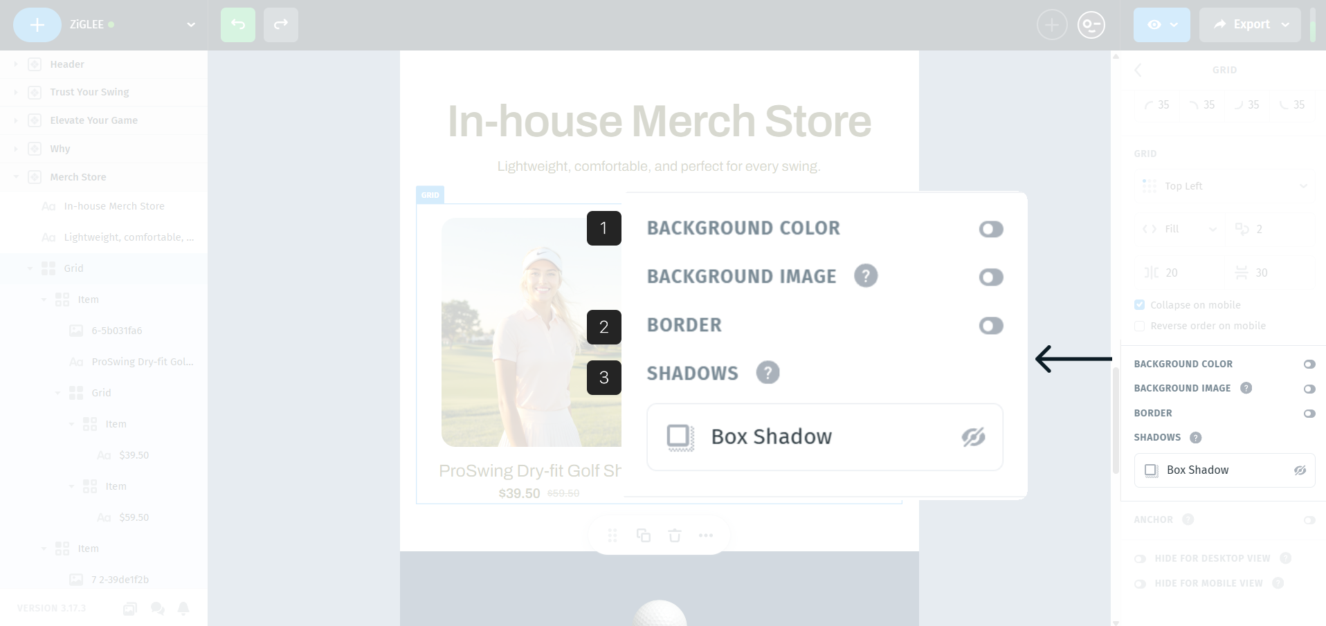
1. Backgrounds
Grids support background styling to help visually group content or separate sections within your template. You can apply a background to the entire Grid using either a color or an image, and it will appear behind all items inside the grid.
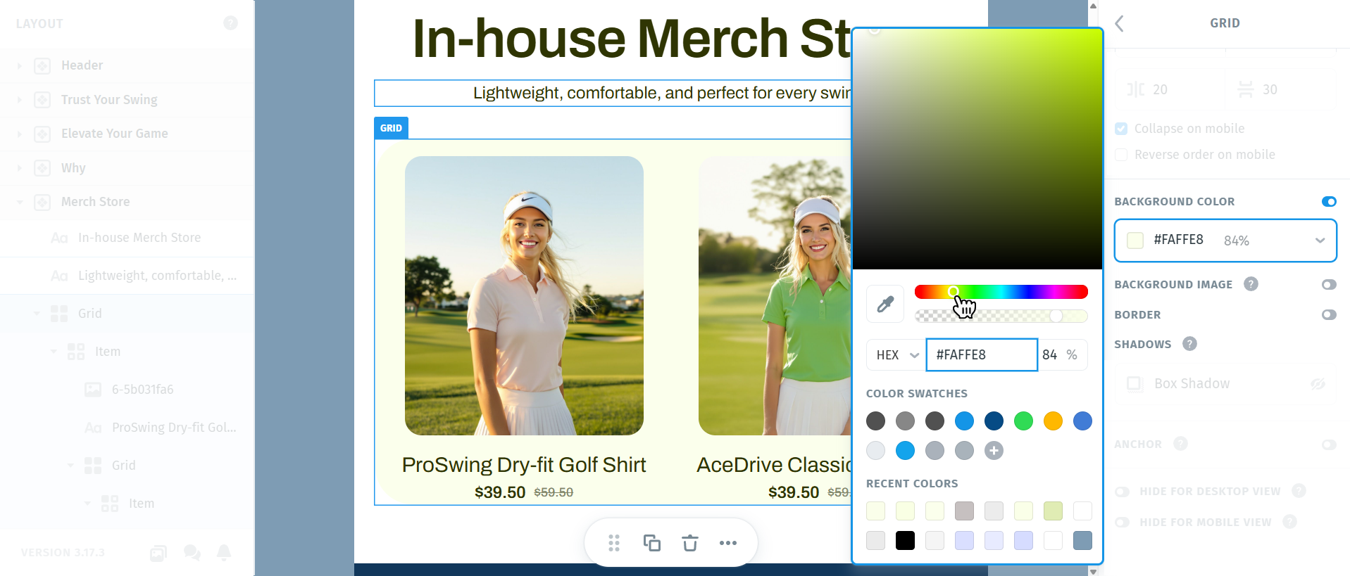
Background Color
Use a solid background color to create contrast, highlight a section, or visually separate the Grid from surrounding content. You can select any color and adjust its opacity to achieve subtle or more pronounced effects, making it easy to fine-tune how strong the background appears.
Background Image
A background image allows you to place an image behind all Grid items, which you can upload from your Image Library or directly from your computer. You can then adjust how the image is displayed and positioned using the available background image settings. This is useful for more visual layouts or branded sections where a simple color isn’t enough. The background image stays attached to the Grid itself, ensuring all items remain aligned and readable on top of it.
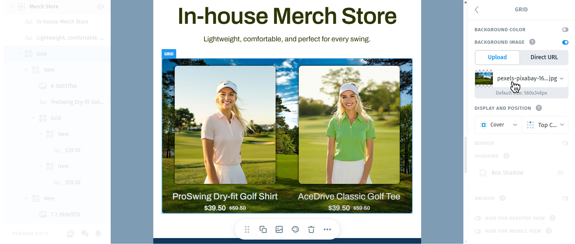
Note: Background images are not consistently supported across all email clients, so rendering results may vary depending on the client and device.
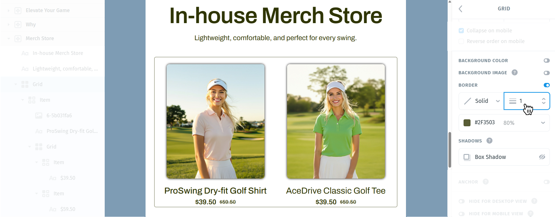
2. Border
You can also add a border to the entire Grid. Toggle the Border setting to enable it, then use the available options to choose the border style (solid, dotted, or dashed), adjust the border thickness, and set the border color. You can define different border thickness values for each side of the Grid by clicking the downward arrow and customizing each side individually.
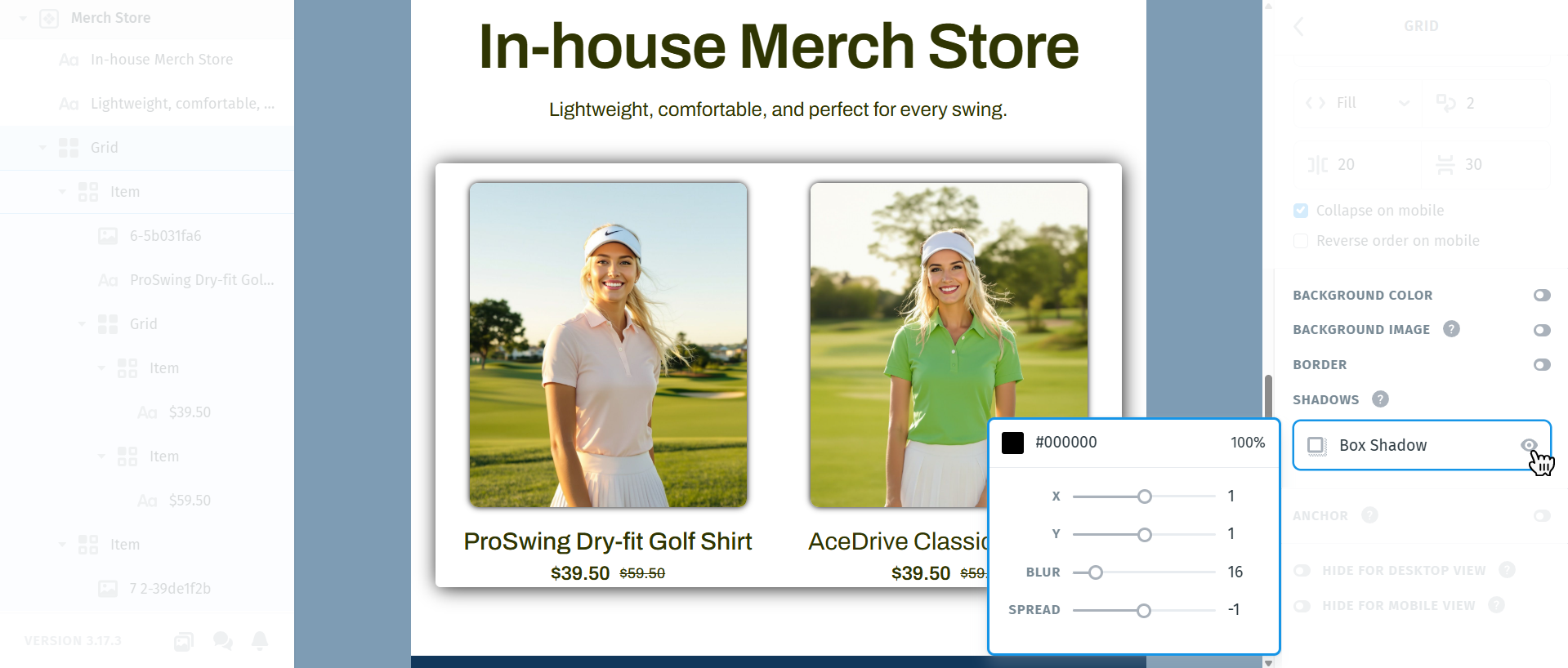
3. Shadows
You can add a shadow to the entire Grid to create depth and visual separation. Click the small eye icon to enable the shadow, then click the Box Shadow field to open the shadow settings. From there, you can control the shadow’s position using the X and Y offset values, adjust the blur and spread, and choose a specific color for the shadow.
Note: Shadow effects are not consistently supported across all email clients, so rendering results may vary depending on the client and device.
Item
A grid item is a single block inside the grid - like a “cell” where you place content (text, image, button, etc.).
Each item has its own alignments (1) and sizing options (2), so you can control the layout more precisely.

1. Alignments
Each grid item can also align the content inside it - for example, text or images inside a column.
Why it’s useful:
Sometimes, one item needs different behavior than another.
For example:
On the left: text should align to the Top Center
On the right: image should be to the Top Left

2. Sizing options
This defines how much of the container the item should occupy.
Every grid item has two main sizing options:
- Width
- Height
And each can be set to:
Hug: The item will shrink to fit the content inside.
Example: If there’s only a short text, the item will stay just as wide as that text.
Fill: The item will stretch to fill the available space in the grid.
Useful when you want elements to take equal width or adapt to the container.
Custom: You can also set a fixed size (e.g., 200px), if you want precise control.

Important (Fixed-Size Content)
If the grid item contains an element like an image with a fixed size, choosing Fill for the item won’t visually change anything.
That’s because the image itself doesn’t stretch - it keeps its own defined size, so the grid item wraps around that instead.
Example:
You apply Fill to an item that contains an image set to 150px width. The item tries to fill the space, but the image doesn’t stretch, so the item stays that size unless the image is set to auto/stretch too.

When working with a Grid layout, you may want to control how the entire grid sits inside the module. This is where grid alignment comes into play - letting you position your content to the left, center, or right within its container.
Use Grid alignment option when:
- The grid itself doesn’t stretch full width (i.e., it’s set to “Hug” or a smaller fixed size).
- The module or container has extra space around the grid.

Important Note:
If the grid or its items are already set to “Fill” the container, there won’t be any leftover space - so alignment controls won’t visibly affect anything.