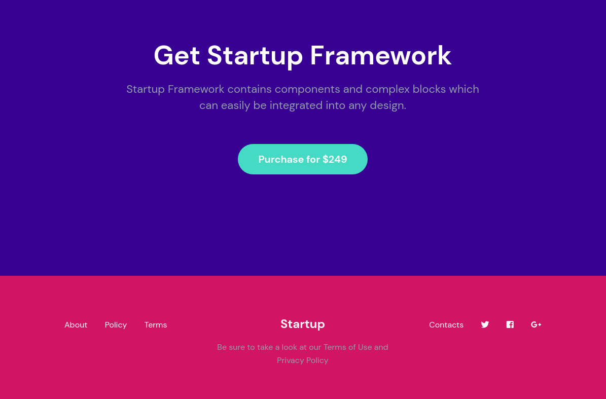
You might use the Startup app to generate a simple landing page containing little content. Maybe it has a sentence or two announcing the launch of your product and an email input field to collect the email addresses of those interested, or maybe it contains a short intro to your product and a single call-to-action button, as shown below.
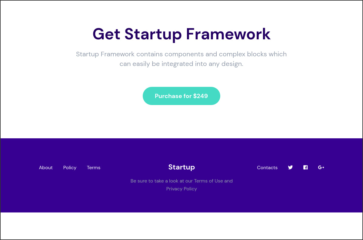
Other than the main content of the website, you might also want to include a footer that holds other content, like important links, as shown above.
If there isn’t much content on the page, you might end up with a page that looks like the above. At the top of the page is the main content, followed by a footer and then some blank white space. Since the content of the page isn’t enough to fill the height of the viewport, we get that whitespace where the content of the page ends. Our footer also ends up not being at the foot of the browser window. Let’s improve the page’s look by adding a Sticky Footer to it.
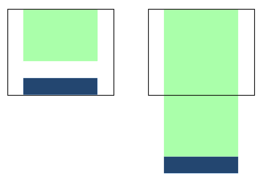
A sticky footer is a footer that stays on the bottom of the browser window regardless of how little content is on the page. However, this footer will be pushed down if there is enough content to at least fill the viewport, so it is different from a fixed footer, which remains at the bottom of the browser window even if the page scrolls.
Below, you can see how a sticky footer (navy blue) will behave on a page with little content (light green) that doesn’t fill the height of the browser window, and with a lot of content that more than fills the height of the browser window:
Let’s see how to make your Startup template’s footer sticky.
Making the Footer Sticky
To make the footer sticky, follow the following 5 steps:
Step 1: Add the h-100 class to the html tag. This gives the element a height of 100%, which will make the height of the page to be equal to the height of the viewport.
<html lang="en" class="h-100">
Step 2: Add the classes h-100, d-flex and flex-column to the body tag. h-100 adds height: 100%, d-flex adds display: flex and flex-column adds flex-direction: column to the body. This makes the body’s height to be equal to its parent’s height (in this case, the height of the html tag, which is equal to the height of the viewport). We set some flexbox rules on the body that ensure that blocks are stacked vertically inside it.
<body class="h-100 d-flex flex-column">
Step 3: Add the flex-shrink-0 class to the tag containing your main content. This adds the following CSS rule to the tag: flex-shrink: 0. The flex-shrink CSS property sets the flex shrink factor of a flex item. If the size of flex items is larger than the flex container, items shrink to fit according to flex-shrink. flex-shrink defines how much a flexbox item should shrink if there’s not enough space available. With flex-shrink: 0, the element will not shrink.
<section class="pt-110 pb-95 bg-light text-center call_to_action_1 flex-shrink-0">
Step 4: Add the mt-auto class to the footer. This sets margin-top: auto on the footer. If you apply auto margins to a flex item, that item will automatically extend its specified margin to occupy the extra space in the flex container, depending on the direction in which the auto-margin is applied. For example, a div with the style margin-left: auto would be pushed all the way to the right of the flex container, with the left-side margin taking up any extra space between the left edge of the element and its previous sibling. Adding margin-top: auto to the footer pushes it to the bottom of the body.
<footer class="pt-75 pb-65 bg-dark text-center footer_1 mt-auto">
Below, you can see the result of taking the above steps.
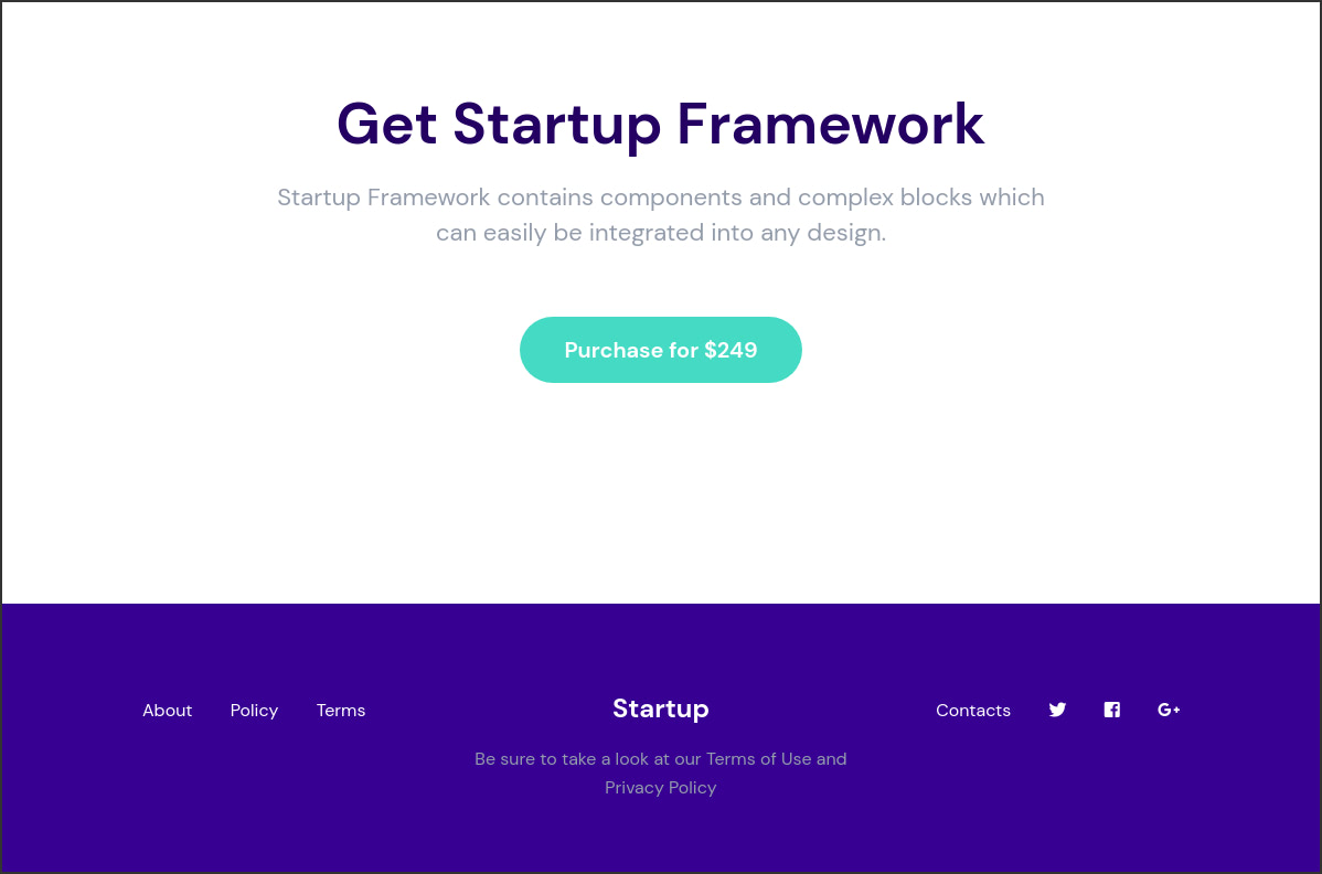
We now have a sticky footer that is positioned at the bottom of the page.
Our page now looks better, but there is a potential problem that you might run into. To better visualize this, let’s add a different background color to the main content and to the footer.
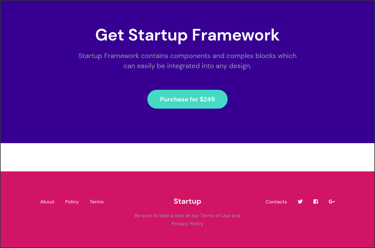
As you can see, the main content still occupies the same amount of space that it was when we started the tutorial. Because we’ve made the footer sticky, it has now been pushed to the bottom of the screen, leaving some blank space between the main content and the footer.
If the background color of your main content is white, you don’t need to do anything as this will blend in with the blank space’s color, making it indiscernible. But if the background color of your main content is not white, then the blank space will be visible.
Step 5: To fix this, give the body the same background color as the background color of the main content. Below, we add bg-dark to the body which gives it the color we selected for dark backgrounds when we generated the template. We have a document on customizing colors on your Startup template if you are interested in learning more about that. You might also be interested in our classes guide for a list of the classes used in the Startup template.
<body class="h-100 d-flex flex-column bg-dark">
Now the blank space is not noticeable.
