You can present related content on your website with HTML lists.
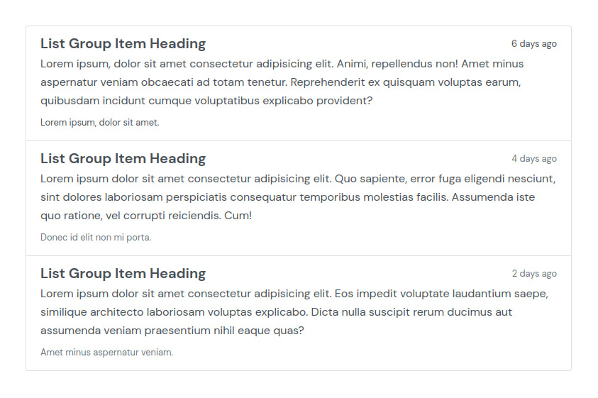
You can create an ordered list as shown below:
<ol>
  <li>Coffee</li>
  <li>Tea</li>
  <li>Milk</li>
  <li>Water</li>
</ol>
In an ordered list, items are marked with numbers by default:
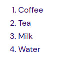
You can create an unordered list as shown below:
<ul>
  <li>Coffee</li>
  <li>Tea</li>
  <li>Milk</li>
  <li>Water</li>
</ul>
In an unordered list, items are marked with bullets by default:
Bootstrap comes with a List Group component that adds styling to lists and adds other features like hover effects, highlighting the active list item, etc. We’ll look at various ways you can use this component.
Creating a List Group
To create a list group, add the list-group class to the list element (using either <ul> or <ol> will result in an unordered list). Then add the class list-group-item to each item in the list.
<section class="pt-105 pb-45">
  <div class="container px-xl-0">
    <div class="row justify-content-center">
      <div class="col-xl-8 col-lg-10">
        <ul class="list-group">
          <li class="list-group-item">JavaScript: The Definitive Guide</li>
          <li class="list-group-item">You Don’t Know JS</li>
          <li class="list-group-item">Secrets of the JavaScript Ninja</li>
          <li class="list-group-item">Eloquent JavaScript</li>
          <li class="list-group-item">JavaScript: The Good Parts</li>
        </ul>
      </div>
    </div>
  </div>
</section>
Below, you can see the list created with the above code:
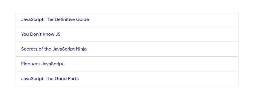
The below section, taken from the code above, is used to position and size the container that the list group is in. If you want to know what the classes do, then check out our classes guide.
<section class="pt-105 pb-45">
  <div class="container px-xl-0">
    <div class="row justify-content-center">
      <div class="col-xl-8 col-lg-10">
      </div>
    </div>
  </div>
</section>
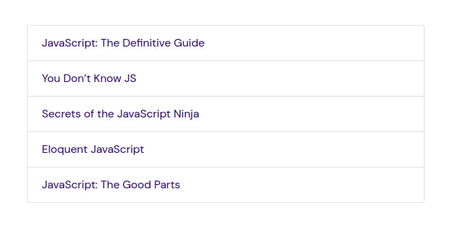
The list group takes up the full width of the container it is in. If you want to change its width, change the width of the container. Below, we reduce the container’s width.
<div class="col-md-8 col-lg-6">
Now the list group is a bit narrower:
Horizontal List Group
You can change the layout of the list group from vertical to horizontal by adding the class list-group-horizontal to it. This will result in a horizontal list group across all breakpoints. You can also use a responsive variant list-group-horizontal-{sm|md|lg|xl} that will make the list group horizontal starting at a particular breakpoint.
<section class="pt-105 pb-45">
  <div class="container px-xl-0">
    <div class="row justify-content-center">
      <div class="col-xl-8 col-lg-10">
        <ul class="list-group list-group-horizontal">
          <li class="list-group-item">Express</li>
          <li class="list-group-item">Ruby on Rails</li>
          <li class="list-group-item">Django</li>
        </ul>
      </div>
    </div>
  </div>
</section>
Below is the list created above:

You can make the horizontal list have equal-width items by adding the class flex-fill to each item.
<section class="pt-105 pb-45">
  <div class="container px-xl-0">
    <div class="row justify-content-center">
      <div class="col-xl-8 col-lg-10">
        <ul class="list-group list-group-horizontal">
          <li class="list-group-item flex-fill">Express</li>
          <li class="list-group-item flex-fill">Ruby on Rails</li>
          <li class="list-group-item flex-fill">Django</li>
        </ul>
      </div>
    </div>
  </div>
</section>
With this, the list group takes up the whole width of the container it’s in, unlike the previous list group which is as big as its content.

List Group With No Border
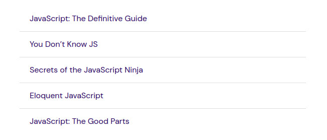
You can remove the list group’s outer border by adding the class list-group-flush to it:
<section class="pt-105 pb-45">
  <div class="container px-xl-0">
    <div class="row justify-content-center">
      <div class="col-md-8 col-lg-6">
        <ul class="list-group list-group-flush">
          <li class="list-group-item">JavaScript: The Definitive Guide</li>
          <li class="list-group-item">You Don’t Know JS</li>
          <li class="list-group-item">Secrets of the JavaScript Ninja</li>
          <li class="list-group-item">Eloquent JavaScript</li>
          <li class="list-group-item">JavaScript: The Good Parts</li>
        </ul>
      </div>
    </div>
  </div>
</section>
Below is the borderless list group.
List Group With Badges
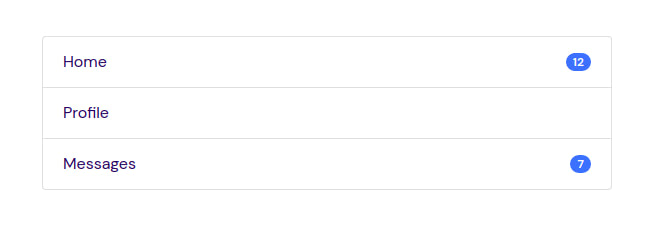
You might need to display a label on a list item conveying some information about that item. You can do this with badges. Below, we use badges to display a count for some items. We use flexbox utilities to position the badges. The d-flex class makes an element into a flexbox container and transforms direct children elements into flex items.
<section class="pt-105 pb-45">
  <div class="container px-xl-0">
    <div class="row justify-content-center">
      <div class="col-md-8 col-lg-6">
        <ul class="list-group">
          <li class="list-group-item d-flex justify-content-between align-items-center">
            Home
            <span class="badge badge-primary badge-pill">12</span>
          </li>
          <li class="list-group-item d-flex justify-content-between align-items-center">
            Profile
          </li>
          <li class="list-group-item d-flex justify-content-between align-items-center">
            Messages
            <span class="badge badge-primary badge-pill">7</span>
          </li>
        </ul>
      </div>
    </div>
  </div>
</section>
We added badges to the first and list item.
Active List Group Item
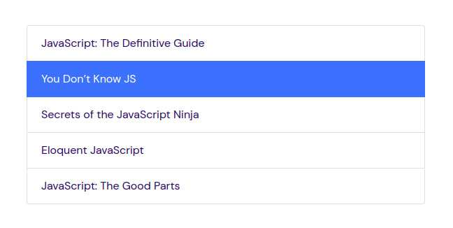
You might need to indicate that a particular list group item is the currently active selection. You can show this by adding the class .active to the item.
<section class="pt-105 pb-45">
  <div class="container px-xl-0">
    <div class="row justify-content-center">
      <div class="col-md-8 col-lg-6">
        <ul class="list-group">
          <li class="list-group-item">JavaScript: The Definitive Guide</li>
          <li class="list-group-item active">You Don’t Know JS</li>
          <li class="list-group-item">Secrets of the JavaScript Ninja</li>
          <li class="list-group-item">Eloquent JavaScript</li>
          <li class="list-group-item">JavaScript: The Good Parts</li>
        </ul>
      </div>
    </div>
  </div>
</section>
You can see the highlighted active item below.
Disabled List Group Item
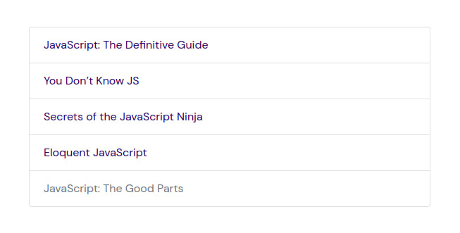
You might also want to indicate that a particular item is not selectable. You can do this by adding the .disabled class to it to make it appear disabled.
<section class="pt-105 pb-45">
  <div class="container px-xl-0">
    <div class="row justify-content-center">
      <div class="col-md-8 col-lg-6">
        <ul class="list-group">
          <li class="list-group-item">JavaScript: The Definitive Guide</li>
          <li class="list-group-item">You Don’t Know JS</li>
          <li class="list-group-item">Secrets of the JavaScript Ninja</li>
          <li class="list-group-item">Eloquent JavaScript</li>
          <li class="list-group-item disabled">JavaScript: The Good Parts</li>
        </ul>
      </div>
    </div>
  </div>
</section>
You can see the disabled item below.
Using Links and Buttons on List Group
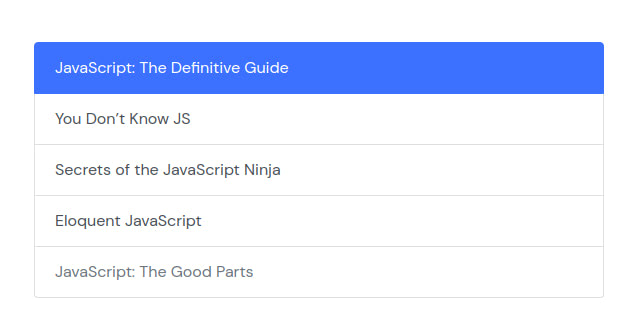
You can create actionable list group items with hover, disabled, and active states by using anchor (<a>) and button (<button>) tags with the list-group-item-action class added. List items created with <li> or <div> are non-interactive and don’t provide a click or tap affordance.
<section class="pt-105 pb-45">
  <div class="container px-xl-0">
    <div class="row justify-content-center">
      <div class="col-md-8 col-lg-6">
        <div class="list-group">
          <a href="#" class="list-group-item list-group-item-action active">
            JavaScript: The Definitive Guide
          </a>
          <a href="#" class="list-group-item list-group-item-action">You Don’t Know JS</a>
          <a href="#" class="list-group-item list-group-item-action">Secrets of the JavaScript Ninja</a>
          <a href="#" class="list-group-item list-group-item-action">Eloquent JavaScript</a>
          <a href="#" class="list-group-item list-group-item-action disabled" tabindex="-1" aria-disabled="true">JavaScript: The Good Parts</a>
        </div>
      </div>
    </div>
  </div>
</section>
Now the list items are clickable and have hover effects (the item hovered over gets highlighted and the cursor turns into a hand pointer).
We used anchor tags above. Below, we use buttons to get the same effect. With a button, you can disable an item by using the disabled attribute as well as using the disabled class. With anchor tags, you can only get the effect by using the class. The tag doesn’t support the disabled attribute.
<section class="pt-105 pb-45">
  <div class="container px-xl-0">
    <div class="row justify-content-center">
      <div class="col-md-8 col-lg-6">
        <div class="list-group">
          <button type="button" class="list-group-item list-group-item-action active">
            JavaScript: The Definitive Guide
          </button>
          <button type="button" class="list-group-item list-group-item-action">You Don’t Know JS</button>
          <button type="button" class="list-group-item list-group-item-action">Secrets of the JavaScript Ninja</button>
          <button type="button" class="list-group-item list-group-item-action">Eloquent JavaScript</button>
          <button type="button" class="list-group-item list-group-item-action" disabled>JavaScript: The Good Parts</button>
        </div>
      </div>
    </div>
  </div>
</section>
Create Tabbable Panes
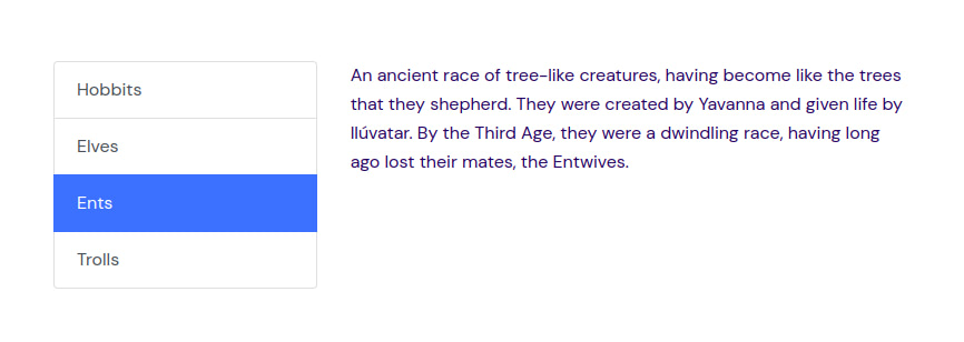
You can use Bootstrap’s Tab JavaScript plugin on a list group to create tabbable panes. Each list item will act as a tab which, when clicked, will display its associated content in a pane.
Below, we place the tabs and panes next to each other by placing both of them in a .row.
<section class="pt-105 pb-45">
  <div class="container px-xl-0">
    <div class="row justify-content-center">
      <div class="col-xl-8 col-lg-10">
        <div class="row">
          <div class="col-4">
            <div class="list-group" id="list-tab" role="tablist">
              <a class="list-group-item list-group-item-action active" id="list-hobbits-list" data-toggle="list" href="#list-hobbits" role="tab" aria-controls="hobbits">Hobbits</a>
              <a class="list-group-item list-group-item-action" id="list-elves-list" data-toggle="list" href="#list-elves" role="tab" aria-controls="elves">Elves</a>
              <a class="list-group-item list-group-item-action" id="list-ents-list" data-toggle="list" href="#list-ents" role="tab" aria-controls="ents">Ents</a>
              <a class="list-group-item list-group-item-action" id="list-trolls-list" data-toggle="list" href="#list-trolls" role="tab" aria-controls="trolls">Trolls</a>
            </div>
          </div>
          <div class="col-8">
            <div class="tab-content" id="nav-tabContent">
              <div class="tab-pane fade show active" id="list-hobbits" role="tabpanel" aria-labelledby="list-hobbits-list">Hobbits are a race of Middle-earth, also known as 'halflings' on account of their short stature, roughly half the size of men. They are characterized by curly hair on their heads and leathery feet that have furry insteps, for which they did not wear shoes.</div>
              <div class="tab-pane fade" id="list-elves" role="tabpanel" aria-labelledby="list-elves-list">The Elves, or Firstborn, were the first of Eru's Children to awaken. Born under the stars before the ascension of the Moon and the Sun, they retain a special love for light and an inner spirit endowed with unique gifts. They call themselves the Quendi, or "Speakers", for they were the first to utter words; and, even now, no race understands language and song like the Firstborn.</div>
              <div class="tab-pane fade" id="list-ents" role="tabpanel" aria-labelledby="list-ents-list">An ancient race of tree-like creatures, having become like the trees that they shepherd. They were created by Yavanna and given life by Ilúvatar. By the Third Age, they were a dwindling race, having long ago lost their mates, the Entwives.</div>
              <div class="tab-pane fade" id="list-trolls" role="tabpanel" aria-labelledby="list-trolls-list">Trolls were said to have been created by Morgoth "in mockery of" the Ents. They disliked the sun, and some types turned to stone if exposed to sunlight. Trolls dwelt in the Misty Mountains as well as in Mordor.</div>
            </div>
          </div>
        </div>
      </div>
    </div>
  </div>
</section>
When you click on a list item on the left, its associated content will be shown on the right pane as shown below. We use the href attribute to point to the content that will be shown when an item is clicked.
List Group With Custom Content
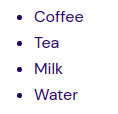
So far, our list group items have consisted of simple text, but you can add nearly any HTML content within a list item. You can use flexbox utilities and our custom utilities to size and position content in the list item.
<section class="pt-105 pb-45">
  <div class="container px-xl-0">
    <div class="row justify-content-center">
      <div class="col-xl-8 col-lg-10">
        <div class="list-group">
          <a href="#" class="list-group-item list-group-item-action">
            <div class="d-flex w-full justify-content-between">
              <h5 class="mb-1">List Group Item Heading</h5>
              <small>6 days ago</small>
            </div>
            <p class="mb-1">Lorem ipsum, dolor sit amet consectetur adipisicing elit. Animi, repellendus non! Amet minus aspernatur veniam obcaecati ad totam tenetur. Reprehenderit ex quisquam voluptas earum, quibusdam incidunt cumque voluptatibus explicabo provident?</p>
            <small>Lorem ipsum, dolor sit amet.</small>
          </a>
          <a href="#" class="list-group-item list-group-item-action">
            <div class="d-flex w-full justify-content-between">
              <h5 class="mb-1">List Group Item Heading</h5>
              <small class="text-muted">4 days ago</small>
            </div>
            <p class="mb-1">Lorem ipsum dolor sit amet consectetur adipisicing elit. Quo sapiente, error fuga eligendi nesciunt, sint dolores laboriosam perspiciatis consequatur temporibus molestias facilis. Assumenda iste quo ratione, vel corrupti reiciendis. Cum!</p>
            <small class="text-muted">Donec id elit non mi porta.</small>
          </a>
          <a href="#" class="list-group-item list-group-item-action">
            <div class="d-flex w-full justify-content-between">
              <h5 class="mb-1">List Group Item Heading</h5>
              <small class="text-muted">2 days ago</small>
            </div>
            <p class="mb-1">Lorem ipsum dolor sit amet consectetur adipisicing elit. Eos impedit voluptate laudantium saepe, similique architecto laboriosam voluptas explicabo. Dicta nulla suscipit rerum ducimus aut assumenda veniam praesentium nihil eaque quas?</p>
            <small class="text-muted">Amet minus aspernatur veniam.</small>
          </a>
        </div>
      </div>
    </div>
  </div>
</section>
Below, you can see the list group created above.
