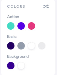
The Startup has a tool that you can use to customize the colors used in your template.

The Action row sets colors that will be used on buttons and links (there are 3 possible styles for these elements).

The Basic row sets colors used for text. There are 4 settings, left to right:
- Main color: the default color for all elements;
- Heading color: the color used for headings and other text, like the text used for input fields.
- White color: the color that will be used for text appearing on dark backgrounds. You should choose a light color for this.
- Gray color: the color used for a few other elements—mostly borders and dividers
The Background row sets colors that will be used for dark (1st option) and light (2nd option) backgrounds.
To change the colors used in an exported template, you’ll have to edit the CSS files.
Changing the Color of All Elements That Share a Class: Using SCSS
If you are using SCSS, you’re in luck because you only have to change the color in one place: it’s variable defined in the scss/variables.scss file. After making the change, the new color will be used anywhere that the variable is used.
If you take a look at the scss/variables.scss file, you’ll find variables for the colors we mentioned previously:
$action_1: #25DAC5;
$action_2: #482BE7;
$action_3: #E93A7D;
$color_main: #1E0E62;
$color_heading: #919DAB;
$color_white: #ffffff;
$color_gray: #EBEAED;
$bg_dark: #2F1893;
$bg_light: #ffffff;
Place in your new color, run the sass command to generate a new CSS file and you should be able to see your changes when you open the index.html file in the browser. You need to re-compile /scss/style.scss and /scss/framework.scss files. Compiled style.css and framework.css files should be in the /css/ folder.
If you aren’t sure which variable is used by a particular class, check the next section for a list of available classes and their corresponding variables.
There are other colors defined in the file:
$color_red: #EA3223;
$color_red_hover: #e10000;
$color_green: #18c967;
$color_green_hover: #0cb658;
$color_facebook: #2e4da7;
$color_twitter: #0aa0f5;
$color_dribbble: #E93A7D;
These cannot be changed by the generator app and we recommend you leave them as they are. Some of them are used when adding popular social media controls.

You can read more about the color classes used by Startup in the documentation.
Changing the Color of All Elements That Share a Class: Using CSS
If you’re using CSS, you’ll have to change all instances of a color used in the CSS files. We recommend using a code editor for this as they usually come with a Find All & Replace All feature that will enable you to make the change in one step. Two free editors that you can use are VS Code and Atom.
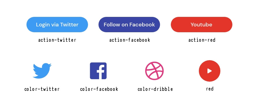
To change the color of a particular class, you first have to know the color it is using. The scss/variables.scss file can help you with this. The following list shows the color class names used in Startup templates and the variable you can use to get the color used from the scss/variables.scss file.
- action-1:
$action_1 - action-2:
$action_2 - action-3:
$action_3 - color-main:
$color_main - color-heading:
$color_heading - color-white:
$color_white - color-gray:
$color_gray - color-transparent-white: this uses
$color_whiteand adds an opacity of0.8to it. - color-red:
$color_red - color-twitter:
$color_twitter - color-facebook:
$color_facebook - color-dribbble:
$color_dribbble - bg-dark:
$bg_dark - bg-light:
$bg_light - bg-action-1:
$action_1 - bg-action-2:
$action_2 - bg-action-3:
$action_3 - bg-main:
$color_main - bg-heading:
$color_heading - bg-white:
$color_white - bg-gray:
$color_gray
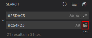
Once you know the color used for a particular class, then search for and replace all instances of it in your CSS files. On both Atom and VS Code, you can open Find & Replace with the keyboard shortcut Ctr+Shift+F (Cmd+Shift+F on macOS).
VS Code:

Atom:

Changing the Color of a Single Element: Using SCSS
If you only want to change the color of a particular element, then first remove its color class. Look at the previous section for a list of classes we use to add color to elements. Then add your own defined class name to the element to make it easier to target in SCSS.
<!-- Remove action-1 class -->
<a href="#" class="link action-1">Sign In</a>

<!-- Add new class (my-cyan-text) -->
<a href="#" class="link my-cyan-text">Sign In</a>
It is optional to use a variable for the new color, but it is recommended as it will be easier to reuse and change the value later when you choose to. Add the variable to the scss/variables.scss file.
$cyan_color: #17a2b8;
Then add a style to the bottom of the scss/style.scss file targeting the class that you added to the element.
.my-cyan-text {
  color: $cyan_color;
}
Now, if you run the sass command to generate a new CSS file, the element should have the new color.
Note that the CSS color property sets the text-color of an element. For some of your styling needs (e.g. to change the color of a button), you’ll need to change the background-color.
<!-- Remove action-1 class -->
<button class="btn action-1 lg">Send</button>

<!-- Add new class (my-cyan-color) -->
<button class="btn my-cyan-color lg">Send</button>
Add the style to the SCSS file:
.my-cyan-color {
  background-color: $cyan_color;
  color: $color_white;
}
You can also choose to set a different background color on the element when the mouse moves over it (you can use a variable for the background-color, but we just used the color HEX code in the example below).
.btn.my-cyan-color:hover {
  background-color: #1592a6;
  color: $color_white;
}
In case your element doesn’t appear with the new color, try adding !important to the style rule to force it to use the color.
.my-cyan-text {
  color: $cyan_color !important;
}
Changing the Color of a Single Element: Using CSS
If you only want to change the color of a particular element, then first remove its color class. Look at a previous section above for a list of classes we use to add color to elements. Then add your own defined class name to the element to make it easier to target in CSS.
<!-- Remove action-1 class -->
<a href="#" class="link action-1">Sign In</a>

<!-- Add new class (my-cyan-text) -->
<a href="#" class="link my-cyan-text">Sign In</a>
Then add a style to the bottom of the css/style.scss file targeting the class that you added to the element.
.my-cyan-text {
  color: #17a2b8;
}
If you refresh the page in the browser, the element should now have the new color.
Note that the CSS color property sets the text-color of an element. For some of your styling needs (e.g. to change the color of a button), you’ll need to change the background-color.
<!-- Remove action-1 class -->
<button class="btn action-1 lg">Send</button>

<!-- Add new class (my-cyan-color) -->
<button class="btn my-cyan-color lg">Send</button>
Add the style to the CSS file:
.my-cyan-color {
  background-color: #17a2b8;
  color: #ffffff;
}
You can also choose to set a different background color on the element when the mouse moves over it.
.btn.my-cyan-color:hover {
  background-color: #1592a6;
  color: #ffffff;
}
In case your element doesn’t appear with the new color, try adding !important to the style rule to force it to use the color.
.my-cyan-text {
  color: #17a2b8 !important;
}