We use the AOS Library to add on-scroll animations that create a nice effect on your Startup webpage. You can customize the animations using the Generator app, and also in your exported template.
Animation Settings
To animate an element, you set the animation type by adding a data-aos="ANIMATION_NAME" attribute to it. The element could be a whole block or just its title and text. You can then adjust the animation’s behavior by using data-aos-* attributes. For example:
<div
    data-aos="fade-up"
    data-aos-offset="200"
    data-aos-delay="50"
    data-aos-duration="1000"
    data-aos-easing="ease-in-out"
    data-aos-mirror="true"
    data-aos-once="false"
    data-aos-anchor-placement="top-center"
>
</div>
- offset: the offset (in px) from the original trigger point.
- delay: a value from 50 to 3000 that indicates the amount of time, in milliseconds, that will pass before the animation runs, when the element is scrolled to. The value should be in steps of 50ms.
- duration: a value from 50 to 3000 that indicates the amount of time, in milliseconds, the animation will take to run. The value should be in steps of 50ms.
- easing: the easing timing function to be used for the animation.
- once: whether the animation should only happen once while scrolling down. The value can be
trueorfalse. - mirror: whether elements should animate out while scrolling past them. The value can be
trueorfalse. - anchorPlacement: defines which position of the element relative to the window should trigger the animation.
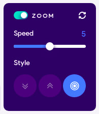
The generator app has a control that you can use to configure some of the above settings.

The control lets you select the animation type (Style) and its duration (Speed). There are three possible styles to choose from: fade-down, fade-up and zoom. The Speed control goes from 0 to 10 with increments of 1. In the code, this translates to durations of 1100ms down to 100ms (i.e. speed 0 is 1100ms, 1 is 1000ms, 5 is 600ms, 10 is 100ms). We’ve also added some sensible delays to the animations to create a nice overall effect. You can experiment with different delays, for different effects. You can, for instance, create a cascading effect by setting different delays on several elements, resulting in the elements animating one after the other (e.g. two or more blocks in a row).
You are also not restricted to using only the options made available by the Startup Animation control. The AOS library offers other settings that you can try on your website.
Below is a list of available options for animations, anchor placements and easing functions. Visit the library’s homepage for a nice demo of the various animations and settings.
Animations
Fade Animations:
- fade
- fade-up
- fade-down
- fade-left
- fade-right
- fade-up-right
- fade-up-left
- fade-down-right
- fade-down-left
Flip Animations:
- flip-up
- flip-down
- flip-left
- flip-right
Slide Animations:
- slide-up
- slide-down
- slide-left
- slide-right
Zoom Animations:
- zoom-in
- zoom-in-up
- zoom-in-down
- zoom-in-left
- zoom-in-right
- zoom-out
- zoom-out-up
- zoom-out-down
- zoom-out-left
- zoom-out-right
Anchor Placements
- top-bottom
- top-center
- top-top
- center-bottom
- center-center
- center-top
- bottom-bottom
- bottom-center
- bottom-top
Easing Functions
- linear
- ease
- ease-in
- ease-out
- ease-in-out
- ease-in-back
- ease-out-back
- ease-in-out-back
- ease-in-sine
- ease-out-sine
- ease-in-out-sine
- ease-in-quad
- ease-out-quad
- ease-in-out-quad
- ease-in-cubic
- ease-out-cubic
- ease-in-out-cubic
- ease-in-quart
- ease-out-quart
- ease-in-out-quart
Adding Custom Animations
You might want an animation that is different from all the animations that the library comes with. AOS allows you to define your own custom animations. To do so, you would first add some CSS styles for the animation:
[data-aos="my-animation"] {
  opacity: 0;
  transition-property: transform, opacity;

  &.aos-animate {
    opacity: 1;
  }

  @media screen and (min-width: 768px) {
    transform: translateX(100px);

    &.aos-animate {
      transform: translateX(0);
    }
  }
}
The above animates the opacity of an element from 0 to 1 (basically fades it in). We use a media query to specify an additional animation if the element is on a screen of a certain size. If the screen size is 768px and above, the element will also slide from right to left.
After defining the animation, you can then use it in HTML:
<div data-aos="my-animation"></div>
You can still use the other attributes like duration and delay with a custom animation.
Adding Custom Easing
Similar to animations you can add custom easings:
[data-aos] {
  body[data-aos-easing="my-easing"] &,
  &[data-aos][data-aos-easing="my-easing"] {
    transition-timing-function: cubic-bezier(.250, .250, .750, .750);
  }
}
Then use it in HTML:
<div
    data-aos="fade-up"
    data-aos-easing="my-easing"
></div>