You might need to allow the user to toggle the visibility of some content on your Startup bootstrap website. This might be content that is important but doesn’t necessarily need to be visible at all times.
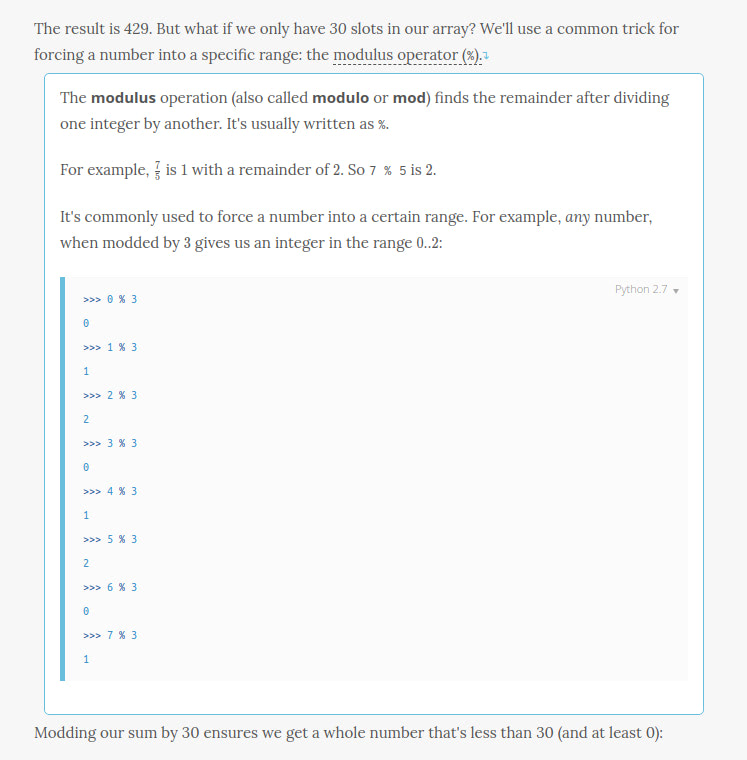
An example use of this can be seen below. The example is taken from the Interview Cake website. The website uses collapsible content to provide further explanation of some terms and phrases. This provides good User Experience because users who are already familiar with these terms aren’t given unnecessary extra content to read, and users who need the detailed explanation can expand the content, read it and move on to the rest of the content.
Content collapsed:

Content expanded:

Let’s see how you can hide and show content on your website.
Collapse
Bootstrap comes with a plugin that can be used to toggle the visibility of content. You use it by adding some predefined attributes and classes to your markup.
Below, we add collapsible content to the page:
<section class="pt-105 pb-45">
  <div class="container px-xl-0">
    <div class="row justify-content-center">
      <div class="col-xl-8 col-lg-10">
        <p>
          <a class="btn sm action-1" data-toggle="collapse" href="#collapseExample" aria-expanded="false" aria-controls="collapseExample">
            Toggle Visibility
          </a>
        </p>
        <div class="collapse" id="collapseExample">
          <div class="card card-body">
            Lorem ipsum dolor sit amet, consectetur adipisicing elit. Facilis nemo quod odio deserunt eaque quas dolor harum eligendi sit nobis. Accusantium explicabo ad, provident debitis asperiores id accusamus amet dolor!
          </div>
        </div>
      </div>
    </div>
  </div>
</section>
The below code, taken from the example above, is used to position and size the container that will hold the collapsible content in our Startup template. You can check out the classes guide for an explanation of what the different classes do.
<section class="pt-105 pb-45">
  <div class="container px-xl-0">
    <div class="row justify-content-center">
      <div class="col-xl-8 col-lg-10">
      </div>
    </div>
  </div>
</section>
To make an element collapsible, you add the class collapse to it. You then add a button or a link that will be used to trigger the collapse or expansion of the element. You reference the .collapse element with the link’s href attribute or the button’s data-target attribute. By default, .collapse elements will appear collapsed when the page loads. If you want the element to be open by default, then add the class show to it. We use the card and card-body classes which are typically used to style cards, to give the collapsible content a nice rounded border.
Below, you can see the collapsed and expanded element. Collapsing an element animates its height from the current value to 0 and vice versa when expanding it.
Collapsed:

Expanded:

We’ve used an anchor tag, styled like a button to toggle the .collapse element’s visibility. We could also have used a button instead. When using a button, you reference the .collapse element with data-target instead of href.
<button class="btn sm action-1" type="button" data-toggle="collapse" data-target="#collapseExample" aria-expanded="false" aria-controls="collapseExample">
  Toggle Visibility
</button>
In the example below, we recreate something similar to the example we looked at in the introduction (i.e. we include collapsible content within a block of text).
<section class="pt-105 pb-45">
  <div class="container px-xl-0">
    <div class="row justify-content-center">
      <div class="col-xl-8 col-lg-10">
        The result is 429. But what if we only have 30 slots in our array? We'll use a common trick for forcing a number into a specific range: the
        <a class="link action-1" data-toggle="collapse" href="#modulus" aria-expanded="false" aria-controls="modulus">
          modulus operator (%)↴.
        </a>
        <div class="collapse" id="modulus">
          <div class="card card-body">
            <p>
              The modulus operation (also called modulo or mod) finds the remainder after dividing one integer by another. It's usually written as %.
            </p>
            <p>Blah blah blah...</p>
          </div>
        </div>
        Modding our sum by 30 ensures we get a whole number that's less than 30 (and at least 0).
      </div>
    </div>
  </div>
</section>
You can see the result below.
Collapsed:

Link clicked to reveal definition:

Accordion
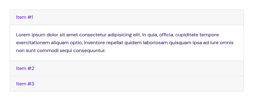
You can also use collapsible content to present information in a more compact and skimmable manner while giving the user the option to view more details. You can, for instance, create an accordion that enables you to present data in a list. Each item in the list can be clicked on to reveal more information.
To create an accordion, you use a card component and extend the default collapse behavior that we’ve looked at to create a column of collapsible items.
<section class="pt-105 pb-45">
  <div class="container px-xl-0">
    <div class="row justify-content-center">
      <div class="col-xl-8 col-lg-10">
        <div class="accordion" id="accordionExample">
          <div class="card">
            <div class="card-header" id="headingOne">
              <a class="link action-2" data-toggle="collapse" href="#collapseOne" aria-expanded="false" aria-controls="collapseOne">
                Item #1
              </a>
            </div>
            <div id="collapseOne" class="collapse" aria-labelledby="headingOne" data-parent="#accordionExample">
              <div class="card-body">
                Lorem ipsum dolor sit amet consectetur adipisicing elit. In quia, officia, cupiditate tempore exercitationem aliquam optio, inventore repellat quidem laboriosam quisquam ipsa ad iure omnis non sunt commodi sequi consequuntur.
              </div>
            </div>
          </div>
          <div class="card">
            <div class="card-header" id="headingTwo">
              <a class="link action-2" data-toggle="collapse" href="#collapseTwo" aria-expanded="false" aria-controls="collapseTwo">
                Item #2
              </a>
            </div>
            <div id="collapseTwo" class="collapse" aria-labelledby="headingTwo" data-parent="#accordionExample">
              <div class="card-body">
                Lorem ipsum dolor sit amet consectetur, adipisicing elit. Ut at maiores magnam deserunt, unde eum incidunt delectus dolores doloribus et error mollitia maxime porro eius? Obcaecati beatae neque voluptate sit!
              </div>
            </div>
          </div>
          <div class="card">
            <div class="card-header" id="headingThree">
              <a class="link action-2" data-toggle="collapse" href="#collapseThree" aria-expanded="false" aria-controls="collapseThree">
                Item #3
              </a>
            </div>
            <div id="collapseThree" class="collapse" aria-labelledby="headingThree" data-parent="#accordionExample">
              <div class="card-body">
                Lorem, ipsum dolor sit amet consectetur adipisicing elit. Adipisci iste velit laudantium totam magnam? Consectetur et assumenda corrupti debitis, praesentium blanditiis ullam distinctio ab, libero tempora vero, ipsum accusamus odit?
              </div>
            </div>
          </div>
        </div>
      </div>
    </div>
  </div>
</section>
To create an accordion, you add the accordion class to the accordion wrapper element. Each item in the accordion is a card, with the card header acting as the collapse/expand trigger and the card body being the collapsible content. To add accordion-like group management to a collapsible area, add the data attribute data-parent="#selector". By default, all items in the accordion will start out collapsed, but if you want one to be open when the page loads, then add the class show to the particular .collapse element.
Below, you can see the accordion created by the code above:

