How to Optimize Your Emails for Dark Mode
Learn how Gmail, Outlook, and iOS Mail apply dark mode to emails and follow proven design techniques to optimize colors, contrast, and layout so your messages stay readable, consistent, and accurate across all email clients.
Dark Mode Preview (Top Toolbar)
To help you account for dark mode behavior early in the design process, you can use the Dark Mode preview toggle in the top toolbar when opening Preview & Share. This view allows you to quickly switch between Light and Dark modes and see how your email may appear when dark mode is enabled in supported email clients (Apple Mail, Outlook Mac and Outlook Windows).

Keep in mind that Email clients continually update the way dark mode is rendered, and each client, such as Gmail, Outlook, and iOS Mail applies its own transformation rules. However, using the Dark Mode preview helps you identify potential contrast, color, and readability issues before sending and makes it easier to design emails that remain clear and consistent across viewing preferences.
What Is Dark Mode in Email?
Dark mode has become a standard viewing preference across operating systems, devices, and major email clients. While it improves readability for many users and reduces eye strain, it also introduces new and often inconsistent rendering behaviors that email designers must account for. Unlike web design, you cannot control how an email client interprets dark mode. Each client applies its own transformation logic, and these rules continue to evolve over time.
Example of the same template viewed in Gmail on iPhone (iOS), shown in Dark Mode vs. Light Mode:

Because dark mode behavior depends entirely on the email client, the device, and the user’s system settings, email builders, including Postcards, cannot override, disable, or force dark mode behavior.
The rendering engine makes that decision at the moment the user opens the message. For this reason, the most reliable strategy is to design your email so it looks correct and consistent in both light and dark modes and to test across multiple clients before sending.
Below is a practical guide to help you optimize for dark mode and avoid the most common rendering issues.
How Email Clients Modify Emails in Dark Mode
Email clients use several different approaches to convert light emails into dark versions. These behaviors vary significantly and may change as clients update their apps. Understanding these changes is essential when you optimize emails for dark mode across Gmail, Outlook, and iOS Mail.
The following transformations are commonly observed:
- Full-Color Inversion: Some clients invert all colors; backgrounds, text, and sometimes even images. Observed in: certain versions of Gmail app, older iOS Mail versions.
- Partial Inversion: Only specific colors (usually background and text) are inverted. Images often remain unchanged. Observed in: iOS Mail (modern builds), Outlook Mobile (partial variations).
- Selective Color Adjustment: Rather than inverting, some clients subtly adjust colors to maintain readability in dark environments. Examples: light backgrounds darkened, dark text lightened.
- No Inversion: A minority of clients respect the original design and do not apply global changes, relying solely on system settings or CSS preferences when available. Observed in: certain versions of Apple Mail on macOS and iOS when respecting color-scheme meta tags.
- Hybrid Approaches: Some clients combine rules, applying inversion to some elements while leaving others intact. For example, the background color is inverted, the text is lightened, and the images remain untouched. This often leads to readability issues or unexpected color shifts. Observed in: Gmail app (iOS/Android), Outlook mobile.
Why You Can’t Override a Client’s Dark Mode Rendering
Dark mode is applied after the email is loaded, directly by the email client or operating system. This means:
There is no reliable hack or code snippet that can prevent inversion. You cannot force an email client to show light mode, dark mode, or a specific version of your design. Even CSS declarations like prefers-color-scheme are inconsistently supported and often ignored.
In other words, dark-mode transformation happens at the client level, not the HTML level. The only sustainable approach is to design an email that holds up visually regardless of which rendering method the client uses.
Dark Mode Email Design Best Practices
Below are the fully expanded and refined best practices for optimizing your emails for dark mode, written to help you anticipate client-side changes and design layouts that remain consistent, readable, and visually strong in both light and dark environments. These best practices help create reliable dark mode email design that holds up across clients.
Avoid Pure White (#FFFFFF) and Pure Black (#000000)
Using pure white or pure black, particularly for background sections, often triggers aggressive color inversion in many email clients and can lead to unpredictable dark-mode results. Instead, opt for softer, more flexible tones that adapt gracefully across environments. Consider using off-whites, dark grays, and near-black shades; these colors maintain smoother contrast, reduce the risk of distortion, and help preserve your design’s intended look whether viewed in light mode or dark mode.
Recommended ranges:
- Off-whites: #F7F7F7 , #F2F2F2 , #EFEFEF
- Dark grays: #1E1E1E , #2A2A2A , #333333
- Near-black values: #0D0D0D , #111111 , #161616
These tones tend to behave more predictably under both full and partial inversion, giving your email a cleaner, more stable appearance across clients.
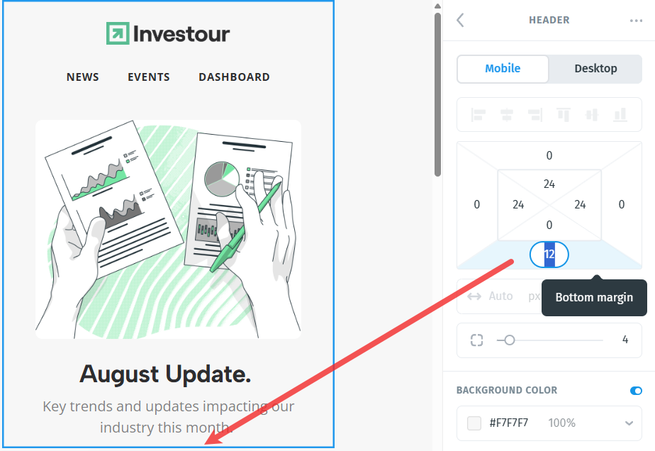
Changing backgrounds in Postcards:
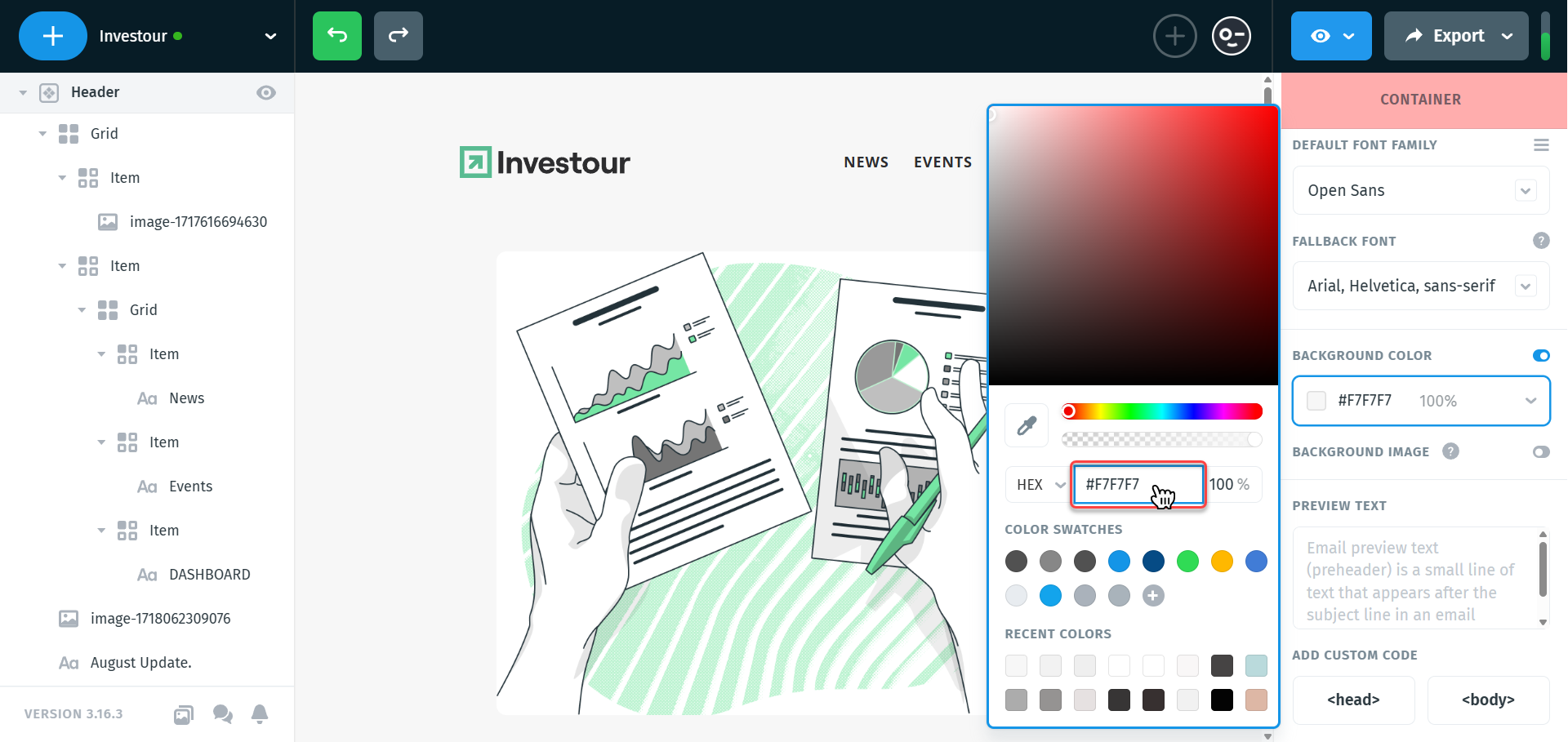
If you want to experiment with these tones in your design, you can adjust them directly in Postcards. To change the overall email background (container), click any empty area of the canvas to deselect all modules, this will reveal the container settings in the right-hand panel. From there, use the Background Color control to apply your desired shade.
To update the background of a specific module, simply select the module on the canvas and adjust its Color Background settings in the right panel. Postcards applies changes instantly, making it easy to preview different options as you refine a dark-mode-friendly palette.
Use Transparent PNGs Whenever Possible
Transparent backgrounds allow images to blend naturally with both light and dark themes, making your design feel more cohesive across clients. If you must use images with their own background, add sufficient padding around the primary element to help the image sit comfortably within the layout and avoid any abrupt visual contrast.

When an email client shifts background colors in dark mode, images with solid, non-transparent backgrounds can create harsh or unintended “boxes” around logos, icons, buttons, or illustrations. Using transparent PNGs helps these elements adapt to whatever background they sit on, whether it's a light tone, a softened gray, or a deep dark-mode shade, resulting in cleaner edges, smoother transitions, and a more polished overall appearance.
Add Outlines to Text Embedded in Images
As you may have noticed in the previous example, we applied a thin outline to the text inside the logo to keep it readable in dark mode.
When your logo is an image rather than live text, dark-mode transformations can invert or shift colors in ways that make dark lettering difficult to see. Adding a subtle light outline around the text of your logo or image creates a stable layer of contrast that holds up even under full or partial inversion. This ensures your logo remains legible on both light and dark backgrounds, regardless of how each email client applies dark-mode adjustments.
Adding outline
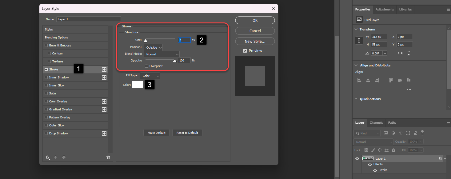
If your logo or image already has a transparent background, you can add this outline quickly in most image-editing tools. In Photoshop specifically:
- Select the logo layer and open the Layer Style panel, then apply a 1–2 px white Stroke set to Outside.
This gives the text a clean contrast edge that holds up in dark mode. Once you’re happy with the outline, export the logo as a transparent PNG so it blends naturally with any email background.
If your logo still has a solid background, you can remove it using most image-editing tools or even free online apps. Tools like remove.bg work well for quick background removal and are helpful when you need a fast solution.
However, for the cleanest and most precise results, it’s still best to do this in Photoshop or other dedicated image-editing software. In Photoshop, you can isolate the logo or image by using features like Remove Background, Select Subject, or Color Range, then delete or mask out the background and export the final logo as a transparent PNG.
Use a Light Logo on a Dark Background & Keep Main Content on Light
Some email clients apply aggressive or uneven dark-mode transformations, especially when dealing with light backgrounds. This can make a light or white logo placed directly on a light background appear washed out, low-contrast, or visually disconnected once dark mode adjusts the surrounding colors. Even if the logo itself isn’t inverted, the background behind it often shifts to a darker tone, which can change the overall balance of your design.
A reliable way to protect your brand consistency is to place your light or white logo on a dedicated dark background block at the top of your email. This small, solid dark section acts as a stable backdrop that email clients are far less likely to invert or alter, ensuring the logo remains clear and readable in both light and dark mode. The dark block essentially creates a “safe zone” where your branding won’t be affected by the unpredictable color manipulation happening elsewhere in the message.

Below this header area, you can keep the main body of your email on a lighter background. This preserves the clean, traditional layout most readers expect and avoids the aesthetic and readability issues that often come with fully dark email designs. The combination of a dark logo block and a light content area strikes a balance between visual safety and design consistency, your logo remains protected, while your content stays easy to read across all major email clients.
This pattern is widely used by brands because it provides a level of control in environments where email clients handle dark mode very differently. Gmail Android, for example, tends to heavily darken or invert light backgrounds, while leaving images largely untouched; this mismatch can make your logo look out of place unless it sits on a controlled dark surface. Using a dark header block ensures that your logo always has reliable contrast, no matter how the rest of the email is transformed.
Consider Designing “Dark Mode First”
For some brands, starting with a dark base palette can be a strategic choice. Designing the email with dark mode in mind from the beginning often reduces inversion-related distortions and creates a more consistent experience for users who primarily view emails in dark mode.
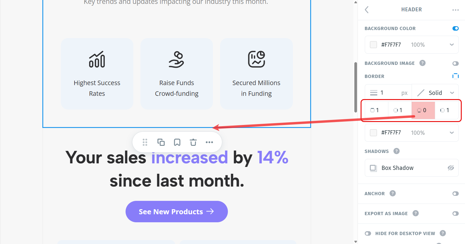
Add a 3px Border Matching the Background
In dark mode, background colors can shift in ways that cause sections to blend together or lose their visual definition. Adding a subtle 3px border, using a color that matches or closely complements the background helps maintain structure, prevents modules from visually merging, and reduces the “collapse” effect that can occur when backgrounds are inverted.
This small adjustment keeps your layout clear and intentional across both light and dark environments.
Inserting border in Postcards:
You can add borders directly inside Postcards to give your modules a clearer structure and improve readability in dark mode. Borders are applied at the module or group level, and Postcards gives you full control over which sides of the module the border appears on.
- Select the module (or group) you want to adjust on the canvas.
- In the right-hand panel, scroll down to the Border section.
- Enable the border if it isn’t already active.
- Set the Width (e.g., 3px).
- Pick the Color, ideally something close to your background tone so the border isn’t noticeable in light mode.
- Choose whether the border should apply to All sides or only specific ones.
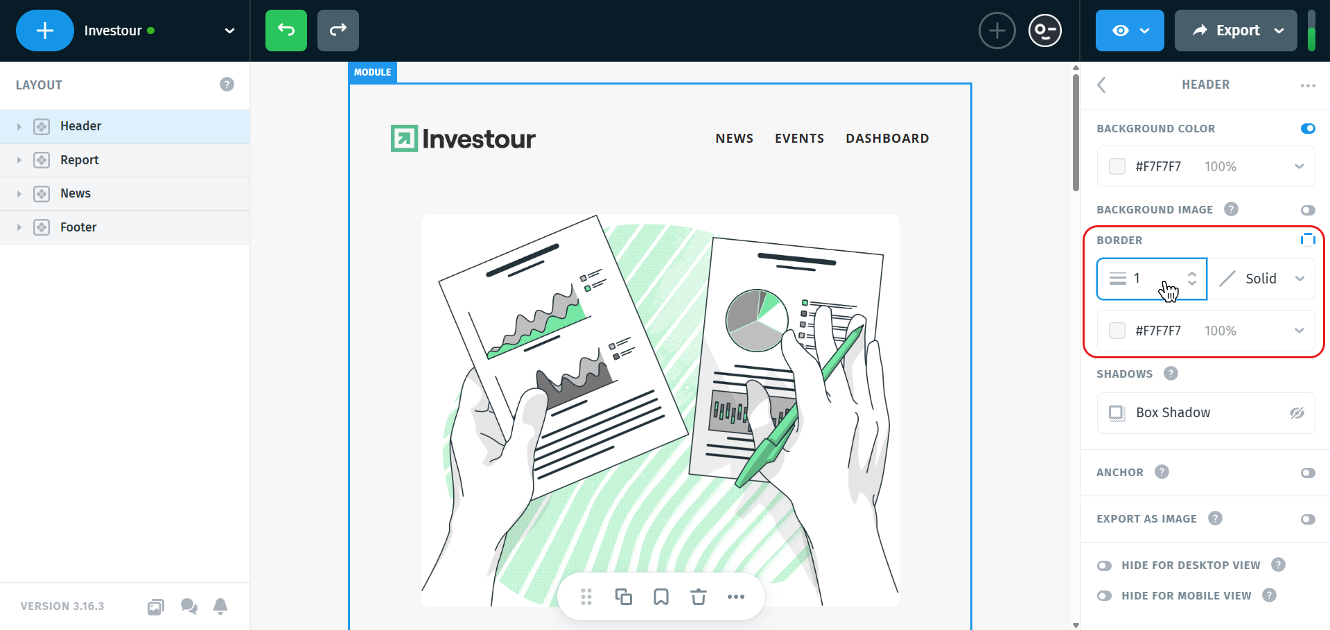
Postcards updates the border instantly, letting you see the effect as you adjust your layout.
Choosing Which Sides Receive the Border (Important for Stacked Modules)
Postcards allows you to assign borders to top, bottom, left, right, or all sides. This is important when stacking modules vertically.
For example: If you add a 3px border to the bottom of Module A and a 3px border to the top of Module B beneath it, you will end up with 6px of border between them, doubling the thickness where they meet.
To avoid this, apply the border to only one of the modules at the touching edge. This keeps your spacing clean and prevents accidental “thick spots” in the layout.
You can also add padding between modules to create separation when using borders. A little top or bottom padding helps keep the modules visually distinct without causing their borders to overlap or appear doubled. This is a simple way to maintain clean spacing and avoid the thicker “stacked border” effect that can happen when two bordered modules sit directly against each other.
Avoid Placing Text Directly Over Background Images
Text layered directly on top of background images becomes unreliable in dark mode because many email clients subtly dim or darken background images to improve overall readability. Even small changes to brightness can weaken text contrast, making your copy harder to read or causing it to blend into the image beneath it.
To keep your message clear, avoid placing text directly on a background image. Instead, place your text inside a solid-color block, semi-transparent overlay, or a dedicated text container positioned over the image. This gives your text a stable, consistent surface that email clients are far less likely to alter, ensuring readability remains strong in both light and dark viewing modes.
Maintain High Text Contrast
Strong, accessible text contrast is essential in both light and dark mode. Because many email clients adjust, darken, or even invert colors automatically, starting with high contrast ensures your text stays readable even when those transformations occur. When the base contrast is already clear and balanced, dark-mode shifts are less likely to wash out your text or make it blend into the background.
To keep your typography consistent across environments:
- Use dark text on light backgrounds (e.g., #111111 or #222222 on off-white tones like #F7F7F7 or #F2F2F2).
- Use light text on dark backgrounds (e.g., white or soft grays like #EDEDED on near-black tones like #0D0D0D or #111111).
- Avoid pure white text on pure black backgrounds, since both tend to invert aggressively and can become visually harsh. Softer variations are more stable and comfortable to read.
WCAG Contrast Guidelines
For reliable readability in both light and dark mode, it’s helpful to follow the WCAG (Web Content Accessibility Guidelines) recommendations for text contrast. WCAG suggests at least:
- 4.5:1 contrast ratio for normal body text
- 3:1 contrast ratio for large text (18px+ or 14px bold)
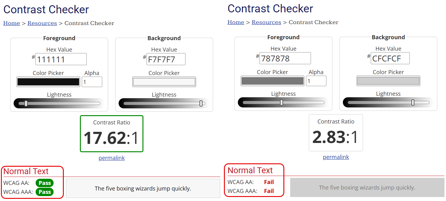
Sticking to these ratios creates a strong baseline that remains readable even when dark-mode adjustments darken, lighten, or invert parts of your design.
You can quickly check your color combinations using a free tool like:
https://webaim.org/resources/contrastchecker/
WCAG reference:
https://www.w3.org/WAI/standards-guidelines/wcag/
Use Midtone Colors for More Resilient Rendering
Midtone colors tend to behave more consistently across email clients, especially in dark mode. Because they sit between pure light and pure dark values, they are far less likely to trigger aggressive inversion. Midtones also maintain better readability when backgrounds shift or dim, and they’re handled more predictably by most dark-mode algorithms. Incorporating midtones into your palette helps create a more stable, balanced design that holds up across a wide range of clients and viewing modes.
Have Light and Dark Versions of Your Logo
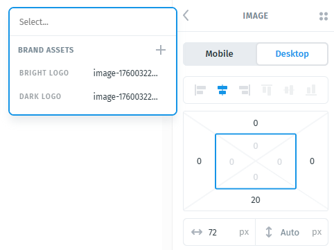
It’s best to maintain two versions of your logo; one optimized for light backgrounds and one for dark background. Always load the correct version as an image rather than relying on CSS-based inversion tricks, which are not reliable across email clients and can produce inconsistent results.
For convenience, you can upload both logo variations directly into your Brand Presets in Postcards. This makes it easy to swap between the light and dark versions depending on the section of your email or the background you’re working with.
You can learn more about setting up Brand Presets here.
Having both versions ready ensures your branding remains clean, readable, and consistent across all light and dark mode environments.
Keep the Layout Simple
Simple layouts hold up far better in dark mode. The more you avoid overlapping elements, complex layering, heavy gradients, or intricate background effects, the more predictable your results will be across different email clients. Dark mode algorithms tend to struggle with complex designs, often applying uneven color adjustments or unexpected inversion. A clean, straightforward structure helps ensure your email renders consistently and remains easy to read in both light and dark environments.
Use Neutral Elements to Stabilize Your Layout in Dark Mode
Dark mode can shift the perceived balance of your design, especially when background colors darken or invert. A helpful way to keep your layout visually stable is to incorporate neutral elements, subtle dividers, muted card backgrounds, low-contrast containers, or simple grayscale shapes. These neutrals act as steady visual reference points, helping maintain hierarchy and structure even when the surrounding colors change.
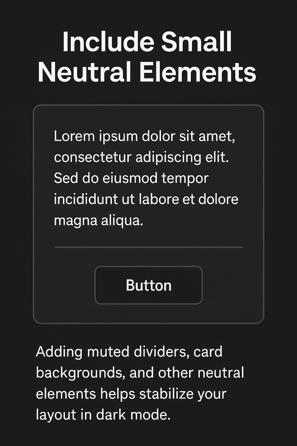
Adding small neutral elements around key areas such as text blocks, CTAs, feature cards, or section dividers helps prevent your content from “floating” on dark backgrounds. They bring clarity, support spacing, and anchor your layout so it feels intentional and balanced in both light and dark environments.
Expect Ongoing Changes
Clients like Gmail, Outlook, and Apple Mail periodically update their dark-mode logic. A design that renders perfectly today may behave differently after an app or OS update. Staying aware of these changes is part of maintaining healthy email design workflows.
Testing Dark Mode Email Rendering
Testing is essential, use tools like Litmus or Email on Acid to preview how your design behaves under different dark-mode conditions. Whenever possible, also test on real devices, since these clients apply dark mode very differently. Testing remains the only reliable way to confirm that your email displays correctly and maintains readability across all environments.
Conclusion
Designing emails that work reliably in dark mode requires understanding how each client, Gmail, Outlook, and iOS Mail applies its own color adjustments and inversion rules. By using midtones, maintaining strong contrast, choosing transparent PNGs, outlining logo text, and avoiding risky overlays, you can create templates that remain readable and visually stable across every environment. Testing your email across major clients, especially in dark mode, is the best way to ensure that your final design behaves as expected.
If you want quick answers to the most common issues related to dark mode email rendering, the FAQ below covers the questions people ask most often.
FAQ: Dark Mode Email Design & Rendering
1. Can I disable dark mode in Gmail, Outlook, or iOS Mail?
No. Email clients apply dark mode automatically, and designers cannot disable or override it. Gmail, Outlook, and iOS Mail all use their own dark-mode algorithms, which may invert colors, adjust backgrounds, or lighten text to improve readability.
2. Why does my email look different in Gmail dark mode?
Gmail applies color inversion and selective adjustments when dark mode is enabled. Light backgrounds may be darkened, dark text may lighten, and some image colors may shift. These transformations happen on the client side, after the email loads, so they can’t be controlled from your HTML.
3. Why does Outlook change my background colors or ignore dark mode styles?
Outlook uses a different rendering engine than Gmail and Apple Mail, and it often applies partial inversion or ignores CSS related to prefers-color-scheme. In some cases, Outlook may skip background images entirely or replace them with solid colors. Designing with midtones and consistent contrast helps reduce visibility issues.
4. How do I keep my logo readable in dark mode?
Use two logo versions: a light logo for dark backgrounds and a dark logo for light backgrounds. Upload both to your Postcards Brand Assets and swap them based on the section’s background color. If your logo has embedded text, add a thin outline to maintain readability when colors shift in dark mode.
5. What colors work best for dark mode email design?
Avoid pure white (#FFFFFF) and pure black (#000000) because they trigger aggressive inversion in many clients. Instead, use off-whites, dark grays, and near-black midtones (e.g., #F7F7F7, #1E1E1E, #111111). These behave more predictably under full or partial color inversion.
6. How do I prevent text from becoming unreadable in dark mode?
Keep text on solid backgrounds, maintain strong contrast ratios (WCAG AA or higher), and avoid placing text directly on background images. Many clients dim images in dark mode, which reduces text contrast. High-contrast color pairs help ensure readability across all modes.
7. Do dark-mode safe emails require special code?
No special HTML is required. Most dark-mode safety comes from design decisions—midtone palettes, transparent PNGs, outlined logo text, solid text containers, and simple layout structures. Technical hacks for forcing light mode or disabling inversion do not work consistently across clients.
8. How should I test dark mode email rendering?
Use tools like Litmus or Email on Acid to preview dark mode across Gmail, Outlook, and iOS. Whenever possible, test on real devices, as mobile clients often use different dark-mode algorithms than desktop or web-based versions.
9. Does Postcards support dark mode optimization?
Yes. Postcards makes dark mode optimization easier by giving you control over midtone backgrounds, strong contrast options, flexible brand presets, and a clean module-based layout system that behaves predictably in both light and dark environments. While Postcards cannot override Gmail or Outlook’s dark mode transformations, it provides the structure and design tools needed to create emails that remain readable, consistent, and stable across all major clients.