Brand Presets
Brand Presets act like your personal design system inside Postcards. They allow you to define reusable brand elements such as colors, fonts, and images – that will automatically apply across your projects.
For example, if your company decides to change its primary color from blue to red, updating the Brand Presets will apply that change instantly across all your saved projects and Postcards pre-made modules. This ensures design consistency and speeds up your workflow.
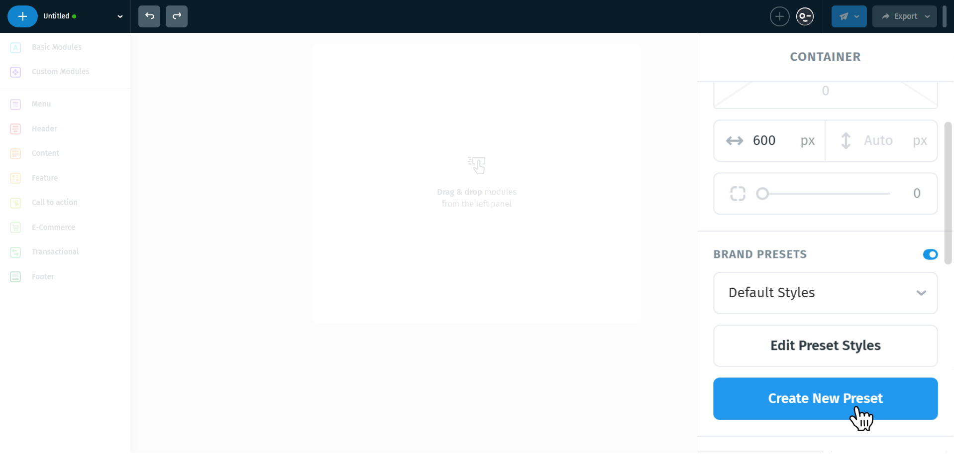
When you first open a project in Postcards, you’ll notice a light-blue information box on the right side of the editor. This explains what Brand Presets are and gives you the option to enable them.
Tip: If you’re working on a one-off project (like a single campaign or test), Brand Presets may not be necessary. But for ongoing brand usage, they’re invaluable for maintaining consistency and saving time.

Working with Brand Presets
Once Brand Presets are enabled, you’ll notice the toggle switch turn blue. You can always deactivate it later if you no longer want to stick with the presets.
Alongside the toggle, you’ll also see a Default Styles dropdown. By default, this is applied to your project, but you can create additional style sets if you’d like to experiment or maintain multiple brand guidelines (for example, for different clients).

There’s also an Edit Presets button. Pressing it will open the full customization panel where you can adjust colors, text styles, and other brand settings. Any modifications made here will be saved as a new custom Brand Preset. This means the default preset remains unchanged – ensuring you always have a clean baseline to return to.

Brand Assets
Brand Assets allow you to store and reuse the core elements of your brand identity, ensuring consistency across all your newsletters.
You can add:
- Bright Logo (for use on dark backgrounds)
- Dark Logo (for use on light backgrounds)
- Brand Name & Address

Once edited, you’ll see that all pre-made modules automatically update with your new assets - saving you time and ensuring brand consistency.

After customization, the preset name will also update. For example, instead of just Default Styles, you might see Default Styles (1). This indicates that a new Brand Preset has been created, keeping the original default intact.

You can also press the “+” icon to add additional Brand Assets. By default, this will insert an image, which you can replace with a custom image or switch to a direct URL.

Additionally, right-clicking on a Brand Asset will reveal two options:
- Duplicate – create a copy of the asset for easy modifications.
- Delete – remove the asset from your Brand Presets.

Color Swatches
By default, Postcards includes 5 predefined brand colors along with 7 additional slots for custom colors. Clicking on any swatch will reveal the color palette, where you can either:
- Navigate and pick a color visually
- Insert a specific hex color code directly

Right-clicking a swatch will provide three options:
- Rename – assign a unique name to your color for easier identification
- Duplicate – create a copy of the swatch to make slight variations
- Delete – remove the swatch from your Brand Presets

Text Styles
By default, Postcards provides 4 predefined text styles:
- Title 1
- Paragraph
- Very Long Title Block
- Text Style
Each of these styles can be customized to match your brand’s look and feel.

You can add more text styles by pressing the + button if needed.

Right-clicking a text style will reveal two options:
- Duplicate – create a copy to make variations
- Delete – remove the style from your Brand Presets

Button Styles
The default button styles are named Primary, Secondary, Stroke, Small, and Micro for a reason:
- Primary – This is your main action button, the one you want users to notice and click first (e.g., “Buy Now” or “Subscribe”).
- Secondary – For supporting actions that are important but less prominent than the primary button (e.g., “Learn More”).
- Stroke – Often used for subtle actions or when a lighter visual is preferred.
- Small / Micro – For secondary or tertiary actions where space is limited, or for buttons that appear in footers, toolbars, or inline with text.
To avoid feeling limited, you can add as many custom button styles as needed by pressing the + button.

Clicking on any button style allows you to customize its appearance separately for desktop and mobile.

Clicking right-click on any button style will reveal:
- Duplicate – create a copy of the style for easy variations.
- Delete – remove the style if no longer needed.

Menu
The Menu comes with 4 predefined links by default, but each link can be fully customized to fit your needs.
Purpose of Menu Links:
- Typically used for important navigation elements that are reused across newsletters.
- Examples include linking to the homepage, a featured product, or key sections of your website.

Social Networks
By default, Postcards includes 3 predefined social networks: Facebook, X.com, and Instagram.
Each social icon can be changed to any other from the predefined icon list.
Note: If you only need a simple link without a predefined icon, it’s often better to include it in the Menu section or as part of your Brand Assets.

Variables
Postcards includes a Variables section to insert placeholders that will later be replaced with real content by the email service you send through.
By default, there are 3 predefined variables:
- {{unsubscribe}} – Placeholder for the unsubscribe link. The email service will replace it with the correct URL when sending.
- {{manage-preferences}} – Placeholder to let recipients manage their email preferences.
- {{view-in-browser}} – Placeholder for a “view in browser” link, useful if the email doesn’t display properly in some clients.
Why these exist:
- They ensure your emails are compliant with anti-spam rules once sent.
- They improve user experience by giving recipients control over how they receive emails.
- They allow the email to render properly in any client when the service replaces the variable with the actual link.
Note: Postcards itself does not handle these links - variables are placeholders. The real URLs are generated and inserted by the email service you connect with.

How to Apply Brand Assets
If you are using a template that mostly fits your needs but needs to reflect your brand:
- Select the element you want to update on the canvas (e.g., an image, text, or button).

- On the right panel, near the panel name, you will see a four-dot icon.

Click the icon to reveal the available brand assets that correspond to the type of element selected.

Example: If you select an image, only pre-defined images from your brand assets will be displayed for quick replacement.
Note: Only the relevant assets for the selected element type will appear, ensuring faster and error-free updates.

Once brand presets are applied, a new section called Preset will appear on the right panel.

Only for Text Elements
Text elements can have up to 2 brand assets applied simultaneously, such as text style and font color.

Unlink
Sometimes, you may want to keep an element styled with your brand presets but still make project-specific adjustments that won’t affect your global brand settings.
That’s where Unlink comes in:
- When you press the Unlink icon, the element will keep all the preset values as a starting point.
- From that moment, you can freely edit it, and the changes will apply only to the current project.
- Future updates to your brand presets will not overwrite this unlinked element.
This is especially useful if you want a small variation of your brand style for one campaign without breaking consistency across other projects.

Publish Changes
When you use a defined Brand Preset in multiple projects, Postcards helps keep everything consistent.
Here’s what happens:
- If you try to edit or add a new item to a Brand Preset, a light-yellow notification block will appear above the Preset name in the right panel.
- This block will suggest: “Update all projects where this preset is currently in use.”
- To confirm, simply click the Publish Changes button.

Once published, you’ll see a green confirmation message letting you know that all updates were successfully applied across every project using that preset.
This makes sure your brand always stays consistent – whether you change a logo, a color, or a text style, everything gets updated automatically in one click.

What if you Forget to Publish?
No worries – it’s not critical. Any changes you make inside the current project will still stay saved.
However, when you later open another project that uses the same preset, a popup will prompt you to push changes (update styles).
You can choose to publish changes or cancel/exit.
Just remember: to keep everything consistent across all projects, you need to eventually hit Publish Changes inside the preset.

Generate a Brand Preset from Your Website (AI Beta)
Use AI to instantly create a Brand Preset from any website URL and apply your brand style across Postcards projects. The AI analyzes your site and automatically builds a starter preset with your brand’s colors, logos, fonts, buttons, and more, ready to apply across your projects for perfectly on-brand emails in seconds. You can review and fine-tune every element the AI creates before applying it.
How to open the feature and use it
- Open your project in Postcards
- On the right panel, find Brand Presets and toggle it ON. Click Create New Preset.
- In the Create New Preset window, enter a Preset Name (i.e. your company or product name).
- Open "Starting Point" and choose Generate using AI from URL (beta).
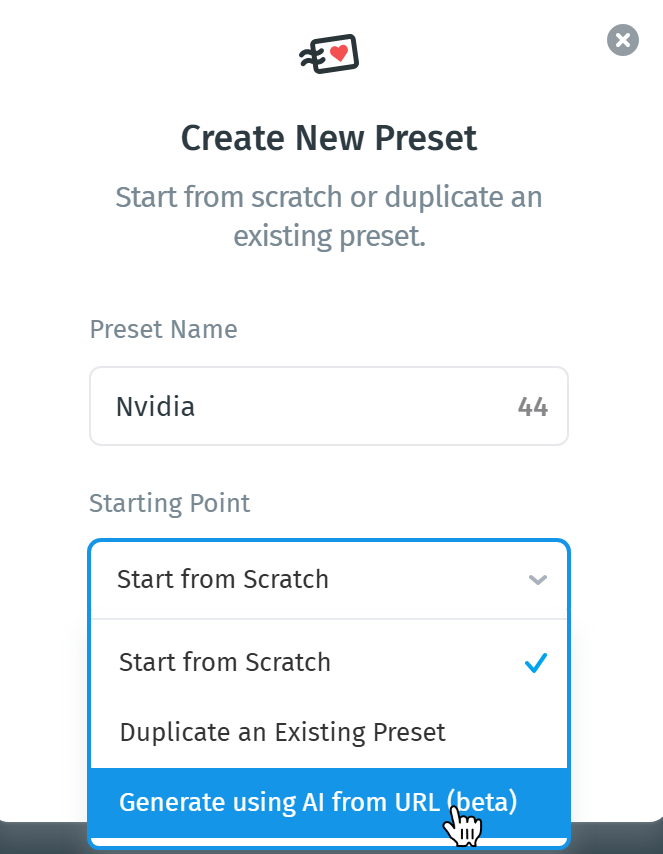
- Paste your full public website address (e.g., https://yourcompany.com ) into the field, then click Create.
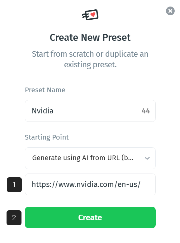
- Let Postcards generate the preset. Postcards will analyze the URL and generate a new Brand Preset based on your site’s look and feel.
- (Optional) Tick Set by Default in the preset header to make this preset the default for the current project, new elements will use these styles out of the box.
- Your preset is now available from Brand Presets → dropdown. Switch presets anytime or click Edit Preset Styles to update it.
What gets generated
Once complete, your new preset opens automatically in the Preset Editor.
You’ll see that Postcards has filled in a full structure of brand assets and styles:
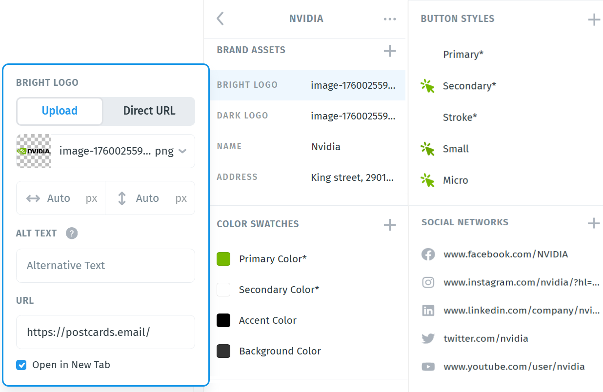
- Brand Assets — your light and dark logos, brand name, and address (if detected).
- Color Swatches — primary, secondary, accent, and background colors extracted from your website.
- Text Styles — default font family, title size, and paragraph style.
- Buttons — primary and secondary button designs with brand colors.
- Menu & Socials — navigation items and default social icons.
You can review and edit every element before saving, then use it just like any other Brand Preset to build consistent, on-brand email templates.
