How Text Works in Postcards
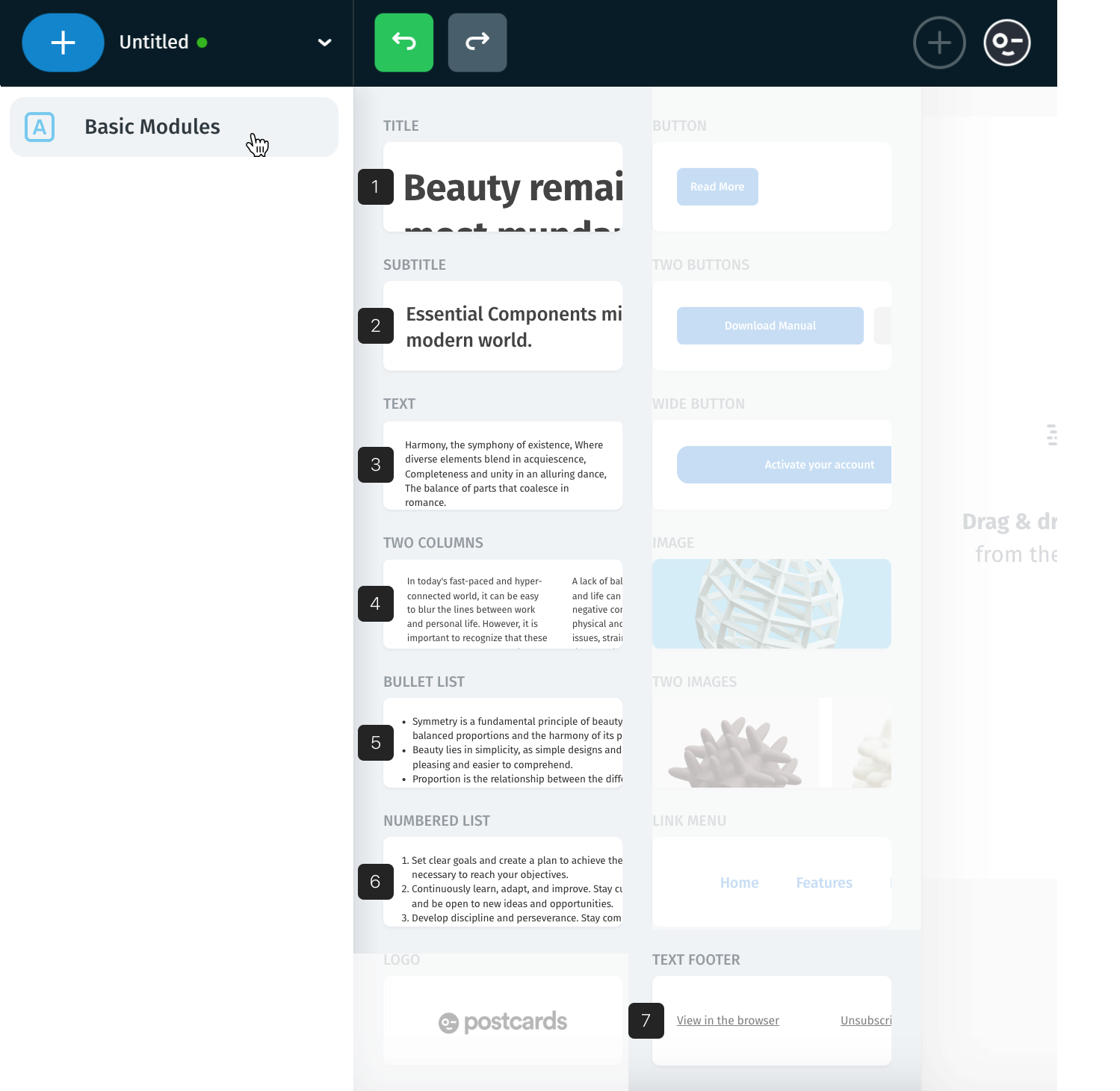
To add a text, navigate to Basic Modules and choose the desired text type you want to add.
There are 7 predefined types:
- Title
- Subtitle
- Text
- Two Columns
- Bullet List
- Numbered List
- Text Footer
We will go through all of them to show what better suits your needs.
Note: Modules are designed for quickly accessing the most common text types.
But don’t feel limited - in fact, any text block can be customized or transformed into another type using font size, weight, spacing and more.
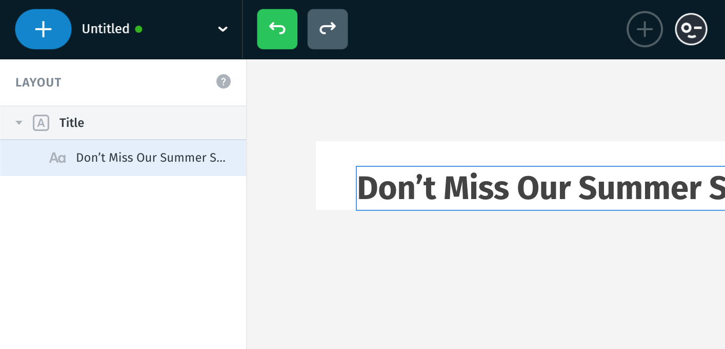
1. Title
This is the main headline of your email - like the title of an article. It’s the biggest and boldest text by default, meant to grab attention first, usually placed at the top of a section or email.
Great for short and powerful messages like: “Don’t Miss Our Summer Sale!”
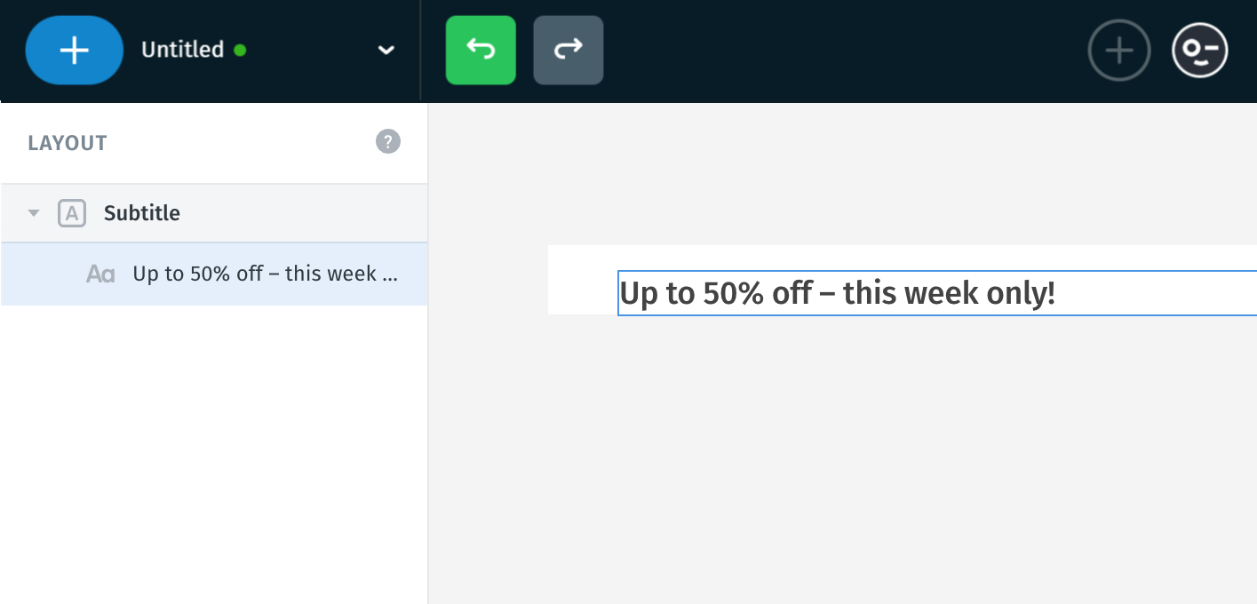
2. Subtitle
This is used for secondary headlines - smaller than a title, but still important. It helps introduce or support the main message.
A good place to give more context or a quick explanation. Example: “Up to 50% off – this week only!”
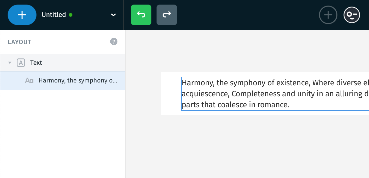
3. Text
This is standard body text (paragraph), perfect for descriptions, details, and longer messages.
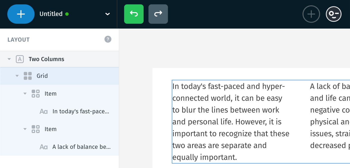
4. Two Columns
Splits your text into two sections side by side. Makes longer text easier to scan. Helpful for comparisons, lists, or when you want to share two ideas at once.
On mobile, these columns stack vertically to stay readable.
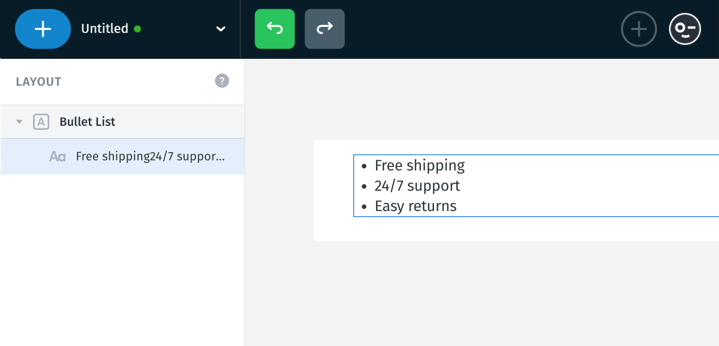
5. Bullet List
A list with simple dots before each item. Used when the order doesn’t matter, like features or highlights.
Example:
- Free shipping
- 24/7 support
- Easy returns
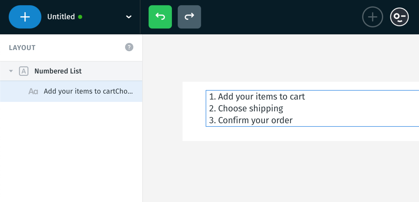
6. Numbered List
Similar to bullet points, but each item is numbered. Use when the order is important - like steps or a process.
Example:
- Add your items to cart
- Choose shipping
- Confirm your order
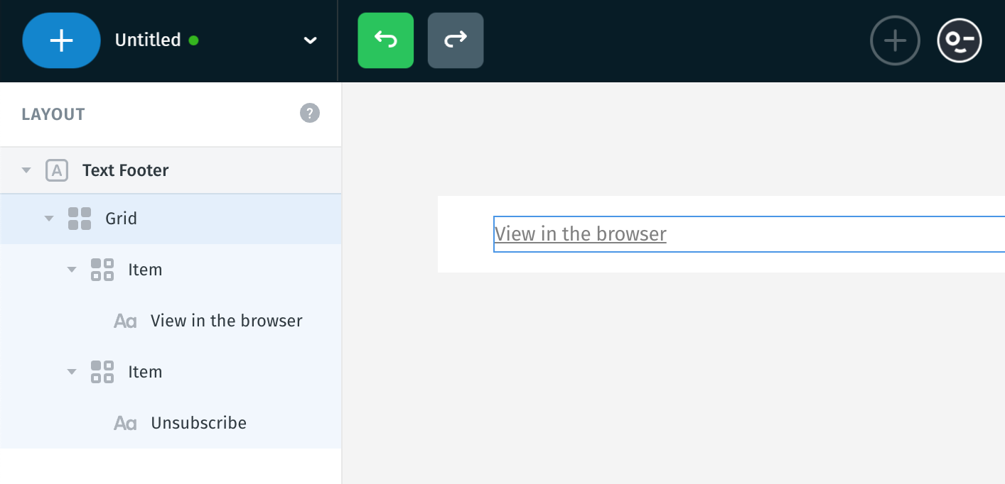
7. Text Footer
The Text Footer module is a quick and ready-to-use section usually placed at the very bottom of your email. It’s commonly used for important, but less visible information - like legal or subscription-related links.
When working with text, design control is fully in your hands.
While you can choose from a variety of fonts - including custom ones - not all email clients support custom fonts.
In those cases, the email will automatically use a safe fallback font (like Arial, Georgia, or Verdana), so your message still looks clean and readable everywhere.
What you can adjust:
- Font family
- Font weight (e.g. regular, bold)
- Font size to control how large the text appears
- Line height to improve readability and vertical spacing
- Letter spacing to fine-tune space between characters
- Font color, to match your brand or design
- Opacity, to make text more subtle or transparent when needed

To use custom fonts, click the menu icon and select the “Custom Fonts” option. A popup will appear, allowing you to choose from the available options. You can find more information about custom fonts Here.

Text alignment controls how the text is positioned:
- Left: Text starts from the left edge (default for most languages).
- Center: Text is centered horizontally.
- Right: Text aligns to the right edge.
- Justified: Text stretches to fill the full width, spacing out words evenly (commonly used in paragraphs).
You can also control font case: All letters become capitalized.
Underline: Adds a line below the text, often used for links.
Strikethrough: Adds a line through the text, usually to indicate deletion or discount.

If you want to fine-tune your layout even more, you’ll find several advanced formatting tools that help you style text just the way you like.
-
Paragraph Spacing - control the space between entire paragraphs, useful when you want to create more visual separation between different thoughts or sections of text.
Note: Making sure different blocks of text don't look cramped.
- Paragraph Indent - this shifts the first line of your paragraph inward, like in traditional printed text.
-
Subscript and Superscript - these reduce the text size and shift it below (subscript) or above (superscript) the baseline.
Often used in scientific or mathematical notation (e.g. H₂O, x²)
- Bullet List - a list with simple dots before each item. Used when the order doesn’t matter, like features or highlights.
- Numbered List - similar to bullet points, but each item is numbered. Use when the order is important - like steps or a process.
- Clear formatting - this resets all styling (font, size, weight, colors) and lets you start from scratch with clean, default text, it’s especially helpful when pasting text from other sources that brings unwanted formatting.

How text adjustments work across views
- If you start editing in Desktop view, your text styles (font, size, color, etc.) will carry over to Mobile unless you make changes in Mobile later.
- If you start in Mobile view, any styling changes will only apply to Mobile - and Desktop will remain unaffected, even if you edit it later.
Note:
- The text content itself (like the actual words or links) always stays the same across both views.
- But any styling adjustments - such as font family, size, color, spacing, alignment, are treated separately between Desktop and Mobile.
This gives you flexibility, but it’s important to be mindful of where you begin styling.

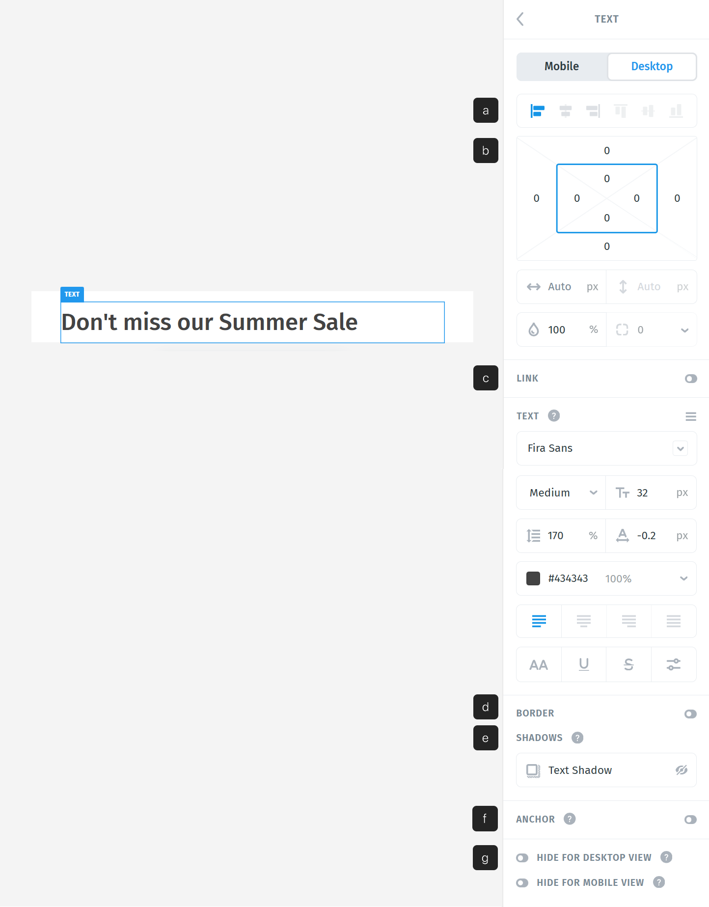
Options
Beyond just editing the text and font, you can fine-tune how your text behaves and looks using several advanced options:
a. Alignments
b. Positioning, Sizes and Opacity
c. Link
d. Border
e. Shadows
f. Anchor
g. Hiding options
a. Alignments
You can align the text in the following ways:
- Left – aligns the text to the left edge of its container
- Center – centers the image horizontally
- Right – aligns the text to the right edge of its container
Note: Why you might not see any change
If your text is set to 100% width or Auto (it stretches to fill its container), alignment won’t have any visible effect - the text already takes up the full horizontal space, so there’s no “room” to align it left or right.

b. Positioning, Sizes and Opacity
Margin is the space outside the text. It creates distance between the element and others around it. Padding is the space inside the text, between its content and the border.
Use margin to control layout spacing, and padding to improve readability and visual comfort within an element.

When width (↔) is set to Auto, the text resizes to fit its content plus any horizontal padding. This ensures the text isn’t too wide or too narrow; it adjusts naturally based on what’s inside.
You can still manually set a specific width (e.g. 200px, 50%) if you want the text to have a fixed or relative size. Auto is just the default behavior.
The height (↕) is typically not set manually; it stays as auto. That’s because the vertical size of the text is controlled by padding (top and bottom), which makes it flexible and keeps the text vertically centered without needing a fixed height.

The Opacity setting controls how transparent the text appears. You can type a value or drag left or right to decrease or increase the percentage.
- 100% = fully visible text
- 0% = completely invisible text
- Values in between = partially transparent text
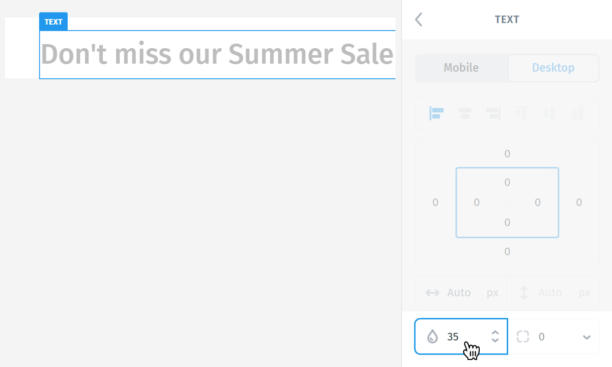
Opacity is useful for subtle text overlays, secondary or de-emphasized content, and layered designs where the text should remain visible without drawing too much attention.
c. Link
The link option is disabled by default. Toggle it on to activate and use it.
You can enter a URL (e.g. https://postcards.email) to direct readers to an external page, or use an anchor (e.g. #section1) to jump to a specific part within the same email (supported by some email clients).
The checkbox “Open in new tab” is usually selected. This is recommended because:
- It ensures readers don’t lose the email when clicking the link.
- It provides a smoother experience, especially on desktop browsers.
- It’s ideal when linking to external websites like blogs, products, or sign-up pages.
If the checkbox is disabled, the link may open in the same tab, which could interrupt the reading flow.

In addition to turning the entire text block into a link, you can also apply a link to a specific piece of text.
To do this:
- Select the desired portion of the text.
- A small blue bubble with a link icon will appear above or near the selection.

Click the icon and insert the URL you want.
This gives you more flexibility - for example, you might want just one word or sentence inside a paragraph to be clickable, rather than the whole block.

d. Border
Adding a border to a text block can help:
- Highlight important content: A border draws attention - perfect for quotes, announcements, or callouts.
- Visually separate content: If your layout has multiple text sections, borders can help define and structure the space more clearly.
Tip: If you don’t want a border anymore, just set the size to 0 - it will be removed entirely.

e. Shadows
Text Shadow applies a shadow directly behind the text, helping it stand out.
To make the shadow visible, you can tweak:
- X offset – how far the shadow moves horizontally
- Y offset – how far it moves vertically
- Blur – how soft or sharp the shadow appears
- Color – choose any tone to match or contrast your design
- Opacity – control how strong or subtle the effect is
Note: Shadow effects are mostly visual and may not appear the same everywhere. Support is limited in some email clients, including Outlook, Gmail, and Windows 10 Mail, where shadows may not render properly or at all.

f. Anchor
Anchors let you create internal navigation by allowing text to scroll to specific sections within the same email.
In this section, you can create an anchor by naming a specific spot in your content: for example, “title”.
Later, you can link to it using #title from a Link.
Note:
- Anchors only work in a few email clients (such as Apple Mail or some web-based clients).
- Major platforms like Gmail, Outlook, and Windows Mail do not support anchor scrolling, so this feature won’t function for all recipients.

g. Hiding options
Sometimes, based on your design or client needs, you may want the text to appear only on mobile or only on desktop.
The Hiding options allow you to control exactly that:
- Choose to hide the text on mobile, desktop, or show it on both.
- This is useful when you want to tailor content for different screen sizes - for example, showing larger text on mobile or hiding duplicate actions on smaller layouts.
You can quickly spot hidden elements using the keyboard shortcut M, as shown in the View Options.
When the hiding option is applied, a new icon will appear in the Layers panel - a crossed-out computer for Desktop or a crossed-out phone for Mobile. This helps you quickly identify which elements are hidden on specific devices, so you won’t forget later.

Add more texts (elements)
Besides using the main plus (+) button in the top bar, you can also add elements directly within the Layers panel on the left.
When navigating through the Layers structure, hovering above or below a specific element will reveal a small plus (+) button.

Clicking it will prompt a bubble of available elements that can be inserted in the exact position - for example, you can quickly add another text inside the same module below the existing one.

Using AI Assistant
When you select text - whether it’s a single word, a sentence, or a full paragraph, you’ll notice the left panel updates with new options. One of these is the AI Assistant.
With the AI Assistant, you can rewrite the selected text.
This is helpful when:
- You want to improve clarity or tone
- You need a shorter version for mobile
- You’re looking for creative variations without writing from scratch
Tip: You can always undo or regenerate if you’re not happy with the result.
