A video background can be used to enhance the aesthetics and overall branding of a website. When done right, it can be a great way to improve your website’s look, capture user attention and tell your business’ story. But without following some important guidelines, it can ruin your site’s performance and mess up the overall design and experience. Here are some things to keep in mind when adding a video background to your site:
- The video should be muted by default. You can add opt-in sound if you prefer.
- You should include a placeholder image for browsers that don’t support HTML5 video to fall back on.
- Accessibility is important. You’ll probably place text on top of the video, so make sure it has enough contrast to be readable.
- Respect bandwidth. The video should be small and compressed as effectively as possible.
- Length is important: too short a video can feel repetitive when put on a loop, while too long becomes a narrative unto itself. Consider something between 12 – 30 seconds.
Let’s dive right in and add a video background to a Startup website.
Add the Markup
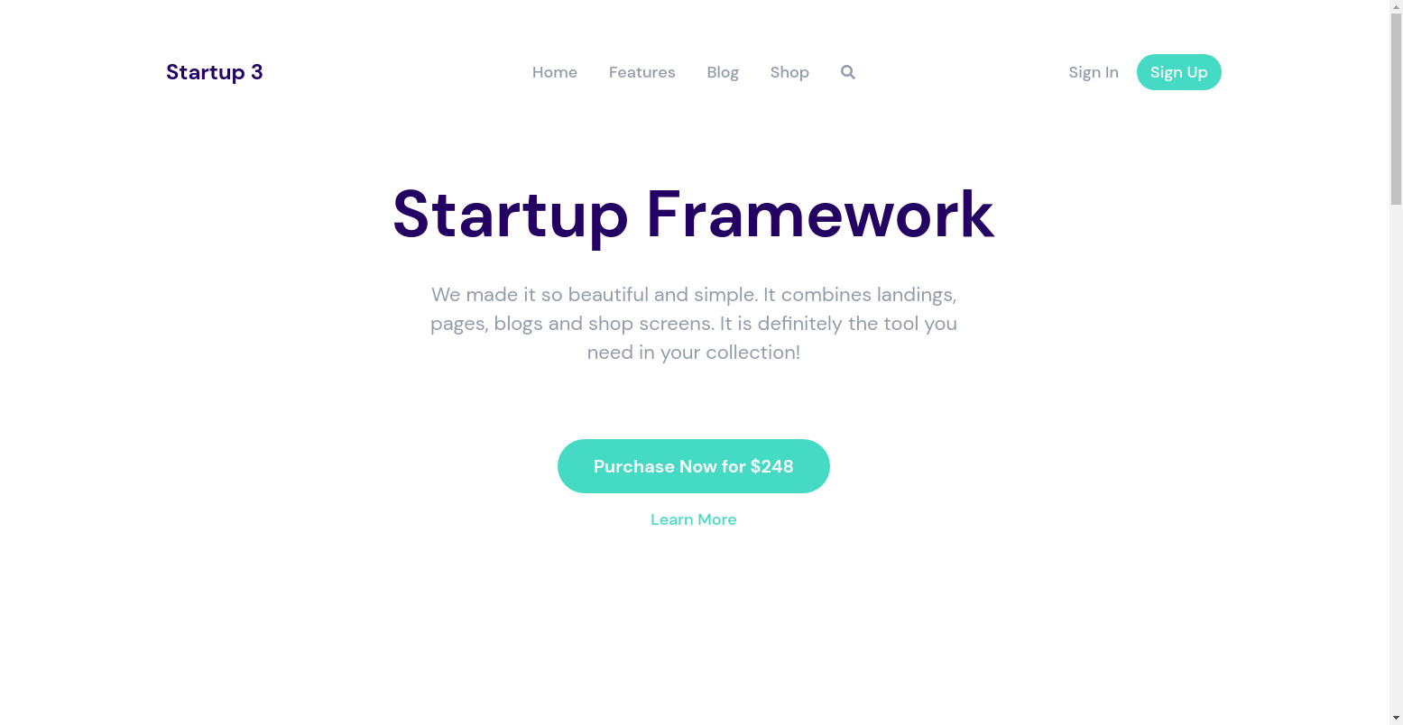
We’ll add a video background to the following header:

Here’s the code for the above:
<!-- Header 1 -->

<header class="pt-195 pb-110 bg-light header_1">

<!-- Header Menu 1 -->

  <nav class="header_menu_1 pt-30 pb-30 mt-30">
    <div class="container px-xl-0">
      <div class="row justify-content-center align-items-center f-18 medium">
        <div class="col-lg-3 logo" data-aos-duration="600" data-aos="fade-down" data-aos-delay="1200">Startup 3</div>
        <div class="col-lg-6 text-center" data-aos-duration="600" data-aos="fade-down" data-aos-delay="900">
          <a href="#" class="link color-heading mx-15">Home</a>
          <a href="#" class="link color-heading mx-15">Features</a>
          <a href="#" class="link color-heading mx-15">Blog</a>
          <a href="#" class="link color-heading mx-15">Shop</a>
          <a href="#" class="link color-heading f-16 mx-15"><i class="fas fa-search"></i></a>
        </div>
        <div class="col-lg-3 col-md-4 col-sm-6 d-flex justify-content-end align-items-center" data-aos-duration="600" data-aos="fade-down" data-aos-delay="1200">
          <a href="#" class="mr-20 link color-heading">Sign In</a>
          <a href="#" class="btn sm action-1">Sign Up</a>
        </div>
      </div>
    </div>
  </nav>

  <div class="container">
    <div class="mb-3 logo d-block d-xl-none text-center logo_mobile">Startup 3</div>
    <h1 class="big text-center" data-aos-duration="600" data-aos="fade-down" data-aos-delay="0">Startup Framework</h1>
    <div class="mw-600 mx-auto mt-30 f-22 color-heading text-center text-adaptive" data-aos-duration="600" data-aos="fade-down" data-aos-delay="300">
      We made it so beautiful and simple. It combines landings, pages, blogs and shop screens. It is definitely the tool you need in your collection!
    </div>
    <div class="mt-80 text-center buttons" data-aos-duration="600" data-aos="fade-down" data-aos-delay="600">
      <div><a href="#" class="btn lg action-1">Purchase Now for $248</a></div>
      <div><a href="#" class="mt-15 link action-1 f-18 medium">Learn More</a></div>
    </div>
  </div>
</header>
Modify the code as shown:
<header>

<!-- Header Menu 1 -->

  <nav class="header_menu_1 pt-30 pb-30 mt-30">
    <div class="container px-xl-0">
      <div class="row justify-content-center align-items-center f-18 medium">
        <div class="col-lg-3 logo" data-aos-duration="600" data-aos="fade-down" data-aos-delay="1200">Startup 3</div>
        <div class="col-lg-6 text-center" data-aos-duration="600" data-aos="fade-down" data-aos-delay="900">
          <a href="#" class="link color-heading mx-15">Home</a>
          <a href="#" class="link color-heading mx-15">Features</a>
          <a href="#" class="link color-heading mx-15">Blog</a>
          <a href="#" class="link color-heading mx-15">Shop</a>
          <a href="#" class="link color-heading f-16 mx-15"><i class="fas fa-search"></i></a>
        </div>
        <div class="col-lg-3 col-md-4 col-sm-6 d-flex justify-content-end align-items-center" data-aos-duration="600" data-aos="fade-down" data-aos-delay="1200">
          <a href="#" class="mr-20 link color-heading">Sign In</a>
          <a href="#" class="btn sm action-1">Sign Up</a>
        </div>
      </div>
    </div>
  </nav>

  <div class="video-background">
    <div class="video-wrap">
      <div id="video">
        <video autoplay loop muted playsinline poster="picture.jpg">
          <source src="video.webm" type="video/webm">
          <source src="video.mp4" type="video/mp4">
        </video>
      </div>
    </div>
  </div>

  <div class="caption">
    <div class="mb-3 logo d-block d-xl-none text-center logo_mobile">Startup 3</div>
    <h1 class="big text-center" data-aos-duration="600" data-aos="fade-down" data-aos-delay="0">Startup Framework</h1>
    <div class="mw-600 mx-auto mt-30 f-22 color-heading text-center text-adaptive" data-aos-duration="600" data-aos="fade-down" data-aos-delay="300">
      We made it so beautiful and simple. It combines landings, pages, blogs and shop screens. It is definitely the tool you need in your collection!
    </div>
    <div class="mt-80 text-center buttons" data-aos-duration="600" data-aos="fade-down" data-aos-delay="600">
      <div><a href="#" class="btn lg action-1">Purchase Now for $248</a></div>
      <div><a href="#" class="mt-15 link action-1 f-18 medium">Learn More</a></div>
    </div>
  </div>
</header>
We start by removing the classes of the header tag <header class="pt-195 pb-110 bg-light header_1"> We want the video background to take up the whole width and height of the viewport (the visible area of the webpage, without scrolling down), so we remove the pt-X classes that add padding to the header. If you are curious about the classes we use on the Startup template, check out our classes guide.
Next, we include a video with the following. The HTML Video element (<video>) embeds a media player that supports video playback into the document.
<div class="video-background">
  <div class="video-wrap">
    <div id="video">
      <video autoplay loop muted playsinline poster="picture.jpg">
        <source src="video.webm" type="video/webm">
        <source src="video.mp4" type="video/mp4">
      </video>
    </div>
  </div>
</div>
We include two different video formats, in case the page is opened in a browser that doesn’t support the other format. In HTML5, there are 3 supported video formats: MP4, WebM, and Ogg.
We add the following attributes to the video tag:
- autoplay: if specified, the video automatically begins to play back as soon as it can do so without stopping to finish loading the data.
- loop: if specified, the browser will automatically seek back to the start upon reaching the end of the video.
- muted: if set, the audio will be initially silenced.
- playsinline: indicates that the video is to be played “inline”, i.e. within the element’s playback area. This is required for the video to play properly on some mobile devices.
- poster: gives the video an image to show while the video is loading or in case the video doesn’t load at all.
Finally, we change the class of the bottom div from class="container" to class="caption". This div holds the text that we want to be in the foreground of the video. We add our own class so that we can style it.
Add Styling
With the HTML taken care of, add the following CSS rules to the bottom of the css/style.css file.
/* Fixed video background that works well on mobile devices */

.video-wrap {
  clip: rect(0, auto, auto, 0);
  position: absolute;
  top: 0;
  left: 0;
  width: 100%;
  height: 100%;
}

#video {
  position: fixed;
  display: block;
  top: 0;
  left: 0;
  width: 100%;
  height: 100%;
  background-size: cover;
  background-position: center center;
  -webkit-transform: translateZ(0);
          transform: translateZ(0);
  will-change: transform;
  z-index: -1000;
}

video {
  position: fixed;
  top: 50%;
  left: 50%;
  min-width: 100%;
  min-height: 100%;
  width: auto;
  height: auto;
  z-index: -100;
  transform: translateX(-50%) translateY(-50%);
  background: url('') no-repeat;
  background-size: cover;
  transition: 1s opacity;
}

.video-background {
  position: relative;
  width: 100%;
  min-height: 100vh;
  background-color: rgba(0, 0, 0, 0.2)
}
The above makes the video fixed, centered and occupying the full width and height of the viewport. We add a dark overlay over the video by setting background-color: rgba(0, 0, 0, 0.2) on .video-background. This makes the background a little dark, thus creating more contrast with the white text in the foreground.
Next, add the following below the above rules.
.caption {
  position: absolute;
  top: 30%;
  width: 100%;
  color: white;
}

nav .logo {
  color: white;
}
We position the caption text to be on the video’s foreground and make its text white so that there is a strong contrast between the text and the dark background. We also make the logo’s text white so that it’s more readable.
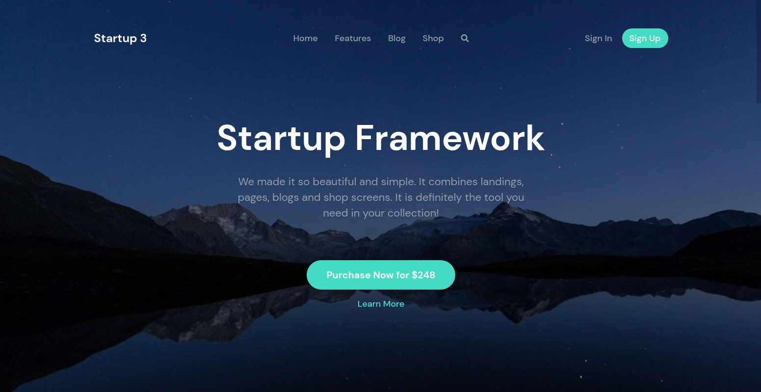
Here’s the new header (video courtesy of pixabay):

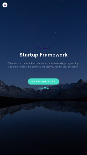
We aren’t done, yet. There is a small fix we need to take care of. The video background is responsive and looks great on mobile, but notice the logo on mobile still retains its original color and is hardly visible on the dark background.

Modify the last style rule you added as shown below to include the mobile logo.
nav .logo, .logo_mobile {
  color: white;
}
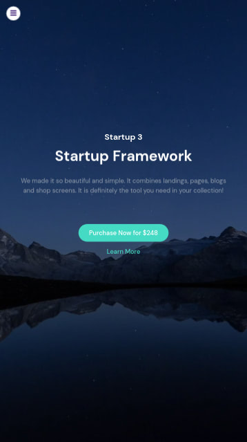
Now the logo is clearly visible on mobile:

If you’d rather have a background image on your page instead of a background video, we have an in-depth guide on that as well.
