This article will show you how to add anchor links in your Startup template that enable you to jump to specific sections of the template.
We will also configure the links found on the navigation bar so that they can be used to navigate to different sections of the page.
Add Anchor Links to Different Sections of the Page
The Startup webpage is made up of different sections (the blocks that you drag-n-dropped on the template) that we want to link to for easy navigation. You can link to different parts of a page by using fragment identifiers (also called anchor identifiers). A fragment identifier is an element with a unique identifying name assigned to an id attribute.
After marking a section with a fragment identifier, you can navigate to it with a URL that ends with #, followed by the fragment identifier, e.g. http://example.com#section_1.
To get started, first identify the different sections on your page that you would want to link to. These can be the different sections that your page is divided into, e.g. Contact Us, About the Team, Product Features, Product Pricing, e.t.c.
On identifying the sections, add an id attribute to the tag enclosing each section with a value of the name you wish to use as the fragment identifier. Below, you can see some fragment identifiers that we’ve added to a page.
<section id="about" class="pt-105 pb-70 bg-light text-center feature_3">
  ...
</section>

<section id="features" class="pt-105 pb-45 bg-light text-center feature_1">
  ...
</section>

<section id="contacts" class="bg-light text-center call_to_action_19">
  ...
</section>

<section id="buy" class="pt-105 pb-100 bg-light text-center pricing_table_5">
  ...
</section>
Next, let’s modify the links on the Navbar so that they link to the various segments.
Edit Navbar Links
If you added a Header or Navigation block to your Startup template, it will have a navigation bar (or menu) with some links.

Initially, the links all point to the page (i.e. href="#"). You should modify them so that they point to various parts of your website.
Below, we’ve modified the links and added the fragment identifiers that we used on the page. Clicking on a link will scroll the page down to the point where the fragment identifier is situated.
<div class="col-lg-9 d-flex justify-content-end align-items-center f-18 medium" data-aos-duration="600" data-aos="fade-down" data-aos-delay="900">
  <a href="#about" class="link color-main mr-30 op-3">About</a>
  <a href="#features" class="link color-main mr-30">Features</a>
  <a href="#contacts" class="link color-main mr-30">Contacts</a>
  <a href="#buy" class="btn sm action-2">Buy</a>
</div>
Now you should be able to navigate to various parts of your page by using the links in the Navbar.
Edit Links on the Mobile Menu
We aren’t done yet!
The Startup template is a responsive website, which means that it adapts itself to the device it is run on. On mobile devices, we don’t use the Navbar for navigation as this will be too squeezed on the smaller mobile screen and thus, won’t provide a good user experience.
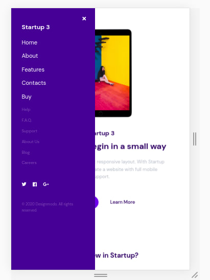
On mobile devices, we hide the Navbar and instead display a side menu that contains navigation links.
You can see how your webpage will look on a mobile device by using your browser’s Developer Tools. You can open the developer tools with Ctrl+Shift+I (Ctrl+Option+I on macOS) on both Firefox and Chrome.
Then, if you are using Chrome, click on the Toggle device toolbar icon shown below (in blue). It’s found on top of the Developer Tools drawer on the left corner. You can also use the keyboard shortcut Ctrl+Shift+M (Ctrl+Option+M on macOS) to toggle the control.
![]()
On Firefox, click the Responsive Design Mode icon shown below (in blue). It’s found on top of the Developer Tools drawer on the right corner. You can also use the keyboard shortcut Ctrl+Shift+M (Ctrl+Option+M on macOS) to toggle the design mode.
![]()
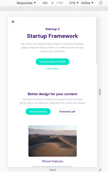
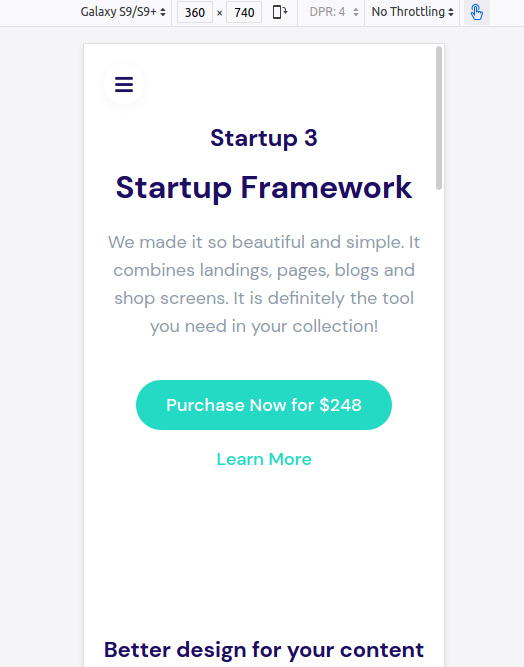
You will then be able to see the page as it will look on a mobile device.
Chrome:

Firefox:

At the top of the Device Toolbar, there are controls that you can use to select the size of the screen, zoom level, simulated network type and portrait/landscape mode.
You can select the dimensions of a specific device by selecting it from the first dropdown menu. If you select Responsive, you will be able to change the size of the device by dragging its edges inwards or outwards.
The code for the mobile menu is marked by the <!-- Navigation Mobile type X --> comment.
<!-- Navigation Mobile type 1 -->
...
<div class="logo color-white mb-30">Startup 3</div>
<div><a href="#" class="f-heading f-22 link color-white mb-20">Home</a></div>
<div><a href="#about" class="f-heading f-22 link color-white mb-20">About</a></div>
<div><a href="#features" class="f-heading f-22 link color-white mb-20">Features</a></div>
<div><a href="#contacts" class="f-heading f-22 link color-white mb-20">Contacts</a></div>
<div><a href="#buy" class="f-heading f-22 link color-white mb-20">Buy</a></div>
<div><a href="#" class="link color-white op-3 mb-15">Help</a></div>
<div><a href="#" class="link color-white op-3 mb-15">F.A.Q.</a></div>
<div><a href="#" class="link color-white op-3 mb-15">Support</a></div>
<div><a href="#" class="link color-white op-3 mb-15">About Us</a></div>
<div><a href="#" class="link color-white op-3 mb-15">Blog</a></div>
<div><a href="#" class="link color-white op-3 mb-15">Careers</a></div>
Remove or add whatever links are necessary for your website. You can see the menu by sliding it open with a left-to-right swipe or by tapping on the three-bar hamburger icon.

