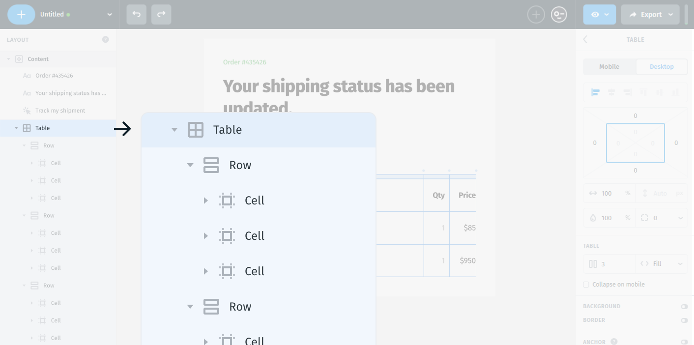
How Table Works in Postcards
A table is a layout structure made of rows and columns - much like a spreadsheet. It’s often used to present structured data in a clear, organized format. Think: pricing comparisons, product specs, schedules, etc.
- A table contains rows (horizontal layers).
- Each row contains cells (individual content blocks).
- You can place text, images, or other elements inside each cell.
To add a new table
When navigating through the Layers structure, hovering above or below a specific element will reveal a small plus (+) button.
Clicking it will prompt a bubble of available elements that can be inserted in the exact position - for example, you can quickly add another image inside the same module below the existing one.
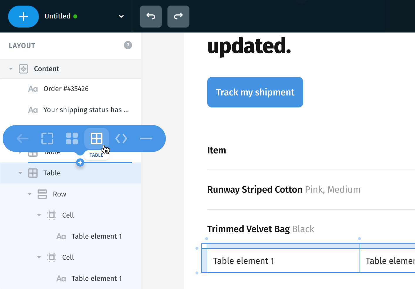
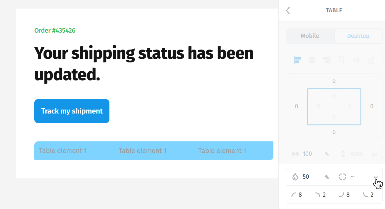
When you add a new table, it comes with several default properties to make layouting easy and consistent.
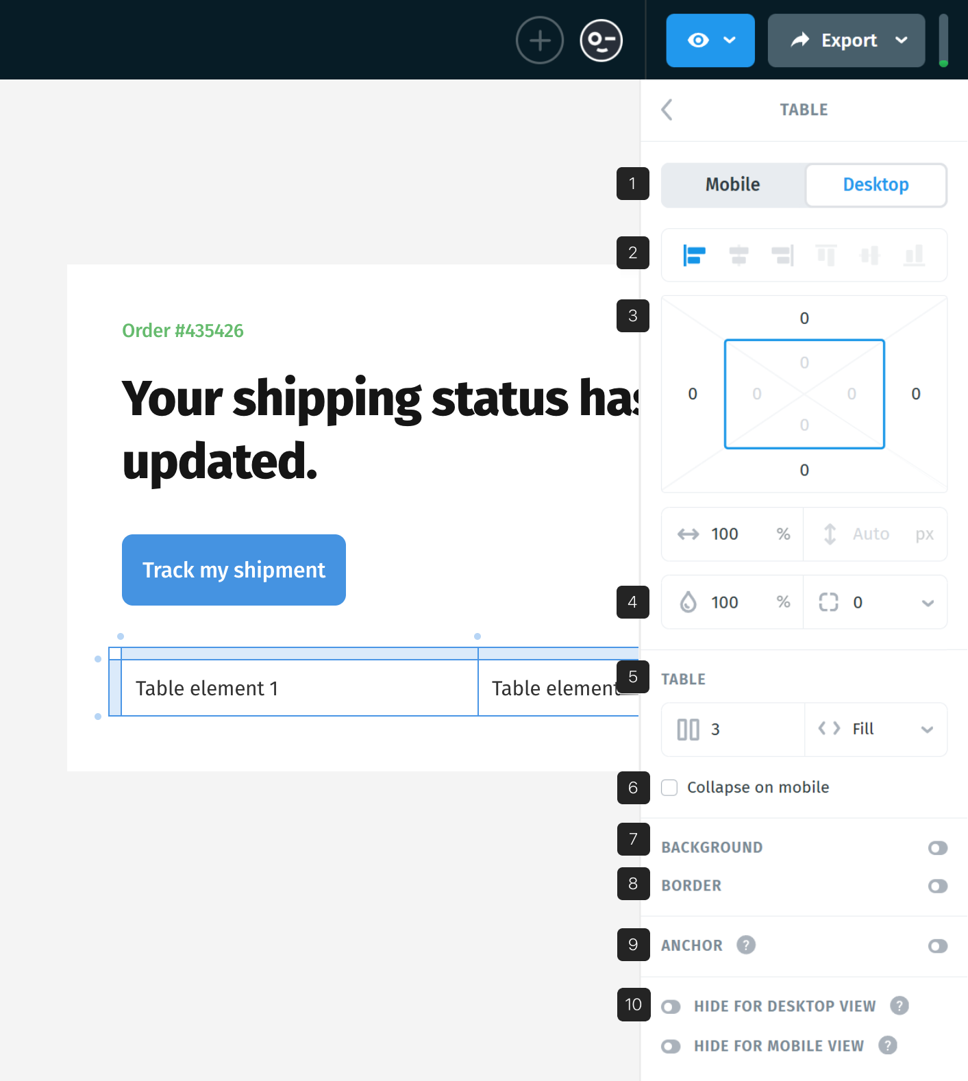
- View options (Desktop, Mobile)
- Alignments
- Positioning and sizes
- Opacity and corners
- Table
- Collapse on mobile
- Background
- Border
- Anchor
- Hiding options
1. View options (Desktop, Mobile)
This option gives the possibility to switch viewing from Desktop to Mobile or vice versa; use the keyboard shortcut M to switch instantly.

2. Alignments
Left-aligned by default.
If you switch to center or right alignment, you might not see a visible change if the table has 100% width, since it’s already taking the full space.

3. Positioning and sizes
- Margins: Set to 0 by default – meaning no extra space outside the table.
- Width: Set to 100% by default (stretches across the full container).
- Corner radius: Exists, but won’t be visible unless you add a background color (otherwise, it blends in).

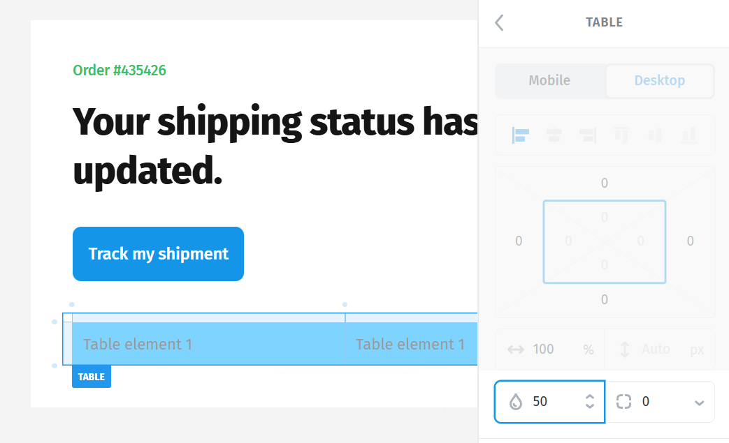
4. Opacity and Corners
The Opacity setting controls the transparency of the entire Table and applies to all of its contents.
You can adjust the opacity by entering a value directly or by clicking the value field and dragging left or right to decrease or increase the percentage.
- 100% makes the table fully visible
- 0% makes the table completely invisible
- Values in between apply partial transparency to the entire table
You can adjust the corner radius of the Table’s background to soften its edges and better separate it visually from other sections. Corner radius can be set to a specific value by entering a number, or by clicking the value field, holding the click, and dragging your mouse left or right to decrease or increase the value.
Each corner of the table can be customized individually by clicking the downward arrow next to the corner radius settings.
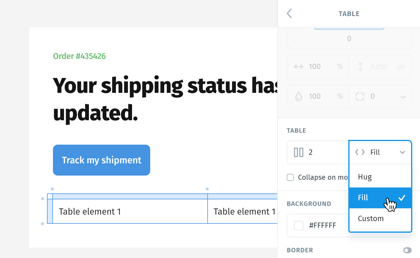
5. Table
Each new table starts with 2 columns by default.
When you add more columns, new cells will be created automatically.
Sizing options:
- Hug: The cell only expands based on padding and content inside.
- Fill: The cell stretches to fill the full table width.
- Custom: You define a fixed width manually.
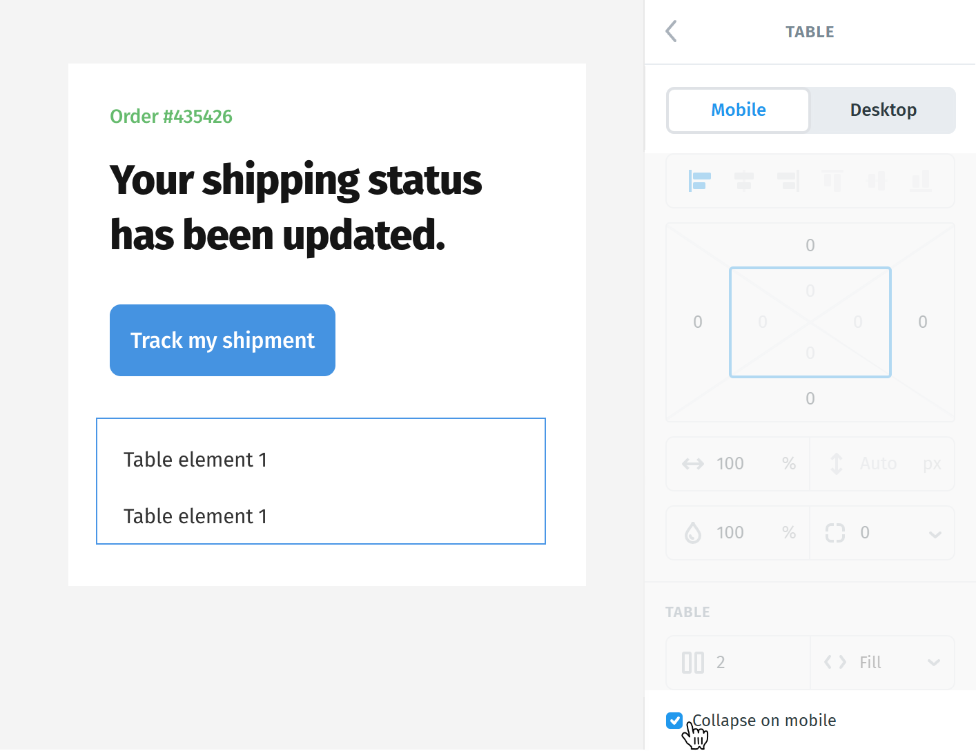
6. Collapse on mobile
When Collapse on mobile is enabled, each row will turn into a stacked block on smaller screens; all cells will display one under the other.
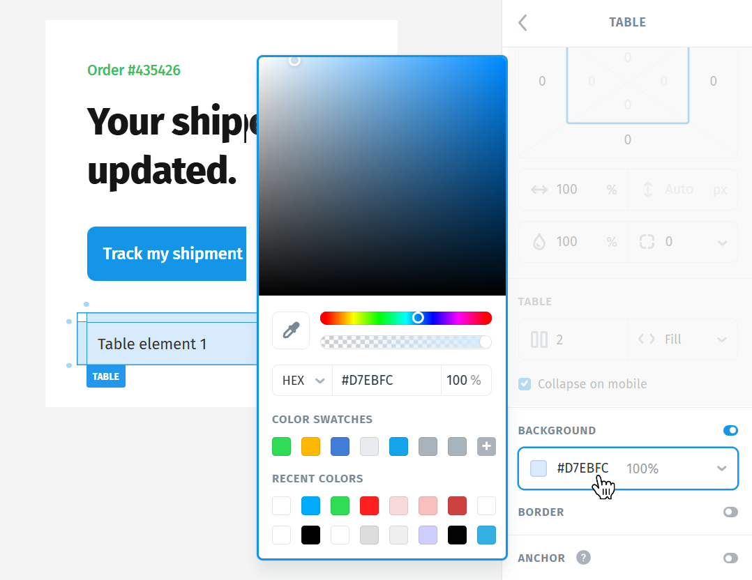
7. Background
You can change the background color of the table (helps to highlight or segment content).
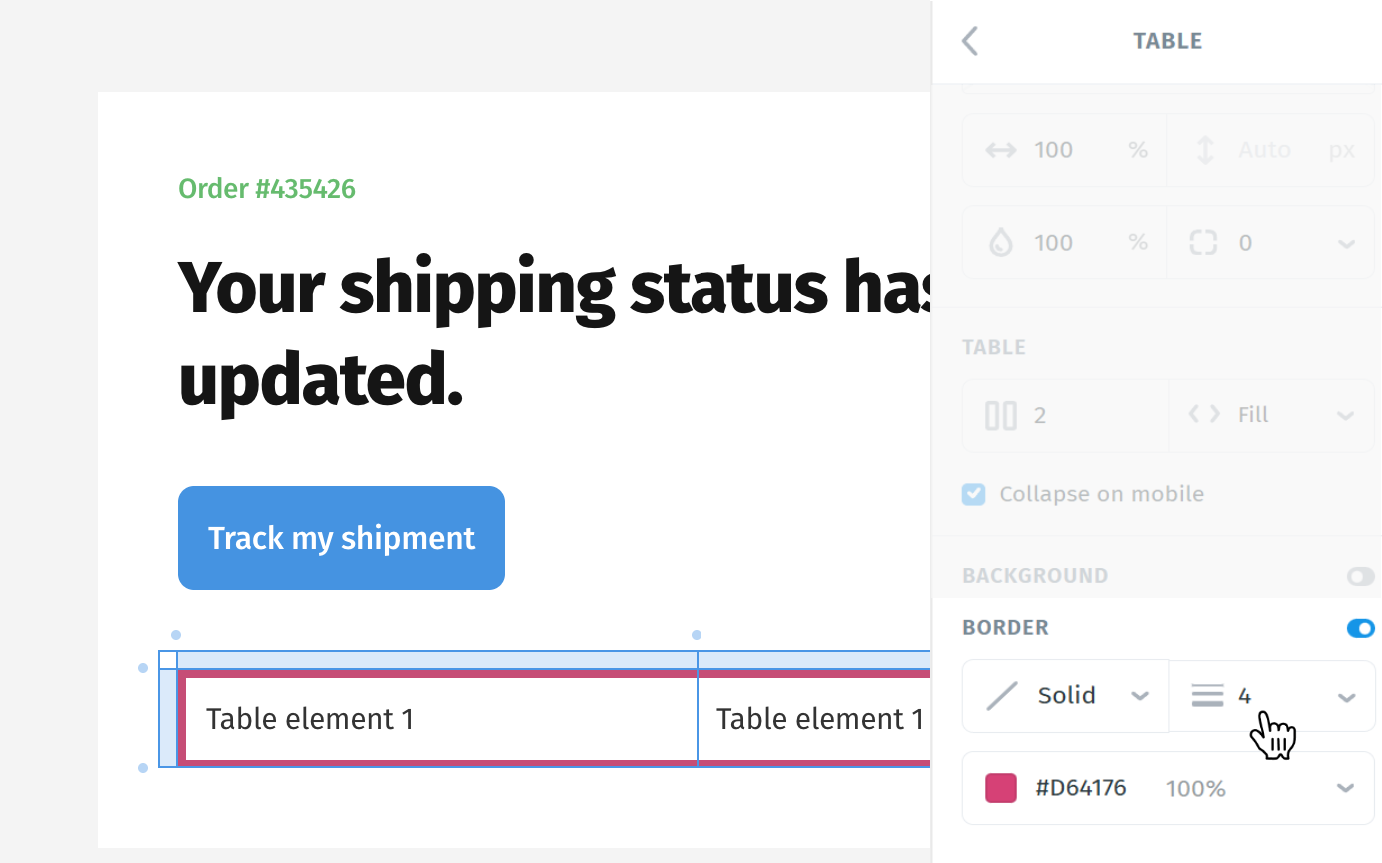
8. Border
Borders help make your table content easier to read and visually structured.
By default, the border is turned off.
When enabled, the border usually defaults to 1px solid – but you can:
- Adjust the thickness
- Change the style (solid, dotted, dashed)
- Choose a color that fits your design
Tip: If you don’t want a border anymore, just set the size to 0 - it will be removed entirely.
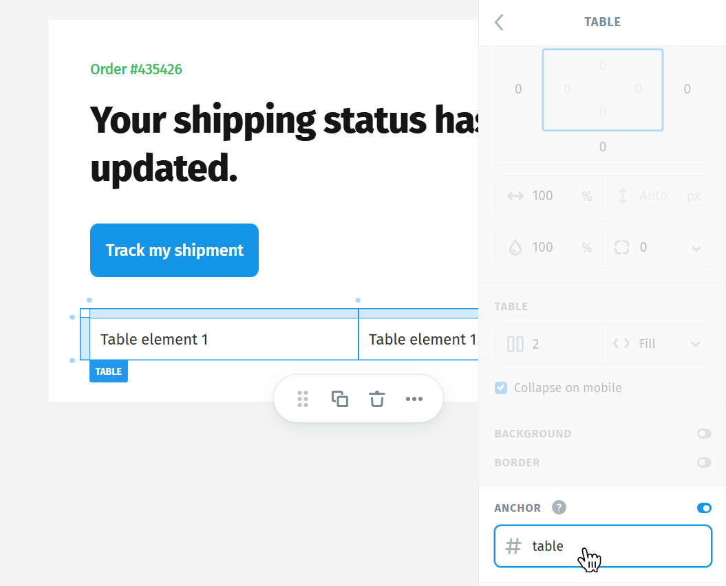
9. Anchor
Anchors let you create internal navigation by allowing the table to scroll to specific sections within the same email.
In this section, you can create an anchor by naming a specific spot in your content: for example, “table”.
Later, you can link to it using #table from a Link.
Note:
- Anchors only work in a few email clients (such as Apple Mail or some web-based clients).
- Major platforms like Gmail, Outlook, and Windows Mail do not support anchor scrolling, so this feature won’t function for all recipients.
Use anchors for subtle in-email navigation when targeting clients that support them, but avoid relying on them for critical actions.
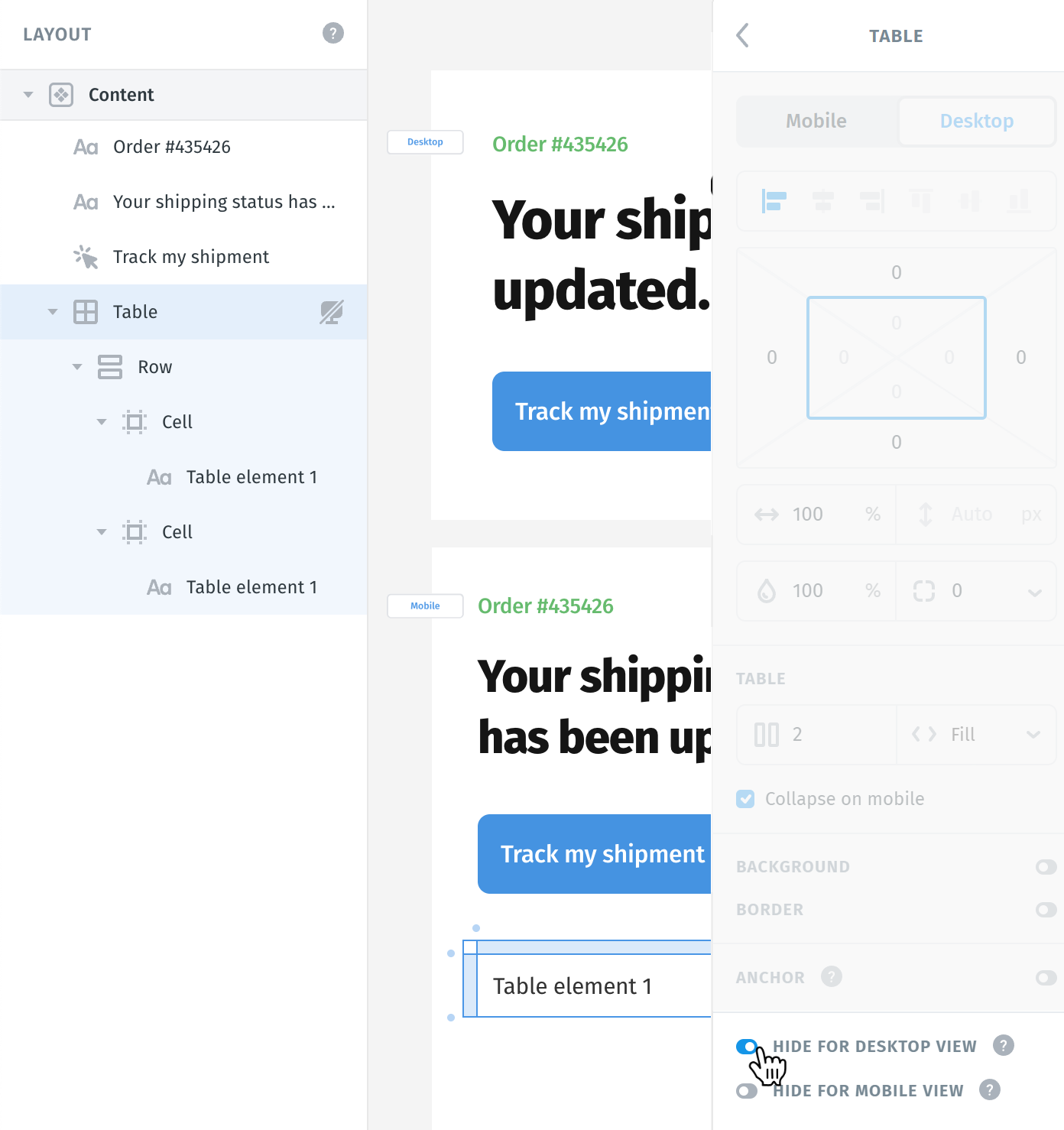
10. Hiding options
Sometimes, based on your design or client needs, you may want the table to appear only on mobile or only on desktop.
The Hiding options allow you to control exactly that:
Choose to hide the table on mobile, desktop, or show it on both.
You can quickly spot hidden elements using the keyboard shortcut M, as shown in the View Options.
When the hiding option is applied, a new icon will appear in the Layers panel - a crossed-out computer for desktop or a crossed-out phone for mobile. This helps you quickly identify which elements are hidden on specific devices, so you won’t forget later.
What is a Row?
A row in a table is a horizontal group of cells. Each table is made up of multiple rows, stacked on top of each other.

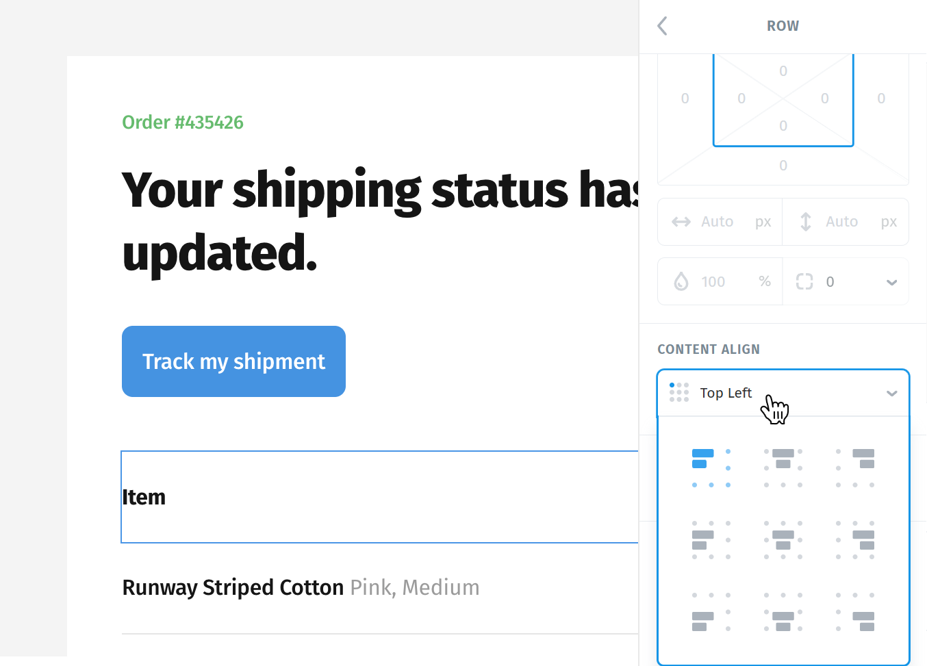
Each row has its own Content Align option.
By default, it’s set to Top Left - meaning all the content inside the row’s cells aligns to the top and left.
Changing this setting will affect all cells inside the row at once, so you can centrally align all content with one action.
A row can have its own background color and border, these will override the table’s background or border if both are applied.
For example: If the table has a white background and the row has light gray, that row will appear highlighted.
Note: Borders on a row apply around the entire row, not individual cells.
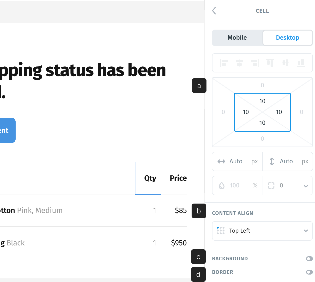
What is a Cell?
A cell is the smallest unit inside a table row - it’s where your actual content (text, images, buttons, etc.) lives.
Each row is made up of cells, arranged horizontally. You can think of a cell like a container inside a row that holds your content independently.

Every cell has its own padding (a), which by default is 10px on all sides (top, bottom, left, right).
Each cell also has a unique content alignment (b) option, by default - it’s set to Top Left, but you can change it per cell (e.g. center or bottom). When changed, the cell’s alignment overrides the row’s alignment settings, giving you fine-grained control.
A cell can have its own background color (c) and border (d). When applied, these override both the row and table styles - this is helpful when you want to highlight a single cell, draw attention, or visually differentiate it from others.
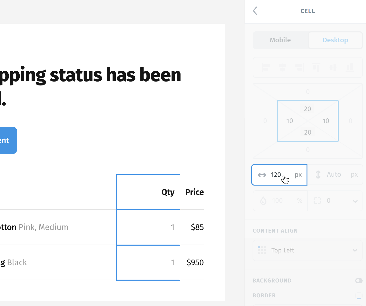
When you adjust the width of a single cell, it’s important to know - changing the width of one cell affects the entire column it belongs to.
That means all cells in the same vertical line will automatically match the new width - you can’t have different widths in a single column.
Why this happens:
Tables are built on a strict column-based structure, where consistency is key. This ensures your content stays aligned, clean, and readable across devices.
Duplicate
You can duplicate any row or cell easily:
- Right-click and select Duplicate
- Or use Cmd + D (Mac) or Ctrl + D (Windows)
This helps build complex layouts quickly, without recreating elements from scratch.

Editing Table Structure
When you select a table, you’ll notice a light-blue highlight appear along the top and left edges - this is a quick-access area for managing rows and columns.

Add new Rows or Columns
You’ll see small blue circles at the edges of rows and columns.
Hovering over one will reveal a plus (+) icon:
- Clicking the + at the top adds a new column.
- Clicking the + on the left adds a new row.
This makes it super fast to grow your table.

Reorder or Delete
Clicking directly on the light-blue spacing (not the + icon) will reveal:
- A x (delete) icon - removes the selected row or column.
- One or two arrow icons - used to reposition rows or columns:
- If the row/column is in the middle, you’ll see up/down or left/right arrows.
- If it’s already at the start or end, you might see only one arrow.
Clicking the arrows moves the row or column in that direction, giving you control over layout order without needing to delete and recreate.

Resizing Rows and Columns
When working with tables, you’ll notice light blue lines when the table is selected.
Hovering over these lines will reveal a drag handle - letting you manually resize rows or columns.

Row height
The minimum height is determined by:
- The content inside the cells
- Plus any padding applied to those cells
You can always drag to increase the height if needed.

Column width
The minimum width follows a similar rule:
- Content width + padding
- You can drag to increase the width up to 100% of the table (it won’t overflow).
