The Slides website template makes use of various icons that you might want to customize according to your needs. We’ll take you through the process of changing and customizing icons on your template.
We use icon fonts and SVG graphics on the Slides template. Icon fonts are fonts that contain symbols and glyphs instead of letters or numbers and can be styled with CSS, the same way you would style text. Icon fonts are a better way of adding icons to your website than using raster images (PNG, JPEG, GIF, etc.) because they scale well (changing the size of an icon doesn’t degrade its visual quality) and styling them (changing their size, color, opacity, shadow, etc.) is just as easy as styling text.
SVG (Scalable Vector Graphics) are an XML-based markup language for describing two-dimensional based vector graphics. Like icon fonts, they scale well (i.e. they can be rendered at any size without loss of quality) and can be styled with CSS.
We’ll take a look at how to work with both of these two types of icons.
Using Icon Fonts
Material Design Icons
Slides uses Material Design Icons for some of its icons. You can see the link importing the icons in the HTML file that comes with the downloaded template (something similar to the below markup).
<!-- Fonts and Material Icons -->
<link rel="stylesheet" as="font" href="https://fonts.googleapis.com/css2?family=Inter:wght@100;200;300;400;500;600;700;800;900&family=Material+Icons&display=swap"/>
You can also include the Material Design Icons separately with the following link.
<link href="https://fonts.googleapis.com/icon?family=Material+Icons" rel="stylesheet">
After linking to the icon font, you can add a particular icon to the page using its name (check the library for available icons and their corresponding names). You place the icon name inside <i> tags. Below are three examples of different icons from the Material Design icon set:
<span style="color: red;">
  <i class="material-icons">face</i>
</span>

<i class="material-icons">settings</i>

<i style="font-size: 3em;" class="material-icons">shopping_cart</i>
You can see these icons below:

There are other icon fonts available online that you can use in your Slides template. The procedure to use them is similar and you can always find specific instructions in the Documentation of the icon font. Next, we’ll look at another popular one.
Font Awesome Icons
To use Font Awesome, first add the following link:
<!-- FontAwesome CSS -->
<link rel="stylesheet" href="https://cdnjs.cloudflare.com/ajax/libs/font-awesome/5.13.0/css/all.min.css">
You can also create an account on the Font Awesome website to get a custom link. The advantage of doing this is that you get access to the latest fonts and you can also customize the font set.
Font Awesome offers a large selection of icons that you can use for free (1,598 free icons, at the time of writing). With the above link, you are all set to use the free icons. We’ll show you how to use Premium icon sets later.
The Font Awesome icons can be used just about anywhere, but they are commonly used with inline elements. You will mostly see them used with <i> and <span> tags.
To reference an icon, you need to know its Style Prefix as well as its Name.
Currently, there are 5 Style Prefixes:
fas
The fas style prefix is used for Solid style icons. You can see an example below. fas icons are available for free.

far
The far style prefix is used for Regular style icons. You can see an example below. far icons are available with a premium subscription to Font Awesome.

fal
The fal style prefix is used for Light style icons. You can see an example below. fal icons are available with a premium subscription to Font Awesome.

fad
The fad style prefix is used for Duotone style icons. You can see an example below. fad icons are available with a premium subscription to Font Awesome.

fab
The fab style prefix is used for Brands style icons. Unlike the previous prefixes, this prefix doesn’t provide a different styling for the icons, instead, it provides icons for different brands (e.g. Facebook, Apple Pay, Bitcoin, etc.) You can see an example below. fab icons are available for free.

To find icons, browse/search the Font Awesome library. Once you identify an icon for use, you add it to an HTML element by adding a class of its name prefixed with fa-, a class of the preferred style prefix and an optional sizing class, which we’ll look at later.
Below are some examples of different icons in use:
<!-- using an <i> element to reference an icon -->
<i class="fas fa-copy fa-2x"></i>

<!-- using a <span> element to reference an icon -->
<span class="far fa-copy fa-2x"></span>

<!-- using an icon in a button -->
<a href="#" class="button blue round small">
  <i class="fas fa-angle-right"></i>
</a>

<!-- using an icon in a button -->
<a class="button red rounded small" href="#">
  <i class="fas fa-trash-alt"></i> Delete
</a>

<!-- using an icon in a button -->
<button class="button red rounded small">
  <i class="fas fa-trash-alt"></i> Delete
</button>
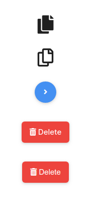
Below are the icons added above:

Styling the Icons
As we saw in the Material Design Icons example, you can style Icon Fonts just as you would any other text. Just like the other text on your page, Font Awesome icons inherit CSS color and size rules, which makes them blend in with text inline wherever you put them.
Below, we add some styling to an icon:
<span style="font-size: 3em; color: rebeccapurple;">
  <i class="fas fa-camera"></i>
</span>
You can see the above icon below:

You can change the icon’s size with the font-size property as we did in the previous example, or you can use some predefined sizing classes that Font Awesome makes available.
<!-- fa-xs. Sizing scale:    .75em -->
<i class="fas fa-cart-plus fa-xs"></i>
<!-- fa-sm. Sizing scale:    .875em -->
<i class="fas fa-cart-plus fa-sm"></i>
<!-- fa-lg. Sizing scale:    1.33em    (Also applies vertical-align: -25%) -->
<i class="fas fa-cart-plus fa-lg"></i>
<!-- fa-2x. Sizing scale:    2em -->
<i class="fas fa-cart-plus fa-2x"></i>
<!-- fa-3x. Sizing scale:    3em -->
<i class="fas fa-cart-plus fa-3x"></i>
<!-- fa-4x. Sizing scale:    4em -->
<i class="fas fa-cart-plus fa-4x"></i>
<!-- fa-5x. Sizing scale:    5em -->
<i class="fas fa-cart-plus fa-5x"></i>
<!-- fa-6x. Sizing scale:    6em -->
<i class="fas fa-cart-plus fa-6x"></i>
<!-- fa-7x. Sizing scale:    7em -->
<i class="fas fa-cart-plus fa-7x"></i>
<!-- fa-8x. Sizing scale:    8em -->
<i class="fas fa-cart-plus fa-8x"></i>
<!-- fa-9x. Sizing scale:    9em -->
<i class="fas fa-cart-plus fa-9x"></i>
<!-- fa-10x. Sizing scale: 10em -->
<i class="fas fa-cart-plus fa-10x"></i>
The above sizing classes set the icon’s size relative to its parent’s size. In the above code, you can see the scale used for each class in the comments.
The above code gives the icons shown.

Using Premium Font Awesome Icons
The link we used to include Font Awesome in the template is a CDN (content delivery network) link that is available to anyone and offers access to the free icons on Font Awesome. If you want a larger variety of icons, you can pay for a subscription. If you are on a premium plan, you will be able to create icon kits for your projects. After creating a Kit, you will be given code that you can use on your page to access the kit. This will be a link to a JavaScript file (an example is shown below). Replace the previously mentioned Font Awesome CSS link with the code you get.
<script src="https://kit.fontawesome.com/0123ab4567.js" crossorigin="anonymous"></script>
With that done, you can now add premium icons to your template. You add them the same way you add the free ones, as previously demonstrated. The code you added gives you access to all icons in the Font Awesome library, so any free icons that you might have been using will still work.
Using SVG Icons
As previously mentioned, some of the icons on the Slides template are SVG graphics.
We use an SVG Library to define the SVG graphics used on the site. You can see this in the HTML file that comes with the downloaded template (something similar to the below markup).
<svg xmlns="http://www.w3.org/2000/svg" style="display:none" id="customSvgLibrary">
  <symbol><path /></symbol>
  <symbol><path /></symbol>
  <symbol><path /></symbol>
  <symbol><path /></symbol>
  <symbol><path /></symbol>
</svg>
The SVG <symbol> element is used to define reusable symbols. The shapes nested inside a <symbol> aren’t displayed unless referenced by a <use> element, as shown below:
<li><a href="#"><svg><use xmlns:xlink="http://www.w3.org/1999/xlink" xlink:href="#facebook"></use></svg></a></li>
The <symbol> element needs an id attribute so that it can be referenced later by a <use> element.
You can add your own symbols to the SVG library and use them in the HTML markup with <use>. Creating SVG graphics and getting the SVG code is out of the scope of this tutorial, you can check online for tutorials on how to do so. We have a video that shows how to create a simple SVG logo with Adobe Illustrator that you might find useful
Other than using SVG code to add SVG graphics on the page, you can use SVG files. You can add an SVG icon to a page via the <img> element as shown below. You might need a height or a width attribute (or both if your SVG has no inherent aspect ratio).
<img src="i/thumb_up-black-48dp.svg" alt="thumbs up" />
Below is the icon added with the above code.

You can also directly add the SVG code to your HTML (this is sometimes called putting your SVG inline, or inlining SVG). Below is the code for the previous icon. When we add it to the page, we get the same result we got when we used the <img> tag.
<svg
  xmlns="http://www.w3.org/2000/svg"
  viewBox="0 0 24 24"
  fill="black"
  width="48px"
  height="48px"
>
  <path d="M0 0h24v24H0V0z" fill="none" />
  <path
    d="M1 21h4V9H1v12zm22-11c0-1.1-.9-2-2-2h-6.31l.95-4.57.03-.32c0-.41-.17-.79-.44-1.06L14.17 1 7.59 7.59C7.22 7.95 7 8.45 7 9v10c0 1.1.9 2 2 2h9c.83 0 1.54-.5 1.84-1.22l3.02-7.05c.09-.23.14-.47.14-.73v-2z"
  />
</svg>
Pros of using the <img> tag:
- Quick, familiar image syntax with built-in text equivalent available in the
altattribute. - You can make the image into a hyperlink easily by nesting the
<img>inside an<a>element. - The SVG file can be cached by the browser, resulting in faster loading times for any page that uses the image loaded in the future.
Cons of using the <img> tag:
- You cannot manipulate the image with JavaScript.
- If you want to control the SVG content with CSS, you must include inline CSS styles in your SVG code. (External stylesheets invoked from the SVG file take no effect.)
- You cannot restyle the image with CSS pseudoclasses (like
:focus).
Pros of inlining SVG:
- Putting your SVG inline saves an HTTP request, and therefore can reduce a bit your loading time.
- You can assign classes and ids to SVG elements and style them with CSS, either within the SVG or wherever you put the CSS style rules for your HTML document. In fact, you can use any SVG presentation attribute as a CSS property.
- Inlining SVG is the only approach that lets you use CSS interactions (like
:focus) and CSS animations on your SVG image (even in your regular stylesheet.) - You can make SVG markup into a hyperlink by wrapping it in an
<a>element.
Cons of inlining SVG:
- This method is only suitable if you’re using the SVG in only one place. Duplication makes for resource-intensive maintenance.
- Extra SVG code increases the size of your HTML file.
- The browser cannot cache inline SVG as it would cache regular image assets, so pages that include the image will not load faster after the first page containing the image is loaded.
- You may include fallback in a
<foreignObject>element, but browsers that support SVG still download any fallback images. You need to weigh whether the extra overhead is really worthwhile, just to support obsolescent browsers.
